Art book 2016 EN Michael Lonfeldt
•
0 likes•72 views

In this catalog I present photos of a selection of recent paintings I’ve made. Combined with a little text about where the inspiration came from. See more paintings on my website: https://artbylonfeldt.com

Recommended
More Related Content
What's hot
What's hot (18)
Similar to Art book 2016 EN Michael Lonfeldt
Similar to Art book 2016 EN Michael Lonfeldt (20)
Recently uploaded
Recently uploaded (20)
Art book 2016 EN Michael Lonfeldt
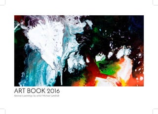
- 1. ART BOOK 2016 Abstract paintings by artist Michael Lønfeldt
- 2. Art Book 2016 | 32 | Art Book 2016 I find inspiration for my colorful abstract paintings in many different places. Not least in the wild on trips and tours in the Danish landscape. The ideas often occur as a view I get of a specific scenario with clear and colorful shapes and color combinations. To start the process I begin with a blank canvas and select the colors, materials, mediums and tools I will use. And then I make a sketch of the scene on the canvas. From here the design develops it’s struc- ture and colors, until at some point I am satisfied with the painting. Paintings by artist Michael Lønfeldt In this catalog I present photos of a selection of recent paint- ings I’ve made. Combined with a little text about where the inspiration came from. I t’s important for me that the finished painting inspires curiosity. And draws the viewer in, by continously revealing new details in the artwork. Therefore, I always try to get plenty of fine details, depth, contrast and rich colors with many shades in my paintings. Michael Lønfeldt DEFLECTION I INFINITY II DIVERSITY I SOLAR STORM I HORIZON III NATURE COLORS I ALTERATION III STORM I DIVERSITY II SUBURBS III 4 6 8 10 12 14 16 18 20 22
- 3. Art Book 2016 | 54 | Art Book 2016 DEFLECTION I 80x180 cm The painting has a mixture of light and dark colors, providing both sharp contrasts and smooth transitions. Because of the very fine color layers, the artwork has a very fine texture. Formed in the same pattern as the canvas. The painting has a signicicantly depth with a myriad of small details and effects.
- 4. Art Book 2016 | 76 | Art Book 2016 The painting has a mix of light and dark colors, and contrasts are clear with sharp boundaries between the colors. The motive is purely abstract. The idea for the painting is based on a combination of special purple, blue, green and red colors. The color combination I have seen in a villa garden on a walk. INFINITY II 80x80 cm
- 5. Art Book 2016 | 98 | Art Book 2016 DIVERSITY I 40x120 cm The painting is made in bright colors, and it has a mix of sharp contrasts and colors that slides easily into each other. In a combination of light and dark colors, in hot and cold tones. There is a massive and strongly diversified structure, which gives an enormous depth with plenty of shade effects and dramatic effects.
- 6. Art Book 2016 | 1110 | Art Book 2016 SOLAR STORM I 40x120 cm There is a mixture of colors flowing into each other, and colors that are sharply separated. The colors alternate between warm and cold hues that complement each other, so the painting appears as a whole. The sharp contrasts are very fine, and the painting has count- less small detailed lines.
- 7. Art Book 2016 | 1312 | Art Book 2016 The painting has strong colors, giving an incredibly beautiful variation. Colours and structure supports each other, and resulting in both flowing and sharp contrast transitions. The subject is an old gravel pit, now converted into a recreational area. With a lot of beautiful nature ,as wildlife, shrubs, trees and lakes. The time is a sunny day in the afternoon. HORIZON III 80x80 cm
- 8. Art Book 2016 | 1514 | Art Book 2016 NATURE COLORS I 70x180 cm The colors are dimmed and the transition between the contrasts are very fine with colors that flow into each other. The motive comes from a walk in the autumn, and reflect the play of colors that you find in nature when the leaves on the trees begin to change colors.
- 9. Art Book 2016 | 1716 | Art Book 2016 The colors are strong with a big variety, and they are kept in a mix of cold and warm tones. There are both clear and smooth contrasts with colors that flow into each other. The idea comes from a bike ride on a vacation on Bornholm. It shows the play of colors in nature. From an open landscape where fields, ditches and hedges has a great color variation with lots of fresh flowers. ALTERATION III 80x60 cm
- 10. Art Book 2016 | 1918 | Art Book 2016 STORM I 40x120 cm The colors are a mix of very light and very dark colors. Mainly kept in cold shades of the warm colors for contrast. There is very strong contrasts between light and dark colors. It is combined with nice little hues. The idea for the design comes from a windy day with a mixture of heavy cloud cover, and small rays of sunlight in between the skies.
- 11. Art Book 2016 | 2120 | Art Book 2016 The painting has many bright colors, changing in light and dark areas in a mixture of smooth and sharp contrasts. The bottom has a varied texture in thick layers, and it gives great depth with shadows and fine details. It is a purely abstract idea behind the design: With beautiful color combinations that combine light and dark areas with differences in the texture. DIVERSITY II 100x100 cm
- 12. Art Book 2016 | 2322 | Art Book 2016 The painting has bright colors with fine nuances. And contrasts that flow smoothly into the tones and stands out sharply compared to the other colors. The idea came on a bike ride on early evening. It shows a suburb, as it looks when the afternoon is dimming. The color tones gets slowly darker and the shadows longer. SUBURBS III 60x60 cm
- 13. ART BOOK 2016 Abstract paintings by artist Michael Lønfeldt artbylonfeldt.dk ml@artbylonfeldt.dk +45 5230 2455