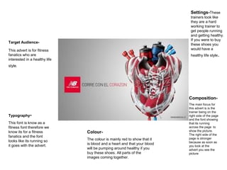
1. Target Audience-
This advert is for fitness
fanatics who are
interested in a healthy life
style.
Typography-
This font is know as a
fitness font therefore we
know its for a fitness
fanatics and the font
looks like its running so
it goes with the advert.
Colour-
The colour is mainly red to show that it
is blood and a heart and that your blood
will be pumping around healthy if you
buy these shoes. All parts of the
images coming together.
Settings-These
trainers look like
they are a hard
working trainer to
get people running
and getting healthy.
If you were to buy
these shoes you
would have a
healthy life style.
Composition-
The main focus for
this advert is is the
trainer being on the
right side of the page
and the font showing
that its running
across the page to
show the picture.
The right side of the
page is stronger
because as soon as
you look at the
advert you see the
picture
2. Target Audience-
This advert is for
women aged between
21-30. I feel this
because they are
colourful and are made
out of luxurious
materials. This advert is
for women with high
paid jobs who are
aiming to live a
glamorous and exciting
life style.
Setting-
They look like they have a
glamorous lifestyle
because there standing on
a cat walk which is
incredibly glossy. As if you
were to buy these shoes
your life would be as
glamorous as a fashion cat
walk.
Typography-
The font used is know as
the Prada font and
therefore we know its an
authentic Prada shoe.
Colour-
The colours are bright and
contrasting to demonstrate
that a life with these shoes
would be exciting and
joyful.
Composition –
The main focus of the
advert is the shoe which is
central in the advert. You
can only see the leg and
shoe which the leg has
been softly shaven and
the shoes are all
serenaded out in different
places.
3. Target audience-
This advert is for women
the aged between 20-32 I
feel this is because the
model is very young and it
fits with the advert and the
theme of the advert.
Typography-
The font used is know as a
straight/plain font that fits in with
the advert.
Colour-
The colours are modern and
bright which go with the advert
and its silk looking advert. With
blue water and the tanned man
next to her.
Composition-
The main focus of the advert is the
man and the shoes and the women
you can see the lady's legs that look
soft and the man that looks like his
sitting by the shoe to get a closer
look.
Setting-
They look like they have a
glamour's life style because
they are sitting by a pool that
looks very expensive and
modern.