Download to read offline
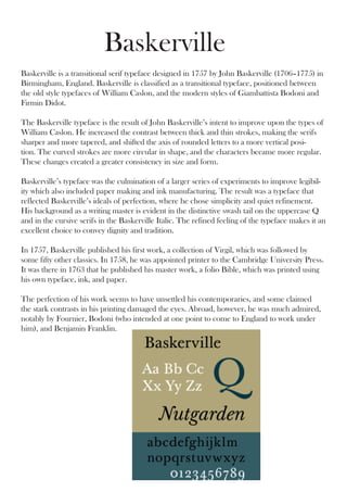

John Baskerville designed the Baskerville typeface in 1757 in Birmingham, England. It was a transitional serif typeface between old style and modern styles. Baskerville improved on William Caslon's types by increasing thickness contrast and making serifs sharper. His experiments in paper making and ink also improved legibility. The refined typeface conveyed dignity and tradition, as shown in its use for his 1763 folio Bible. While some contemporaries criticized it as eye-damaging, Baskerville was admired abroad, including by Fournier, Bodoni, and Benjamin Franklin.


![74676371-Coagulation-and-Flocculation[1].ppt](https://cdn.slidesharecdn.com/ss_thumbnails/74676371-coagulation-and-flocculation1-260116154109-a3cbf55e-thumbnail.jpg?width=640&height=640&fit=bounds)
