1. Evaluation Question 2- How effective is the combination of your main product and the ancillary
tasks?
Consistency that was the main idea I wanted to flow through with the main product and the ancillary
task. This section of the course we were asked to create a digipak and a magazine advertisement for
the artist in order to introduce and promote them into the market. I placed forward my main ideas
on the theme of classical and sophisticated, this was to follow the main sources of a inspiration that I
got from the albums that I analysed such as, ‘’Chris Brown, Fortune’’ and ‘’Usher Raymond vs
Raymond.’’ Part of the ancillary task was to produce a magazine advert to promote the album
release. I was able to flourish my editing skills in different soft wares.
- Doing my research on existing digipak, it gave me the opportunity to look at some of the
things I would be able to replicate for my final digipak. I looked at similar artist within the genre such
as usher, john legend who has been a key inspiration through my project and Chris Brown. They are
examples of artist who conform to the genre R&B and Soul, the ideas that they have created for the
digipak have been successful in building the brand identity that they all strive for at the beginning of
their careers.
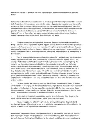
- They all have produced Digipak that have been successful, I felt like if I take certain elements
of each digipak that they have done I would be able to combine them onto my final product. For
example the front cover of Chris Brown’s album Fortune, the clothes that his wearing brings the
maturity and the modern sophisticated look that the male audience strive for and the female
audience appeal to and I did the same with a slim fit black suit, white shirt and black tie, and the
white shirt stands out from the rest of the album cover. In addition, his CD to ‘’Graffiti’’ he has a
long shot silhouette of himself and I used a side profile close up for the artist and increase the
contrast to see the profile in white again a black CD cover. The idea of having a series of the same
photo for the inserts was similar to ‘’Usher’s, Raymond vs Raymond.’’ I wanted to amply the skills
and the ability of the software I was using (Adobe Photoshop) and show what the software can do
and my abilities.
- The main concept was simplicity, as it was the artist first album the main idea is to sell the
artist and I did so by keeping him the centre of attention using mid shots. He was the main feature of
the album in the front cover, the first page of the insert and the CD. The front cover photo shows
him wearing classy clothes, the photo in the insert shows him wearing casual clothes, like the music
video, I mixed the smart casual look to shows the two sides of the artist.
- On the back of the digipak I decided take another form of silhouette if the dancer in the
music video as a main attraction on the back linking in with the music video.
- However I opposed to follow through with the font styles throughout the product and
ancillary task. Using a different type of font as a credit in the music video and a different font for the
digipak, however for the digipak I kept the same font throughout.
Nevertheless they were areas that I managed to maintain to link the music video and the ancillary
task. Keeping the concept of both parts of the coursework and making them flow as one worked
perfectly. However for the photos I had taken for the artist, it would have been more idea to use a
2. better camera in order to get the best quality image, and subtract the use of too much editing
keeping the photo as natural as possible.