SlideShare a Scribd company logo
1 of 1
HeadlinesThe title is bold and masculine. The word ‘vantage’  has a metallic colour to it  which links with the gun, and the word ‘point’ is red, which connotes danger and blood to the viewer. After the viewer has observed the different images, the title then likes well and explains what the film is about, which is different views narrowing or combine to make one.ImagesThe black and white images make up a silhouette of a man. It is clearly a man due to the narrow figure and the suit that is possible to make out. The close up of an eye indicates stalking and being watched. These images are scenes from the film, each showing different points of views which links to the story line.ColourThe only colours in this poster are black and white. This could reflect the idea of how the truth is black and white, meaning clear and obvious. These simple colours make the red letter really pop out at the viewer, grabbing their attention and making it clear that there is danger and blood involved, as this is what the colour red connotes to most people. Target audienceThe target audience for this film would be male as the genre is action. The viewer can tell this by the gun and the action and tension in the images. The headline also gives an implication due to the connotations of danger.TextThe three short sentences are simple that brings the storyline together. The font used is also simple and is back to stand out from the bland, white background. The last bit of information is at the very bottom of the poster and tells the viewer little about when it is released keeping them wondering and awaiting.LayoutThe silhouette of the man takes up the whole poster and the small snippets of scenes make up some of this figure. There is no background so all the focus is on this figure. The text placed beside the head gives the viewer some insight and explanation on the divided scenes. The names of the actor are placed in a box of their own which is a different and more interesting way to read it. The headline is placed at the waist area so the viewer can take in the above images and information so that the title will make some sense. Every bit of text in contained inside this silhouette, this keeps a neat presentation.6877901173707<br />

More Related Content

What's hot (18)

Blair witch poster analysis
Blair witch poster analysisBlair witch poster analysis
Blair witch poster analysis
 
Tinker Tailor Soldier Spy
Tinker Tailor Soldier SpyTinker Tailor Soldier Spy
Tinker Tailor Soldier Spy
 
Tinker Tailor Soldier Spy
Tinker Tailor Soldier SpyTinker Tailor Soldier Spy
Tinker Tailor Soldier Spy
 
Tinker Tailor Soldier Spy
Tinker Tailor Soldier SpyTinker Tailor Soldier Spy
Tinker Tailor Soldier Spy
 
Symbolic convergence theory of ernest bormann
Symbolic convergence theory of ernest bormannSymbolic convergence theory of ernest bormann
Symbolic convergence theory of ernest bormann
 
Conventions of a horror poster
Conventions of a horror posterConventions of a horror poster
Conventions of a horror poster
 
Roland barthes
Roland barthesRoland barthes
Roland barthes
 
Print analysis
Print analysisPrint analysis
Print analysis
 
Trailer Title Screen's
Trailer Title Screen'sTrailer Title Screen's
Trailer Title Screen's
 
Narrative 2017
Narrative 2017Narrative 2017
Narrative 2017
 
Unit 11 analysis of scripts
Unit 11  analysis of scriptsUnit 11  analysis of scripts
Unit 11 analysis of scripts
 
Scott pilgrim vs. the world poster analysis
Scott pilgrim vs. the world poster analysis Scott pilgrim vs. the world poster analysis
Scott pilgrim vs. the world poster analysis
 
Narrative theory - test your knowledge
Narrative theory - test your knowledgeNarrative theory - test your knowledge
Narrative theory - test your knowledge
 
Analyzing and Creating Political Cartoons
Analyzing and Creating Political CartoonsAnalyzing and Creating Political Cartoons
Analyzing and Creating Political Cartoons
 
Q1&2
Q1&2Q1&2
Q1&2
 
A2 media studies MIGRAIN coursework - Dana
A2 media studies MIGRAIN coursework - DanaA2 media studies MIGRAIN coursework - Dana
A2 media studies MIGRAIN coursework - Dana
 
Semiotics: A Short Introduction
Semiotics: A Short IntroductionSemiotics: A Short Introduction
Semiotics: A Short Introduction
 
Symbolic convergence theory
Symbolic convergence theorySymbolic convergence theory
Symbolic convergence theory
 

Similar to Vantage point poster[1][1] (20)

Textual analysis ancillary tasks
Textual analysis ancillary tasksTextual analysis ancillary tasks
Textual analysis ancillary tasks
 
Textual analysis ancillary tasks
Textual analysis ancillary tasksTextual analysis ancillary tasks
Textual analysis ancillary tasks
 
Poster genre research
Poster genre researchPoster genre research
Poster genre research
 
Drama film poster analysis
Drama film poster analysisDrama film poster analysis
Drama film poster analysis
 
Textual analysis
Textual analysisTextual analysis
Textual analysis
 
Film poster inspirations
Film poster inspirationsFilm poster inspirations
Film poster inspirations
 
Inception film magazine analysis
Inception   film magazine analysisInception   film magazine analysis
Inception film magazine analysis
 
Magg
MaggMagg
Magg
 
Textual analysis film posters
Textual analysis film postersTextual analysis film posters
Textual analysis film posters
 
Genre ideology
Genre ideology Genre ideology
Genre ideology
 
Genre ideology 2
Genre ideology 2 Genre ideology 2
Genre ideology 2
 
JZ Evaluation
JZ EvaluationJZ Evaluation
JZ Evaluation
 
Textual Analysis for Magazine and Film Poster
Textual Analysis for Magazine and Film PosterTextual Analysis for Magazine and Film Poster
Textual Analysis for Magazine and Film Poster
 
Geoffrey Eze, Media A2 - Case Study
Geoffrey Eze, Media A2 - Case StudyGeoffrey Eze, Media A2 - Case Study
Geoffrey Eze, Media A2 - Case Study
 
Poster Analysis
Poster AnalysisPoster Analysis
Poster Analysis
 
Poster Analysis
Poster AnalysisPoster Analysis
Poster Analysis
 
Deconstruction of a text
Deconstruction of a textDeconstruction of a text
Deconstruction of a text
 
Film poster analysis
Film poster analysisFilm poster analysis
Film poster analysis
 
Poster analysis
Poster analysisPoster analysis
Poster analysis
 
Poster analysis me and hollz
Poster analysis me and hollzPoster analysis me and hollz
Poster analysis me and hollz
 

Vantage point poster[1][1]

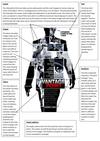
  • 1. HeadlinesThe title is bold and masculine. The word ‘vantage’ has a metallic colour to it which links with the gun, and the word ‘point’ is red, which connotes danger and blood to the viewer. After the viewer has observed the different images, the title then likes well and explains what the film is about, which is different views narrowing or combine to make one.ImagesThe black and white images make up a silhouette of a man. It is clearly a man due to the narrow figure and the suit that is possible to make out. The close up of an eye indicates stalking and being watched. These images are scenes from the film, each showing different points of views which links to the story line.ColourThe only colours in this poster are black and white. This could reflect the idea of how the truth is black and white, meaning clear and obvious. These simple colours make the red letter really pop out at the viewer, grabbing their attention and making it clear that there is danger and blood involved, as this is what the colour red connotes to most people. Target audienceThe target audience for this film would be male as the genre is action. The viewer can tell this by the gun and the action and tension in the images. The headline also gives an implication due to the connotations of danger.TextThe three short sentences are simple that brings the storyline together. The font used is also simple and is back to stand out from the bland, white background. The last bit of information is at the very bottom of the poster and tells the viewer little about when it is released keeping them wondering and awaiting.LayoutThe silhouette of the man takes up the whole poster and the small snippets of scenes make up some of this figure. There is no background so all the focus is on this figure. The text placed beside the head gives the viewer some insight and explanation on the divided scenes. The names of the actor are placed in a box of their own which is a different and more interesting way to read it. The headline is placed at the waist area so the viewer can take in the above images and information so that the title will make some sense. Every bit of text in contained inside this silhouette, this keeps a neat presentation.6877901173707<br />