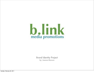
2. What’s in a name?
• The original company name was MoJo
Media. But after googling the name, I
found there were pages upon pages of
MoJo Medias already!
• After hours of word play the new company
name is... “b.link media promotions”
• It is a social media company that focuses
on promoting independent music artists
and companies.
Sunday, February 20, 2011
3. The name b.link was chosen for a
number of reasons.
One of my favorite books is Blink, by
Malcom Gladwell. It is about
‘the power of thinking
without thinking’ and how
quickly our minds come to
conclusions without us
making a conscious effort.
http://www.fitrinl.com/blink-the-power-of-thinking-without-thinking-malcolm-gladwell
Sunday, February 20, 2011
4. What does that have to do with social
media promotions?
Initially, nothing....
Pronounced “blink”, the name
is a simple word that implies action.
But by adding the period in
between the b and link a concept
and tag line were born!
The word “link” is associated with
the internet and social media,
the platform our company is
working in.
Sunday, February 20, 2011
5. b.link media promotions
Let us ‘b’ the link between you and your fans.
We use the name to focus on what we do - creating and
managing social media sites to help promote the artist
and connect with fans.
I would consider the company name to be arbitrary as
the word “blink” has no direct connection with social
media or music/entertainment.
http://www.masternewmedia.org/content_delivery_and_distribution/music-publishing/make-music-profitable-by-leveraging-events-context-relationships-20071014.htm
Sunday, February 20, 2011
6. How does it reflect our unique brand?
A look at logos...
There are a
number of social
media sites.
Many contain
the color blue.
Because these sites are not our competition
but the platforms in which we are working, it
would be beneficial to include blue in our
logo. Blue is also often associated with
internet “links”.
http://appadvice.com/appnn/2009/08/facebook-confirms-they-were-also-hit-with-a-denial-of-service-attack/ http://www.nuigalway.ie/microbiology/flickr.html
Sunday, February 20, 2011
7. Our Competitors
There are a number of different social media
marketing companies.
Many seem to use wordmark logos or incorporate a
simple image into the logo. Colors vary but many
include red, blue and green.
http://www.lisapeyton.com/ http://designthattalks.com/?cat=3 http://www.fusionmediafirm.com/ http://www.jessloren.com/portfolio/ http://www.tylerjanderson.com/work-with-me/
Sunday, February 20, 2011
8. MY LOGO
• The best logo type for my company is a wordmark. Since the word itself is
also part of the slogan it doesn’t require a flashy icon or emblem.
• The bright green is eye-catching and the words often associated with this
color are: refreshing, lively, trendy, fresh.
• It is a san serif font - Optima. It is simple yet modern, so that the customer is
focusing more on the word than the font.
• The design does not require a symbol or image because the word becomes
the icon. Adding the “.” turned a simple word into something more.
http://www.shakerpainting.com/residential/education/pdf/web_color_interpretation.pdf
Sunday, February 20, 2011
9. Corporate Culture
Creativity
Develop an atmosphere of creativity
for our employees and customers.
Support
We work together. Because two heads
are always better than one.
Fun
Having fun means wanting to come
to work everyday!
Sunday, February 20, 2011
10. Mission Statement
b.link media promotions
We connect artists with their fans.
Using creativity, we develop a strong
link to artists and those that love them most.
*This mission statement will be displayed for both our
employees and the public.
Sunday, February 20, 2011
11. Our Tagline
Let us B the LINK between you and your fans!
The tagline brings together the company name
and what we do!
Sunday, February 20, 2011