
Recommended
More Related Content
Viewers also liked
Viewers also liked (20)
Similar to WEB AUTHORING - (E.Eniola O)
Similar to WEB AUTHORING - (E.Eniola O) (20)
More from haverstockmedia
More from haverstockmedia (20)
Recently uploaded
Recently uploaded (20)
WEB AUTHORING - (E.Eniola O)
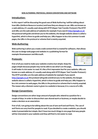
- 1. WEB-AUTHORING: PROTOCOLS, DESIGN CONVENTIONS AND SOFTWARE Introduction: In this report I will be discussing the good uses of Web Authoring. I will be talking about how URLs (Uniform Resource Locator) and how they are always in use. URLs are known as a web address, it’s usually used along with HTTP (Hyper Text Transfer Protocol.) The HTTP and URLs are the web address of websites for example if you search http://google.co.uk this protocol will guide and direct you to the website, the Google website above is called a hyperlink, which is there to guide and help you. URLs happen to be a lot common to web pages, the URLs is the protocol or scheme that is mainly acquired. Web-Authoring: Web authoring is when you create a web content that is created for software, that allows the user to design web pages and website in a publishing format for example Dreamweaver and Microsoft. Protocols: First of all you need to make your website creative but simple. Keep the pages simple because people may not be able to see what’s on the page, it will make it a lot easier to read. It’s like a first impression but for your website. URLs are known as a web address, it’s usually used along with HTTP (Hyper Text Transfer Protocol.) The HTTP and URLs are the web address of website for example if you search http://google.co.uk this protocol will guide and direct you to the website, the Google website above is called a hyperlink, which is there to guide and help you. URLs happen to be a lot common to web pages, the URLs is the protocol or scheme that is mainly acquired. The reason why a Domain name is given to a website is because; it is a source of a URL. Design Conventions: Design conventions are when large amount of people who attend to a position for a couple of days. In order to discuss their own shared work or business, or maybe decide to make a decision as an association. First of all, I am going to be talking about the use of sans serif and serif fonts. The use of serif fonts are very hard for people to read. If you decided to create a website, you should make it presentable but simple. Don’t have too much things in one page that way people will be interested in your website and they will find it a lot easier to read.
- 2. Rule of Thirds: The Rule of Thirds is when you place a focus on a specific side of a picture. For example you can place the focus on a painting, a picture just to make it stand out from its surroundings. You can align it with a guideline or an interchange by placing it horizontally on the screen to get the focus on the main picture. Here is an example: These arrows in the four corners represent the power point. This means that the power point is the main thi9ng that we are focusing on; they often use it in movies. For instance, if they are trying to get a good shot or angle, they zoom in by using the rule of thirds only to check the focus of the scene or the movie. Colours: If you decide to do a website you can create it, by using monochromatic colours. So all you would need to do is choose different shades of one colour so that it can match your colour scheme. Here is a monochromatic colour wheel. If you wanted to choose one colour like blue or red to emphasise, what you want it to represent. For example, someone has opened a new store and they use the colour red to emphasise that it is a warm comfortable place where everyone would love to go. Or they use blue to show that what they serve there are cold beverages, ice-cream and so on. That would be the best way to use the monochromatic colour scheme.
- 3. Monochromatic websites: - Lipton- monochromatic represents the warm feeling of tea - Costa- monochromatic colour scheme represents the warm atmosphere of coffee and ready cooked/baked pastry - Volvic- monochromatic colour scheme represents the natural mineral water that tastes so fresh and clean. Complementary Colours: Complementary colours are always combined together to produce one colour. The colour can be a light colour or a dark one. The colours are slightly similar but, the only difference is that they have different colour saturations and are lighter or darker. The colour scheme uses two colours that gives a high contrasts of bright and vibrant coloursAnalogous colour scheme is when you use similar colours, as you can see they are close together on the colour wheel. The next colour wheel shows us if the colours next to each other are primary or secondary. They are different wide ranges of colours, the types you would see as part of a rainbow. They are could start either way from light to dark or dark to light, as long as there is no mistake of placing the colours incorrectly. Fonts: First of all, I am going to be talking about the use of sans serif and serif fonts. The use of serif fonts are very hard for people to read. If you decided to create a website, you should make it presentable but simple. Don’t have too much things in one page that way people will be interested in your website and they will find it a lot easier to read.