
Recommended
More Related Content
Viewers also liked
Similar to Case study 2 cd
Similar to Case study 2 cd (20)
More from guest1b1071
More from guest1b1071 (17)
Case study 2 cd
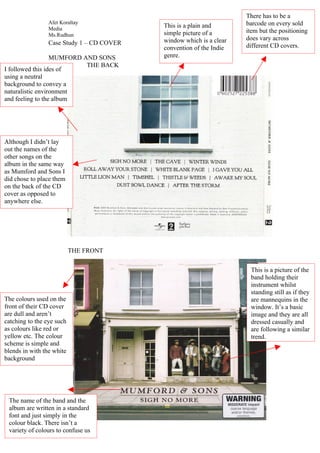
- 1. There has to be a Afet Koraltay barcode on every sold Media This is a plain and simple picture of a item but the positioning Ms.Rudhun window which is a clear does vary across Case Study 1 – CD COVER different CD covers. convention of the Indie MUMFORD AND SONS genre. THE BACK I followed this ides of using a neutral background to convey a naturalistic environment and feeling to the album Although I didn’t lay out the names of the other songs on the album in the same way as Mumford and Sons I did chose to place them on the back of the CD cover as opposed to anywhere else. THE FRONT This is a picture of the band holding their instrument whilst standing still as if they The colours used on the are mannequins in the front of their CD cover window. It’s a basic are dull and aren’t image and they are all catching to the eye such dressed casually and as colours like red or are following a similar yellow etc. The colour trend. scheme is simple and blends in with the white background The name of the band and the album are written in a standard font and just simply in the colour black. There isn’t a variety of colours to confuse us