
Recommended
More Related Content
What's hot
What's hot (15)
Viewers also liked
Viewers also liked (12)
More from chloemasonnn
More from chloemasonnn (20)
Poster
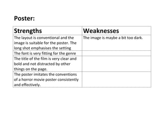
- 1. Poster: Strengths Weaknesses The layout is conventional and the The image is maybe a bit too dark. image is suitable for the poster. The long shot emphasises the setting The font is very fitting for the genre The title of the film is very clear and bold and not distracted by other things on the page. The poster imitates the conventions of a horror movie poster consistently and effectively.