
Recommended
More Related Content
Similar to Media conventions
Similar to Media conventions (20)
Recently uploaded
Recently uploaded (20)
Media conventions
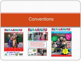
- 1. Conventions
- 2. Conventions of a Children's magazine During the research stages I analysed three different magazine covers, in order to get a variety of regular conventions. By doing this it enabled me to be able to incorporate them into my product, making it a successful product. The three magazine covers I analysed were Balamory, Ben 10 and Hannah Montana. Main image of Character fact files main characters A free gift Posters Conventions of a magazine Catchy cover Programm lines e title the top, large size Bright colours Fun shapes Simple, easy Barcode, to read fonts in price, issue different sizes number/date
- 3. Conventions of a Children's DVD cover During the research stages I analysed three different DVD covers, in order to get a variety of regular conventions. By doing this it enabled me to be able to incorporate them into my product, making it a successful product. The three magazine covers I analysed were Balamory, Ben 10 and Hannah Montana. Bright, colourful Simple, and vibrant clear fonts Rating information and Series barcode information Conventions Programme of a DVD name clear and cover large at the top Logo of Image of channel its main aired on characters Clear, simple Organise d
- 4. Conventions of a Children’s opening sequence During the research stages I analysed three different opening sequences in order to get a variety of regular conventions. By doing this it enabled me to be able to incorporate them into my product, making it a successful product. The three magazine covers I analysed were Balamory, Ben 10 and Lizzie Mcguire. Props, costumes and Minimal camera colours all relate to movement different character types Each character Fast paced Conventions of introduced editing a children’s individually, props opening showing sequence character types Editing such as cuts wipes, and Catchy, upbeat fading. Also music, no one transitions talking between shots Lasting between Different 30 seconds – 1 stereotypical Relatable minute 20 characters, settings, seconds long someone for e.g. School everyone to relate
- 5. How have I used these conventions in my magazine cover? Clear, large title of Issue date and programme at the top, price consistent through all my products creating brand identity Different things included Large image of the relating to different characters, establishing the characters, attracting a school setting larger audience. Huge variety of vibrant colours and fonts used, A free poster, having four to giving the impression of collect will make the audience keep wanting to buy the being hand written and also magazine so that they get all to attract the target the posters. audience of both males and females Cover lines of A lure, e.g. free things included gift Unisex colours being Barcode used, attracting a Fun shapes being used, wider audience making it more exciting
- 6. How have I used these conventions in my DVD cover? Keeping the title the same in all Information telling you a little bit my products creates brand about the programme identity and helps the audience identify my product Main image of cast looking Clear, simple and organised happy, showing the school setting Variety of bright colours, simple clear fonts, giving the handwritten effect, to Rating certificate, DVD logo help attract the target audience and channel programme can be found on Series information Individual images of characters helping introduce them, using colours which represent their stereotypical Paragraph at the back of the DVD characters, using their names to cover, telling you what the make them more recognisable to the programme is about audience Using colours like blue and red are unisex, meaning my product will attract a larger audience Running time, barcode, rating certificate
- 7. How are these conventions and forms used in my ancillary tasks for RunAround? I tried to follow as many conventions as possible, making my product easier to attract the target audience and advertise. When comparing my products to similar existing products there are many similarities. For example, the main focus for both of my products is the large image of the main characters, which is evident in all the magazine/DVD covers that I analysed. The ensures that audience will instantly see this photo, and immediately recognise the programme as being RunAround. The cast are shown as being happy, which gives the impression that the programme is going to be fun and happy. In my magazine cover, the main image is surrounded by cover lines and fun shapes which help attract my target audience. The fonts I have used are all bright and colourful, using unisex colours such as blue and red to attract a wider audience, and also using colours relating to the character stereotypes, e.g. using pink when talking about Emily, as she is stereotypically a girly girl. Using a variety of font sizes also make the page seem more fun, making things which are more important stand out further. Using fun shapes when adding taglines immediately makes it more fun for the reader. Bright, bold colours are used throughout my magazine cover and DVD cover as it is representable to my target audience of children. On both of my products there is a barcode, date/series information, and a rating certificate, immediately this makes them seem far more realistic. There is a free gift offered in the magazine which makes it more exciting to the audience, also there is childish language such as; “cool” and “fun.” Lastly, the clothing and props relate to the characters stereotype which is easily recognisable. Like on the back of the DVD cover I included individual images of each character, with a strip of colour around them enhancing their character, e.g. Emily is in pink as she is stereotypically a girly girl, with her name wrote in pink, and in a girly font.
- 8. How are these conventions used in your audiovisual media product? Underneath this presentation you will find a video containing a commentary of me talking about the conventions of my product. Although their are a few conventions I haven't mentioned in the video. These are; The length of our video – our video follows convections of an opening sequence as it is 40 seconds long. It also included fast paced editing, making it more exciting for the audience. There is a mixture of males and females, attracting a larger audience. Mainly a still camera is used due to the audience being young, this enables them to easily follow the programme, however the camera does pan at some stages. Having four different stereotypes enables the audience to always have something to relate too, props, costumes and colours are used to further the characters stereotypes. Starting and ending on a clip with the characters having fun together promotes a positive message to the audience which they will relate to, our programme portrays good role models to young children. The only sound which can be heard is the theme tune, the characters are not speaking.
- 9. In what way does your media products challenge, form or develop media conventions? When producing my ancillary tasks and my audiovisual task, I used as many forms and conventions from real products that I had researched earlier. My reasons for doing this is that it makes it more realistic and it will fit in with similar products my target audience already enjoys, which will make my product just as successful as existing products. All my products use bright colours, consistency and are fun for the target audience, following the youthful style. Although following many conventions, my main task did break conventions in some areas, as I felt this would work better for the product I was producing. These are; • Using a theme tune without lyrics, enabling the children to focus mainly on the sequence. • It is evident in some of our filing that we used a handheld camera due to the unsteadiness of I, this is breaking conventions as normally a still camera would be used. I feel this lets us down and would be improved on if I was too make a similar product again. Overall I feel that my products are successful and do relate to our chosen target audience well. During my ancillary tasks I strictly followed conventions to a high professional standard making them realistic and suitable for my young target audience.