Page layouts and why they are important for your Gold Coast website design
•
0 likes•114 views

Let’s go into a little more detail and discuss what a good page layout is and why it's instrumental to the success of your businesses Gold Coast web design.

Recommended
More Related Content
Recently uploaded
Recently uploaded (20)
Featured
Featured (20)
Page layouts and why they are important for your Gold Coast website design
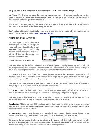
- 1. Page layouts and why they are important for your Gold Coast website design At Alinga Web Design, we know the value and importance that well-designed page layout has for your Brisbane and Gold Coast website design. When visitors go to your website, you only have a few seconds to make a great first impression. If you fail to impress your visitors, the chances that they will click off your website are greatly increased and can result in lost business opportunities. Let’s go into a little more detail and discuss what a good page layout is and why it's instrumental to the success of your businesses Gold Coast web design. WHAT IS A PAGE LAYOUT? A page layout is what determines how images and text are arranged on your web page. Specifically, a well designed page layout will make website content look great, regardless of the device and the screen sizes used to access your site. TYPES OF PAGE LAYOUTS Although knowing the difference between the different types of page layouts is required (or should be) for professional web designers, Brisbane and Gold Coast business owners also have a lot to gain by at least knowing the basics of how each layout can affect their company websites. 1. Static: Also known as a “fixed” layout, static layouts maintains the same page size regardless of the browser’s width. This is the way web pages were originally designed before responsive design and the widely available options we have today. Although static layouts are no longer used as much as before, their main benefit is that they offer a very simple way of making websites that can still be effective. 2. Liquid: Liquid, or fluid, layouts make use of relative units instead of defined units. In other words, liquid layouts use percentage of screen size vs specifying 200 pixels on a page. Although simpler than responsive deign, liquid layouts have some limitations when using very big or small browser widths and can cause text and images to look a little weird. 3. Adaptive: This layout uses CSS media queries to figure out the width of the browser accessing the site and resizes accordingly. Adaptive layouts can easily be applied to a static layout when needed to create a mobile website. 4. Responsive: Responsive layouts are currently the most comprehensive page layout setup available and basically combine the characteristics of liquid and adaptive page layouts. Responsive layout design is closely associated with making websites look good on all mobile devices and screens. This is because web designers will typically first work with the mobile website before expanding to a desktop view to create a better user experience.