Booking open Available Pune Call Girls Ambegaon Khurd 6297143586 Call Hot In...
Task 101010
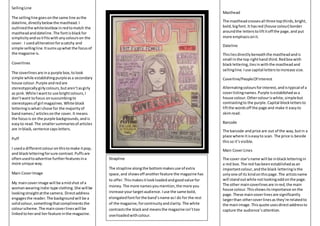
1. Masthead
The mastheadcrossesall three topthirds,bright,
bold,bigfont.It hasred (house colour) border
aroundthe letterstoliftitoff the page,and put
more emphasisonit.
Dateline
Thisliesdirectlybeneaththe mastheadandis
small inthe top righthand third.Redbox with
blacklettering,tiesinwiththe mastheadand
sellingline. Iuse capital letterstoincrease size.
Coverline/PeopleOf Interest
Alternatingcoloursforinterest,andistypical of a
coverlistingnames.Purple isestablishedasa
house colour.Othercolouriswhite,simplebut
contrastingto the purple.Capital blocklettersto
liftthe wordsoff the page and make it easyto
skimread.
Barcode
The barcode andprice are out of the way,butin a
place where itiseasyto scan. The price is beside
thisso it’svisible.
Main CoverLines
The cover star’sname will be inblackletteringin
a red box.The red hasbeenestablishedasan
importantcolour,andthe black letteringisthe
onlyone of its kindonthispage.The artistsname
will standoutwhile notlookingoddonthe page.
The other maincoverlinesare inred,the main
house colour.Thisshowsitsimportance onthe
page. These maincoverlines are significantly
largerthan othercoverlinesas they’re relatedto
the mainimage.Thisquote usesdirectaddressto
capture the audience’sattention.
Strapline
The strapline alongthe bottommakesuse of extra
space,and showsoff anotherfeature the magazine has
to offer.Thismakesitlookloadedandgoodvalue for
money.The more namesyoumention,the more you
increase yourtargetaudience.Iuse the same bold,
elongatedfontforthe band’sname asI do for the rest
of the magazine,forcontinuityandclarity.The white
contraststhe blackand meansthe magazine isn’ttoo
overloaded withcolour.
SellingLine
The sellingline goesonthe same line asthe
dateline, directlybelowthe masthead.I
outlined the whitetextbox inredtomatch the
mastheadanddateline.The fontisblackfor
simplicityandsoitfitswithanycolourson the
cover. I usedalliterationforacatchy and
simple sellingline.Itsumsupwhat the focusof
the magazine is.
Coverlines
The coverlinesare ina purple box,tolook
simple while establishingpurpleasa secondary
house colour.Purple andredare
stereotypicallygirlycolours,butaren’tasgirly
as pink.While Iwantto use brightcolours,I
don’twant tofocus onsuccumbingto
stereotypesof girl magazines.White block
letteringiswhatIchose for the majorityof
bandnames/ articlesonthe cover.It means
the focusis on the purple backgrounds,andis
easyto read.The smallersummariesof articles
are inblack,sentence capsletters.
Puff
I useda differentcolouronthistomake itpop,
and blackletteringforsure contrast.Puffsare
oftenusedtoadvertise furtherfeaturesina
more unique way.
Main CoverImage
My maincoverimage will be amidshot of a
womanwearingindie-type clothing.She will be
lookingstraightatthe camera. Directaddress
engagesthe reader.The backgroundwill be a
solidcolour,somethingthatcomplimentsthe
colourscheme.The maincoverlineswill be
linkedtoherand herfeature inthe magazine.