
Recommended
Recommended
More Related Content
Similar to dispersion1.pptx
Similar to dispersion1.pptx (20)
Recently uploaded
Recently uploaded (20)
dispersion1.pptx
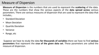
- 1. Measure of Dispersion is the numbers that are used to represent the scattering of the data. These are the numbers that show the various aspects of the data spread across various parameters. There are various measures of dispersion that are used to represent the data that includes,. • Standard Deviation • Mean Deviation • Quartile Deviation • Variance • Range, etc Suppose we have to study the data for thousands of variables there we have to find various parameters that represent the crux of the given data set. These parameters are called the measure of dispersion. Measure of Dispersion
- 2. Measures of Dispersion measure the scattering of the data, i.e. how the values are distributed in the data set. In statistics, we define the measure of dispersion as various parameters that are used to define the various attributes of the data. What is the Measure of Dispersion in Statistics? These measures of dispersion capture variation between different values of the data.
- 3. Measures of Dispersion is a non-negative real number that gives various parameters of the data. The measure of dispersion will be zero when the dispersion of the data set will be zero. If we have dispersion in the given data then, these numbers which give the attributes of the data set are the measure of dispersion. Example of Measures of Dispersion We can understand the measure of dispersion by studying the following example, suppose we have 10 students in a class and the marks scored by them in a Mathematics test are 12, 14, 18, 9, 11, 7, 9, 16, 19, and 20 out of 20. Then the average value scored by the student in the class is, Mean (Average) = (12 + 14 + 18 + 9 + 11 + 7 + 9 + 16 + 19 + 20)/10 = 135/10 = 13.5 Then, the average value of the marks is 13.5 Mean Deviation = {|12-13.5| + |14-13.5| + |18-13.5| + |9-13.5| + |11-13.5| + |7-13.5| + |9- 13.5| + |16-13.5| + |19-13.5| + |20-13.5|}/10 = 34.5/10 = 3.45 Measures of Dispersion Definition
- 4. Measures of dispersion can be classified into two categories shown below: • Absolute Measures of Dispersion • Relative Measures of Dispersion Types of Measures of Dispersion
- 5. Absolute Dispersion Absolute Measures of Dispersion These measures of dispersion are measured and expressed in the units of data themselves. For example – Meters, Dollars, Kg, etc. Some absolute measures of dispersion are: Range: Range is defined as the difference between the largest and the smallest value in the distribution. Mean Deviation: Mean deviation is the arithmetic mean of the difference between the values and their mean. Standard Deviation: Standard Deviation is the square root of the arithmetic average of the square of the deviations measured from the mean. Variance: Variance is defined as the average of the square deviation from the mean of the given data set. Quartile Deviation: Quartile deviation is defined as half of the difference between the third quartile and the first quartile in a given data set. Interquartile Range: The difference between upper(Q3 ) and lower(Q1) quartile is called Interterquartile Range. The formula for Interquartile Range is given as Q3 – Q1
- 6. Suppose we have to measure the two quantities that have different units than we used relative measures of dispersion to get a better idea about the scatter of the data. Various relative measures of the dispersion are, Coefficient of Range: The coefficient of range is defined as the ratio of the difference between the highest and lowest value in a data set to the sum of the highest and lowest value. Coefficient of Variation: The coefficient of Variation is defined as the ratio of the standard deviation to the mean of the data set. We use percentages to express the coefficient of variation. Coefficient of Mean Deviation: The coefficient of the Mean Deviation is defined as the ratio of the mean deviation to the value of the central point of the data set. Coefficient of Quartile Deviation: The coefficient of the Quartile Deviation is defined as the ratio of the difference between the third quartile and the first quartile to the sum of the third and first quartiles. Relative Measures of Dispersion
- 7. Range of Data Set The range is the difference between the largest and the smallest values in the distribution. Thus, it can be written as R = L – S where L is the largest value in the Distribution S is the smallest value in the Distribution A higher value of range implies higher variation. One drawback of this measure is that it only takes into account the maximum and the minimum value which might not always be the proper indicator of how the values of the distribution are scattered. Temporal classification
- 8. Example: Find the range of the data set 10, 20, 15, 0, 100. Smallest Value in the data = 0 Largest Value in the data = 100 Thus, the range of the data set is, R = 100 – 0 R = 100 Note: Range cannot be calculated for the open-ended frequency distributions. Open-ended frequency distributions are those distributions in which either the lower limit of the lowest class or the higher limit of the highest class is not defined. Range of Data Set
- 9. The range of the data set for the ungrouped data set is first we have to find the smallest and the largest value of the data set by observing and the difference between them gives the range of ungrouped data. This is explained by the following example: Example: Find out the range for the following observations, 20, 24, 31, 17, 45, 39, 51, 61. Range for Ungrouped Data Largest Value = 61 Smallest Value = 17 Thus, the range of the data set is Range = 61 – 17 = 44
- 10. The range of the data set for the grouped data set is found by studying the following example, Example: Find out the range for the following frequency distribution table for the marks scored by class 10 students. Solution: Range for Grouped Data Marks Intervals Number of Students 0-10 5 10-20 8 20-30 15 30-40 9 •For Largest Value: Taking the higher limit of Highest Class = 40 •For Smallest Value: Taking the lower limit of Lowest Class = 0 Range = 40 – 0 Thus, the range of the given data set is, Range = 40
- 11. Range as a measure of dispersion only depends on the highest and the lowest values in the data. Mean deviation on the other hand measures the deviation of the observations from the mean of the distribution. Since the average is the central value of the data, some deviations might be positive and some might be negative. If they are added like that, their sum will not reveal much as they tend to cancel each other’s effect. For example, Consider the data given below, -5, 10, 25 Mean = (-5 + 10 + 25)/3 = 10 Now a deviation from the mean for different values is, (-5 -10) = -15 (10 – 10) = 0 (25 – 10) = 15 Now adding the deviations, shows that there is zero deviation from the mean which is incorrect. Thus, to counter this problem only the absolute values of the difference are taken while calculating the mean deviation. Mean Deviation
- 12. calculating the mean deviation for ungrouped data, the following steps must be followed: Step 1: Calculate the arithmetic mean for all the values of the dataset. Step 2: Calculate the difference between each value of the dataset and the mean. Only absolute values of the differences will be considered. Step 3: Calculate the arithmetic mean of these deviations using the formula, Example: Calculate the mean deviation for the given ungrouped data, 2, 4, 6, 8, 10 Mean(μ) = (2+4+6+8+10)/(5) μ = 6 M. D = ⇒ M.D = (4+2+0+2+4)/(5) ⇒ M.D = 12/5 = 2.4 Mean Deviation for Ungrouped Data
- 13. Absolute Measures of Dispersion: Absolute Measures of Dispersion Related Formulas Range H – S where, •H is the Largest Value •S is the Smallest Value Variance Population Variance(σ2) σ2 = Σ(xi-μ)2 /n Sample Variance(S2) S2 = Σ(xi-μ)2 /(n-1) where, •μ is the mean •n is the number of observation
- 14. Absolute Measures of Dispersion: Standard Deviation S.D. = √(σ2) Mean Deviation μ = (x – a)/n where, •a is the central value(mean, median, mode) •n is the number of observation Quartile Deviation (Q3 – Q1)/2 where, •Q3 = Third Quartile •Q1 = First Quartile
- 15. Relative Measures of Dispersion Relative Measures of Dispersion Related Formulas Coefficient of Range (H – S)/(H + S) Coefficient of Variation (SD/Mean)×100 Coefficient of Mean Deviation (Mean Deviation)/μ where, μ is the central point for which the mean is calculated Coefficient of Quartile Deviation (Q3 – Q1)/(Q3 + Q1)
- 16. Central Tendency and Measure of Dispersion Central Tendency Measure of Dispersion Central Tendency is the numbers that are used to quantify the properties of the data set. Measure of Distribution is used to quantify the variability of the data of dispersion. Measure of Central tendency include, •Mean •Median •Mode Various parameters included for the measure of dispersion are, •Range •Variance •Standard Deviation •Mean Deviation •Quartile Deviation
- 17. Skewness and Kurtosis Introduction: “Skewness essentially is a commonly used measure in descriptive statistics that characterizes the asymmetry of a data distribution, while kurtosis determines the heaviness of the distribution tails.” Understanding the shape of data is crucial while practicing data science. It helps to understand where the most information lies and analyze the outliers in a given data. we’ll learn about the shape of data, the importance of skewness, and kurtosis in statistics. The types of skewness and kurtosis and Analyze the shape of data in the given dataset.
- 18. What Is Skewness? Skewness is a statistical measure that assesses the asymmetry of a probability distribution. It quantifies the extent to which the data is skewed or shifted to one side., while negative Positive skewness indicates a longer tail on the right side of the distribution skewness indicates a longer tail on the left side. Skewness helps in understanding the shape and outliers in a dataset. If the values of a specific independent variable (feature) are skewed, depending on the model, skewness may violate model assumptions or may reduce the interpretation of feature importance. In statistics, skewness is a degree of asymmetry observed in a probability distribution that deviates from the symmetrical normal distribution (bell curve) in a given set of data. A skewed data set, typical values fall between the first quartile (Q1) and the third quartile (Q3). The normal distribution helps to know a skewness. When we talk about normal distribution, data symmetrically distributed. The symmetrical distribution has zero skewness as all measures of a central tendency lies in the middle.
- 19. DIAGRAMMATIC PRESENTATION OF DATA When data is symmetrically distributed, the left-hand side, and right-hand side, contain the same number of observations. (If the dataset has 90 values, then the left-hand side has 45 observations, and the right- hand side has 45 observations.). But, what if not symmetrical distributed? That data is called asymmetrical data, and that time skewness
- 20. Types of Skewness Positive Skewed or Right-Skewed (Positive Skewness). In statistics, a positively skewed or right-skewed distribution has a long right tail. It is a sort of distribution where the measures are dispersing, unlike symmetrically distributed data where all measures of the central tendency (mean, median, and mode) equal each other. This makes Positively Skewed Distribution a type of distribution where the mean, median, and mode of the distribution are positive rather than negative or zero.
- 21. positively skewed In positively skewed, the mean of the data is greater than the median (a large number of data-pushed on the right-hand side). In other words, the results are bent towards the lower side. The mean will be more than the median as the median is the middle value and mode is always the most frequent value. Extreme positive skewness is not desirable for a distribution, as a high level of skewness can cause misleading results. The data transformation tools are helping to make the skewed data closer to a normal distribution.
- 22. Negative Skewed or Left-Skewed (Negative Skewness) A negatively skewed or left-skewed distribution has a long left tail; it is the complete opposite of a positively skewed distribution. In statistics, negatively skewed distribution refers to the distribution model where more values are plots on the right side of the graph, and the tail of the distribution is spreading on the left side. In negatively skewed, the mean of the data is less than the median (a large number of data-pushed on the left-hand side). Negatively Skewed Distribution is a type of distribution where the mean, median, and mode of the distribution are negative rather than positive or zero. Median is the middle value, and mode is the most frequent value. Due to an unbalanced distribution, the median will be higher than the mean.
- 23. Skewness can be calculated using various methods, whereas the most commonly used method is Pearson’s coefficient. Pearson’s first coefficient of skewness To calculate skewness values, subtract the mode from the mean, and then divide the difference by standard deviation. As Pearson’s correlation coefficient differs from -1 (perfect negative linear relationship) to +1 (perfect positive linear relationship), including a value of 0 indicating no linear relationship, When we divide the covariance values by the standard deviation, it truly scales the value down to a limited range of -1 to +1. That accurately shows the range of the correlation values. How to Calculate the Skewness Coefficient?
- 24. Rule of thumb Rule of thumb: If the skewness is between -0.5 & 0.5, the data are nearly symmetrical. If the skewness is between -1 & -0.5 (negative skewed) or between 0.5 & 1(positive skewed), the data are slightly skewed. If the skewness is lower than -1 (negative skewed) or greater than 1 (positive skewed), the data are extremely skewed.
- 25. Kurtosis is a statistical measure that quantifies the shape of a probability distribution. It provides information about the tails and peakedness of the distribution compared to a normal distribution. Positive kurtosis indicates heavier tails and a more peaked distribution, while negative kurtosis suggests lighter tails and a flatter distribution. Kurtosis helps in analyzing the characteristics and outliers of a dataset. The measure of Kurtosis refers to the tailedness of a distribution. Tailedness refers to how often the outliers occur. Peakedness in a data distribution is the degree to which data values are concentrated around the mean. Datasets with high kurtosis tend to have a distinct peak near the mean, decline rapidly, and have heavy tails. Datasets with low kurtosis tend to have a flat top near the mean rather than a sharp peak. What Is Kurtosis?
- 26. In finance, kurtosis is used as a measure of financial risk. A large kurtosis is associated with a high level of risk for an investment because it indicates that there are high probabilities of extremely large and extremely small returns. On the other hand, a small kurtosis signals a moderate level of risk because the probabilities of extreme returns are relatively low. What Is Excess Kurtosis? The excess kurtosis is used in statistics and probability theory to compare the kurtosis coefficient with that normal distribution. Excess kurtosis can be positive (Leptokurtic distribution), negative (Platykurtic distribution), or near zero (Mesokurtic distribution). Since normal distributions have a kurtosis of 3, excess kurtosis is calculated by subtracting kurtosis by 3. Excess kurtosis = Kurt – 3 What Is Kurtosis?
- 27. • Leptokurtic or heavy-tailed distribution (kurtosis more than normal distribution). • Mesokurtic (kurtosis same as the normal distribution). • Platykurtic or short-tailed distribution (kurtosis less than normal distribution). Types of Excess Kurtosis
- 28. Leptokurtic (Kurtosis > 3) Leptokurtic has very long and thick tails, which means there are more chances of outliers. Positive values of kurtosis indicate that distribution is peaked and possesses thick tails. Extremely positive kurtosis indicates a distribution where more numbers are located in the tails of the distribution instead of around the mean. Platykurtic (Kurtosis < 3) Platykurtic having a thin tail and stretched around the center means most data points are present in high proximity to the mean. A platykurtic distribution is flatter (less peaked) when compared with the normal distribution. Mesokurtic (Kurtosis = 3) Mesokurtic is the same as the normal distribution, which means kurtosis is near 0. In Mesokurtic, distributions are moderate in breadth, and curves are a medium peaked height. Types of Excess Kurtosis
- 29. The skewness is a measure of symmetry or asymmetry of data distribution, and kurtosis measures whether data is heavy-tailed or light-tailed in a distribution. Data can be positive-skewed (data-pushed towards the right side) or negative-skewed (data- pushed towards the left side). When data is skewed, the tail region may behave as an outlier for the statistical model, and outliers un sympathetically affect the model’s performance, especially regression-based models. Some statistical models are robust to outliers like Tree-based models, but it will limit the possibility of trying other models. So there is a necessity to transform the skewed data to be close enough to a Normal distribution. Conclusion
- 30. exploratory data analysis which is one of the basic and essential steps of a data science project. A data scientist involves almost 70% of his work in doing the EDA of his dataset. Exploratory Data Analysis (EDA) Exploratory Data Analysis (EDA) refers to the method of studying and exploring record sets to apprehend their predominant traits, discover patterns, locate outliers, and identify relationships between variables. EDA is normally carried out as a preliminary step before undertaking extra formal statistical analyses or modeling. What is Exploratory Data Analysis ?
- 31. 1. Data Cleaning: EDA involves examining the information for errors, lacking values, and inconsistencies. It includes techniques including records imputation, managing missing statistics, and figuring out and getting rid of outliers. 2. Descriptive Statistics: EDA utilizes precise records to recognize the important tendency, variability, and distribution of variables. Measures like suggest, median, mode, preferred deviation, range, and percentiles are usually used. 3. Data Visualization: EDA employs visual techniques to represent the statistics graphically. Visualizations consisting of histograms, box plots, scatter plots, line plots, heat maps, and bar charts assist in identifying styles, trends, and relationships within the facts. 4. Feature Engineering: EDA allows for the exploration of various variables and their adjustments to create new functions or derive meaningful insights. Feature engineering can contain scaling, normalization, binning, encoding express variables, and creating interplay or derived variables. The Foremost Goals of EDA
- 32. 5. Correlation and Relationships: EDA allows discover relationships and dependencies between variables. Techniques such as correlation analysis, scatter plots, and pass-tabulations offer insights into the power and direction of relationships between variables. 6. Data Segmentation: EDA can contain dividing the information into significant segments based totally on sure standards or traits. This segmentation allows advantage insights into unique subgroups inside the information and might cause extra focused analysis. 7. Hypothesis Generation: EDA aids in generating hypotheses or studies questions based totally on the preliminary exploration of the data. It facilitates form the inspiration for in addition evaluation and model building. 8. Data Quality Assessment: EDA permits for assessing the nice and reliability of the information. It involves checking for records integrity, consistency, and accuracy to make certain the information is suitable for analysis. The Foremost Goals of EDA
- 33. Remove duplicates Remove irrelevant data Standardize capitalization Convert data type Clear formatting Fix errors Language translation Handle missing values Data cleaning
- 34. • when you collect your data from a range of different places, or scrape your data, it’s likely that you will have duplicated entries. • These duplicates could originate from human error where the person inputting the data or filling out a form made a mistake. • Duplicates will inevitably skew your data and/or confuse your results. • They can also just make the data hard to read when you want to visualize it, so it’s best to remove them right away. 1. Remove Duplicates
- 35. Irrelevant data will slow down and confuse any analysis that you want to do. So, deciphering what is relevant and what is not is necessary before you begin your data cleaning. For instance, if you are analyzing the age range of your customers, you don’t need to include their email addresses. Other elements you’ll need to remove as they add nothing to your data include: • Personal identifiable (PII) data • URLs • HTML tags • Boilerplate text (for ex. in emails) • Tracking codes • Excessive blank space between text 2. Remove Irrelevant Data
- 36. Within your data, you need to make sure that the text is consistent. If you have a mixture of capitalization, this could lead to different erroneous categories being created. It could also cause problems when you need to translate before processing as capitalization can change the meaning. For instance, Bill is a person's name whereas a bill or to bill is something else entirely. If, in addition to data cleaning, you are text cleaning in order to process your data with a computer model, it’s much simpler to put everything in lowercase. 3. Standardize Capitalization
- 37. Numbers are the most common data type that you will need to convert when cleaning your data. Often numbers are imputed as text, however, in order to be processed, they need to appear as numerals. If they are appearing as text, they are classed as a string and your analysis algorithms cannot perform mathematical equations on them. The same is true for dates that are stored as text. These should all be changed to numerals. For example, if you have an entry that reads September 24th 2021, you’ll need to change that to read 09/24/2021. 4. Convert Data Types
- 38. Machine learning models can’t process your information if it is heavily formatted. If you are taking data from a range of sources, it’s likely that there are a number of different document formats. This can make your data confusing and incorrect. You should remove any kind of formatting that has been applied to your documents, so you can start from zero. This is normally not a difficult process, both excel and google sheets, for example, have a simple standardization function to do this. 5. Clear Formatting
- 39. • It probably goes without saying that you’ll need to carefully remove any errors from your data. • Errors as avoidable as typos could lead to you missing out on key findings from your data. • Some of these can be avoided with something as simple as a quick spell-check. • Spelling mistakes or extra punctuation in data like an email address could mean you miss out on communicating with your customers. • It could also lead to you sending unwanted emails to people who didn’t sign up for them. • Other errors can include inconsistencies in formatting. • For example, if you have a column of US dollar amounts, you’ll have to convert any other currency type into US dollars so as to preserve a consistent standard currency. The same is true of any other form of measurement such as grams, ounces, etc. 6. Fix Errors
- 40. To have consistent data, you’ll want everything in the same language. The Natural Language Processing (NLP) models behind software used to analyze data are also predominantly monolingual, meaning they are not capable of processing multiple languages. So, you’ll need to translate everything into one language. 7. Language Translation
- 41. when it comes to missing values you have two options: Remove the observations that have this missing value Input the missing data What you choose to do will depend on your analysis goals and what you want to do next with your data. Removing the missing value completely might remove useful insights from your data. After all, there was a reason that you wanted to pull this information in the first place. Therefore it might be better to input the missing data by researching what should go in that field. If you don’t know what it is, you could replace it with the word missing. If it is numerical you can place a zero in the missing field. However, if there are so many missing values that there isn’t enough data to use, then you should remove the whole section. 8. Handle Missing Values
- 42. Depending on the number of columns we are analyzing we can divide EDA into two types. EDA, or Exploratory Data Analysis, refers back to the method of analyzing and analyzing information units to uncover styles, pick out relationships, and gain insights. There are various sorts of EDA strategies that can be hired relying on the nature of the records and the desires of the evaluation. Here are some not unusual kinds of EDA: 1. Univariate Analysis: This sort of evaluation makes a speciality of analyzing character variables inside the records set. It involves summarizing and visualizing a unmarried variable at a time to understand its distribution, relevant tendency, unfold, and different applicable records. Techniques like histograms, field plots, bar charts, and precis information are generally used in univariate analysis. 2. Bivariate Analysis: Bivariate evaluation involves exploring the connection between variables. It enables find associations, correlations, and dependencies between pairs of variables. Scatter plots, line plots, correlation matrices, and move-tabulation are generally used strategies in bivariate analysis. Types of EDA
- 43. 3. Multivariate Analysis: Multivariate analysis extends bivariate evaluation to encompass greater than variables. It ambitions to apprehend the complex interactions and dependencies among more than one variables in a records set. Techniques inclusive of heatmaps, parallel coordinates, aspect analysis, and primary component analysis (PCA) are used for multivariate analysis. 4. Time Series Analysis: This type of analysis is mainly applied to statistics sets that have a temporal component. Time collection evaluation entails inspecting and modeling styles, traits, and seasonality inside the statistics through the years. Techniques like line plots, autocorrelation analysis, transferring averages, and ARIMA (AutoRegressive Integrated Moving Average) fashions are generally utilized in time series analysis. Types of EDA
- 44. 5.Missing Data Analysis: Missing information is a not unusual issue in datasets, and it may impact the reliability and validity of the evaluation. Missing statistics analysis includes figuring out missing values, know-how the patterns of missingness, and using suitable techniques to deal with missing data. Techniques along with lacking facts styles, imputation strategies, and sensitivity evaluation are employed in lacking facts evaluation. 6. Outlier Analysis: Outliers are statistics factors that drastically deviate from the general sample of the facts. Outlier analysis includes identifying and knowledge the presence of outliers, their capability reasons, and their impact at the analysis. Techniques along with box plots, scatter plots, z-rankings, and clustering algorithms are used for outlier evaluation. Types of EDA
- 45. 7.Data Visualization: Data visualization is a critical factor of EDA that entails creating visible representations of the statistics to facilitate understanding and exploration. Various visualization techniques, inclusive of bar charts, histograms, scatter plots, line plots, heatmaps, and interactive dashboards, are used to represent exclusive kinds of statistics. These are just a few examples of the types of EDA techniques that can be employed at some stage in information evaluation. The choice of strategies relies upon on the information traits, research questions, and the insights sought from the analysis. Types of EDA
- 46. We will use the employee data for this. It contains 8 columns namely – First Name, Gender, Start Date, Last Login, Salary, Bonus%, Senior Management, and Team. We can get the dataset here Employees.csv Let’s read the dataset using the Pandas read_csv() function and print the 1st five rows. To print the first five rows we will use the head() function. import pandas as pd import numpy as np # read datasdet using pandas df = pd.read_csv('employees.csv') df.head() Exploratory Data Analysis (EDA) Using Python Libraries
- 47. Exploratory Data Analysis (EDA) Using Python Libraries Getting Insights About The Dataset Let’s see the shape of the data using the shape. df.shape Output: (1000, 8) This means that this dataset has 1000 rows and 8 columns.
- 48. Exploratory Data Analysis (EDA) Using Python Libraries The describe() function applies basic statistical computations on the dataset like extreme values, count of data points standard deviation, etc. Any missing value or NaN value is automatically skipped. describe() function gives a good picture of the distribution of data. df.describe() description of the data frame Note we can also get the description of categorical columns of the dataset if we specify include =’all’ in the describe function.
- 49. Exploratory Data Analysis (EDA) Using Python Libraries The describe() function applies basic statistical computations on the dataset like extreme values, count of data points standard deviation, etc. Any missing value or NaN value is automatically skipped. describe() function gives a good picture of the distribution of data. df.describe() description of the data frame