
Recommended
More Related Content
What's hot
Viewers also liked
Viewers also liked (20)
Recently uploaded
Recently uploaded (20)
Workshop5 anupong
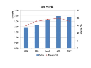
- 1. 0 5 10 15 20 25 0.00 0.50 1.00 1.50 2.00 2.50 3.00 3.50 JAN FEB MAR APR MAY Margin(%) Millions Sale Marge Sales Margin(%)