2. Genre & Audience
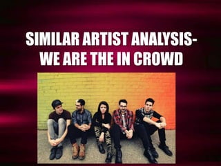
We Are The In Crowd is an American
pop-punk band, which consists of five
members.
Pop-punk music is targeted towards a
very specific niche audience, who is
more of an active listener. However,
despite this being a sub-genre of
‘rock’ music, it takes elements of that
genre alongside pop, and therefore
appeals to a wider audience than
straight up rock music does.
Their music manages to corporate pop
melodies and rock riffs, to create the
ultimate blend of pop-punk music.
3. Values
WATIC could be considered
quite a laid-back band,
whereby they are
themselves in front of the
cameras, and aren’t afraid
to swear or rebel. However,
because they’re borderline
pop as well as punk, they
are not overly anti-conformist,
as they also
appeal to a younger fan
base who look up to them.
Lyrics from one of the band’s
songs ‘The Best Thing (That
Never Happened)
4. What’s different about this band, Image
is that the lead singer is a woman,
which is a very rare occurrence
within this genre
of music. I am going to incorporate
this into my own ideas, as I feel
like there is a
gap in the market for front women
as opposed to men
at this moment in time. In
terms of the band itself, they tend
to counteract Laura Mulvey’s
‘Male Gaze’ theory, as she is quite
reserved and it is evident that it is
more about the music rather than
her being portrayed as a sexual
object.
5. Digipak
The band’s digipak is quite interesting, because there are no images of the band
featured whatsoever. It therefore chooses to focus primarily on symbolism, and
how this can be used to portray the band itself. The denim jacket symbolises
rebellion, and anti-conformity, as it appears to be quite jagged and worn-out.
The dominant colours are black and white, which are very simplistic, black
giving connotations of death and danger, and white connoting purity and
freedom, therefore combining both of the connotations together to create their
genre ‘pop-punk’.
6. Website
Again, much like the album
cover, the band’s website
appears to have adhered to
the same theme, but has
simply altered the colour
scheme by adding grey. The
overall layout is extremely
simplistic, and focuses solely
on promotion of the album
‘Weird Kids’. Not only that,
but there are no images of
the band placed within view
point on this website, and
therefore this implies that
music is much more
important than the band’s
image, and shows that they
aren’t really part of the
appeal. The only hyperlinks
that can really be seen are
the ones directing the users
to iTunes, YouTube, Spotify
and so on, therefore
reinforcing this idea that
music is the main
importance.