Dev ops metrics
•Download as PPTX, PDF•
1 like•276 views

The document discusses DevOps metrics collection and analysis to measure the success of Agile and DevOps implementations. It recommends collecting metrics at multiple levels - team, program, and enterprise - to identify areas for improvement. Automated collection is emphasized to provide faster feedback. Key metrics include deployment frequency, change lead time, production incidents, test coverage, and customer satisfaction. Analysis should correlate metrics to gain insights. Regular reporting of metrics will build trust and show improvements in areas like time to market, quality, and productivity.

Recommended
More Related Content
What's hot
What's hot (20)
Similar to Dev ops metrics
Similar to Dev ops metrics (20)
Recently uploaded
Recently uploaded (20)
Dev ops metrics
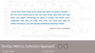
- 1. DevOps Metrics Collection Approach “If you don’t know where you’re going, any path is as good as another…. But you won’t realise you’re lost, you won’t know what time you’ll get there, you might unknowingly be going in circles, and others won’t understand how they can help. And, since you could pass right by without knowing it, you won’t get the satisfaction of having arrived!” Lewis Carrol: Alice in Wonderland Shivagami Gugan 26th April 2019
- 2. Measuring Agile DevOps Implementation Success DevOps & Release on Demand based on Scaled Agile Framework
- 3. DevOps Health Radar • The DevOps Health Radar and the DevOps Metrics are complementary in nature and will help identify improvements and focus areas. • Whilst the DevOps Health Radar gives us the state of “Where we are in the Journey”, the Metrics driven by telemetry provides insights on “How to improve” to get to Targets DevOps Metrics and DevOps Health Radar Objective/ Business Goal Key DevOps Metrics Operational Definition Time to Market Delivery Cycle Time, Change lead time Total time taken from story commit to release into production Deployment Frequency* Number of Releases to production Business Value points ($) * Business value points delivered per PI Quality # of Production Incidents* Number of production incidents per release or change Test coverage Number of test scenarios covered during testing SLA compliance*, Application Performance*, Availability* Number of rollbacks % compliance to Targets Productivity Testing cost Cost spent in conducting various testing activities (UTA, STA, E2E Test Automation) Effort to development and deployment of software Improvement in effort to develop and deploy changes Engagement Customer Satisfaction* Business Value Delivered, Business Predictability, Net Promoter Score * key outcome metrics
- 4. Metrics Collection Guiding Principles • To continuously assess and improve processes, metrics will be harnessed at Team level (for every Iteration), Program level (for every PI) and at Enterprise level. • Identify what matters to the Business and measure metrics that would enable what matters • Bring the Business Outcome/ Impact to the Teams • Start with key Metrics • Collect at every iteration level, so that there is faster feedback and corrective action can be taken during PI, and not at end of PI • Automate Metrics collection as much as possible through telemetry points • Key metrics such as Application performance, production defects, rollbacks, deployment frequency should be measured in real-time • Correlation between Metrics is of paramount importance (for example Test Coverage and Production incidents) or (deployment frequency and number of rollbacks). In isolation, metrics may provide inaccurate insights of the improvement journey. • Balance between the ROI of collecting metrics and the Value the metric is delivering.
- 5. Approach for ART (Agile Release Train) • Identify Key Metrics that matter for ART’s business outcomes • Outcome based metrics • Deployment Frequency • Application Performance • Application Availability • # of Production Incidents • Business Value Delivered • Business Predictability • Input Measures Y (Outcomes) = are a function of inputs f(x). Business outcomes are correlated to input measures. Hence measure key input measures. • Testing Cycle Time • Development Effort • Defect Rate • Rework • Facilitate collection at every Iteration level for faster feedback loop • Assign DICE “data experts” to analyse, correlate and report at ART level • Automate collection as much as possible through telemetry • Improve collection process and tools as we progress in the journey
- 6. Team Level Metric Iteration Level Metrics (representative) Teams to collect metrics in the quantitative part of every team retrospective, at Iteration level. This data to be made available to the DICE team. Add telemetry (as many as possible) along the CI/CD pipeline. Team 1 Iteration 1 Iteration2 Functionality Velocity Planned Velocity Actual # Stories Planned versus Accepted # Stories Completed versus Accepted Quality Code Debt Unit Test Coverage Number of Defects Total Tests Automated % # of New Test Cases # of New Test Cases automated Rework % Total hours taken for Testing (hrs) # NFR testing Automation Automate collection as much as possible
- 7. Team Level Metric Team PI Performance Report During the PI System Demo, the Business Owners, Customers, Agile teams, and other key stakeholders rate the actual business value (BV) achieved for each team’s PI Objectives. PI # Objective Business Value Planned Business Value Delivered Feature1 7 4 Feature2 5 5 Feature3 9 8 Feature4 Feature5 Feature6 Feature n Total 50 45 % Achievement 90%
- 8. Team Level Metric Team Self Assessment Radar for Technical Health To continuously assess and improve their process, the team evaluates their maturity during every iteration retrospective, including a scoring for Technical health, which will provide a trend on areas to focus on team and technical agility. Technical Health Team actively reduces technical debt in each Iteration Team has clear guidance and understanding of intentional architecture guidance, but is free and flexible enough to allow emergent design to support optimal implementation Automated acceptance tests and unit tests are part of story DoD Refactoring is always underway CI, build and test automation infrastructure is improving Team is coming up with new hypotheses and testing them continuously Team is continuously deploying to production Team architects their work to allow for continuous deployment, release on demand and recovery Total Technical Health Score
- 9. DevOps Health Radar Measurements @ Program Level DevOps Health Radar per PI at ART Level The DevOps Health Radar is a tool to assess the progress at the Program level in improving the flow of value through Continuous Delivery Pipeline. The 16 sub- dimensions that are used to assess the maturity will help identify sitting, crawling, walking, running, or flying, and identify places where to improve.
- 10. DevOps Program Metrics Program Performance level Metrics During PI and at end of PI (as part of I&A phase), program level metrics are calculated to measure Velocity, Quality and Productivity. Team level metrics on Quality are rolled up to check ART performance and bottlenecks. Analysis from real-time metrics such as Application performance should feed into program backlog as necessary. ART 1 PI1 PI2 Functionality Program Velocity Predictability Measure # Features Planned versus Accepted # Stories Planned versus Accepted Deployment Frequency Quality Unit Test Coverage Number of Defects Total Tests Automated % Total hours taken for Testing (hrs) # NFR testing Automation Continuous Delivery Systems and solutions are continuously deployed to production Release is happening whenever the business needs it The flow of value and hypothesis from idea to cash is monitored and improved Measurements of the Continuous Delivery Pipeline are tracked and used to improve flow Systems are architected to allow for fast recovery with support for fix forward Automation of the entire Continuous Delivery pipeline is improving Total CD Score
- 11. DevOps Health Radar Measurements Delivery Pipeline Level Metrics @ ART level The pipeline efficiency compares the amount of touch time versus wait time.
- 12. DevOps Health Radar Measurements Deployments and Releases per PI @ ART Level This metric is meant to demonstrate whether the program is making progress toward deploying and releasing more frequently. It can be viewed on a PI basis.
- 13. DevOps Health Radar Measurements Deployments and Releases per PI @ ART Level This metric is meant to demonstrate the trend of the number of Deploys and Releases per iteration. It can be viewed on a PI basis.
- 14. DevOps Health Radar Measurements Enterprise level Metrics At the enterprise level, improvements can be driven by analyzing strengths and weakness related to built-in quality, Devops culture, continuous delivery pipeline, continuous integration DevOps and Release on Demand Built-In Quality Sit (1-2): Quality is poor and inconsistent Crawl (3-4): Some testing is done as part of each iteration Walk (5-6): Most testing is automated and done within the iteration Run (7-8): Teams are applying BDD, TDD, architecture, design and release quality Fly (9-10): Releases are nearly defect free DevOps and Release on Demand Organizing Around Value Sit (1-2): Functional silos; work is planned centrally Crawl (3-4): Agile teams are formed into Teams of Agile Teams Walk (5-6): Teams of Agile Teams plan, integrate, release, and learn together Run (7-8): Teams of Agile Teams are organized around value and include business and operations Fly (9-10): Teams of Agile Teams deliver end value quickly and predictably DevOps and Release on Demand DevOps Culture Sit (1-2): Development and operations are functional silos Crawl (3-4): Teams are trained in DevOps Walk (5-6): Dev and Ops are collaborating on automation and deployments Run (7-8): Dev and Ops are integrated and focused on measurement Fly (9-10): Teams of Agile Teams define, build, deploy, release and operate DevOps and Release on Demand Continuous Delivery Pipeline Sit (1-2): Releases are infrequent and problematic Crawl (3-4): Some continuous integration; value stream maps inform next steps Walk (5-6): Continuous integration and continuous deployment are largely automated Run (7-8): Release is decoupled from deployment and available on demand Fly (9-10): Continuous exploration drives rapid deployment of innovations
- 15. Summary • DevOps is the key enabler of Velocity, Quality, Productivity, Customer and Staff engagement of the transformation journey • A combination of health analysis (using SAFe DevOps health radar) and telemetry metrics will provide a transparent view of the improvement journey, and more importantly identify the areas to focus upon • Automate the telemetry and the collection processes as much as possible to remove toil and people dependency • Cross correlate the metrics to drive insights • Baselining the metrics and harvesting them systematically is key for building IT brand and Business trust
- 16. Typical reporting of Improvements at ART level/ Program Level Time-to-market examples • A 75% reduction in the time to get features to market (from 12 to 24 months down to three to six months). Features are now released twice a week for XXX ART Quality examples • A 25% reduction in defects in production • Predictability – 98% accuracy on delivery predictability, an increase by 20% Productivity examples • XXX ART reduced its infrastructure costs by 40% due to Infra as Code • Complete testing in just one hour, instead of days – The full testing cycle, including environment provisioning, functional tests, and upstream/downstream interface validation dropped from five days to just one hour • Since the initial Program Increment, the throughput of the train’s business outcomes rose in 18 months by over 400% with only a 20% team size increase Customer satisfaction examples • The Net Promoter Score rose by 8 points over the course of one year. • Employee engagement – Employee satisfaction and engagement increased by TEI results
- 17. Appendix Bouquet of Program Performance level Metrics • Choose Key Metrics that matters for the ART Deployment Frequency Deployment frequency denotes how often new features or capabilities are launched. Frequency can be measured on a daily or weekly basis. Change Volume The actual value of deployments may be better reflected by change volume. This DevOps KPI determines the extent to which code is changed versus remaining static. Improvements in deployment frequency should not have a significant impact on change volume. Deployment Time How long does it take to roll out deployments once they’ve been approved? Failed Deployment Rate Sometimes referred to as the mean time to failure, this metric determines how often deployments prompt outages or other issues. Change Failure Rate The change failure rate refers to the extent to which releases lead to unexpected outages or other unplanned failures. A low change failure rate suggests that deployments occur quickly and regularly. Conversely, a high change failure rate suggests poor application stability, which can lead to negative end-user outcomes. Time to Detection It is essential to catch failures quickly if they do occur. Time to detection KPIs can determine whether current response efforts are adequate. High time to detection could prompt bottlenecks capable of interrupting the entire workflow. Mean Time to Recovery Once failed deployments or changes are detected, how long does it take actually to address the problem and get back on track? Mean time to recovery (MTTR) is an essential metric that indicates your ability to respond appropriately to identified issues. Lead Time Lead time measures how long it takes for a change to occur. This metric may be tracked beginning with idea initiation and continuing through deployment and production. Defect Escape Rate The defect escape rate tracks how often defects are uncovered in pre- production versus during the production process. This figure can provide a valuable gauge of the overarching quality of software releases. Defect Volume This metric relates to the escape rate highlighted above, but instead focuses on the actual volume of defects. While some defects are to be expected, sudden increases should spark concern. A high volume of defects for a particular application may indicate issues with development or test data management. Availability Availability highlights the extent of downtime for a given application. Service Level Agreement Compliance To increase transparency, most companies operate according to service level agreements. These highlight commitments between providers and clients. SLA compliance KPIs provide the necessary accountability to ensure that SLAs or other expectations are met. Unplanned Work How much time is dedicated to unexpected efforts? The unplanned work rate (UWR) tracks this in relation to time spent on planned work. A high UWR may reveal efforts wasted on unexpected errors that were likely not detected early in the workflow. The UWR is sometimes examined alongside the rework rate (RWR), which relates to the effort to address issues brought up in tickets. Number of Service Now Tickets As the defect escape rate KPI suggests, not all defects are disastrous. Ideally, however, they will be caught early. This concept is best reflected in customer ticket volume, which indicates how many alerts end users generate. Stable user volume alongside increased ticket volume suggests issues in production or testing. Cycle Time Cycle time metrics provide a broad overview of application deployment.
- 18. Thank You