New OR Case Study 11.25.14
•
0 likes•160 views

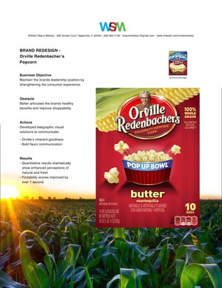
The document is a summary of a brand redesign project for Orville Redenbacher's Popcorn. The objective was to maintain the brand's leadership position by strengthening the consumer experience. The obstacle was to better communicate the brand's healthy benefits and improve how easy it was to find in stores. The actions taken were to develop visual designs that communicated the inherent goodness and bold flavors of Orville popcorn. The results were quantitative data showing dramatically improved perceptions of the popcorn being natural and fresh, and findability scores in stores improved by over one second compared to the previous packaging.

Recommended
More Related Content
Featured
Featured (20)
New OR Case Study 11.25.14
- 1. William Shaun Markey • 560 Dorset Court, Naperville, Il 60540 • 630-352-7126 • shaunmarkey1@gmail.com • www.linkedin.com/in/wsmarkey/ BRAND REDESIGN - Orville Redenbacher’s Popcorn Business Objective Maintain the brands leadership position by strengthening the consumer experience. Obstacle Better articulate the brands healthy benefits and improve shoppability. Actions Developed telegraphic visual solutions to communicate: • Orville’s inherent goodness • Bold flavor communication Results • Quantitative results dramatically show enhanced perceptions of natural and fresh • Findability scores improved by over 1 second (previous package)