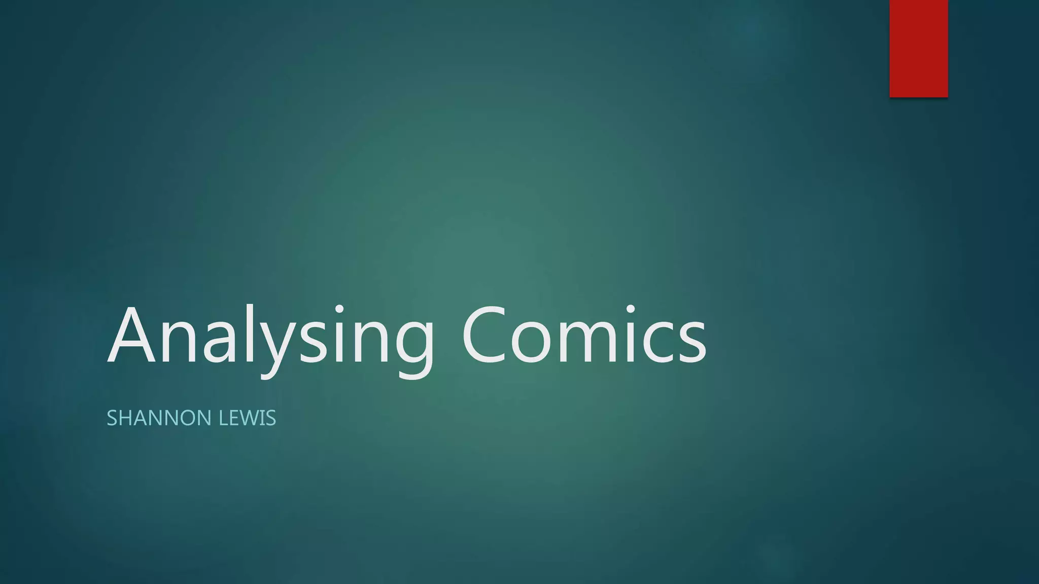
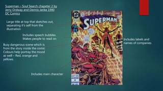
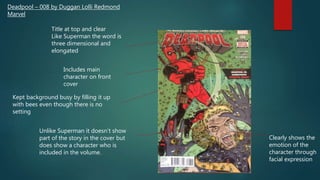
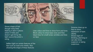
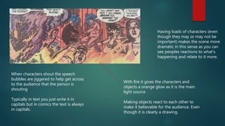
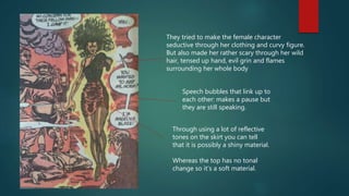
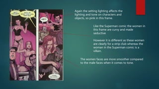
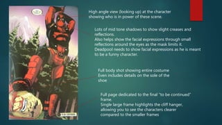
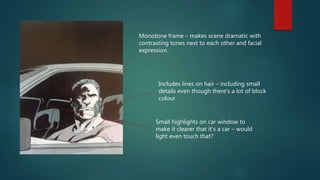
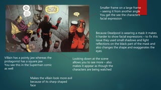
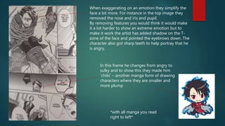
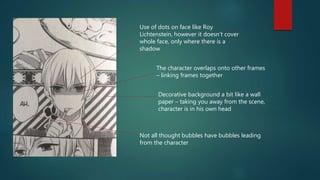
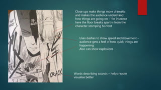
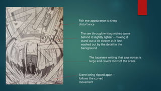
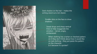
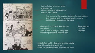
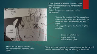
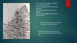
2. Superman – Soul Search chapeter 2 by
Jerry Ordway and Dennis Janke 1990
DC Comics
Large title at top that sketches out,
separating it’s self from the
illustration
Includes speech bubbles
Makes people to read on
Busy dangerous scene which is
from the story inside the comic
Colours help portray the mood
as well – Red, orange and
yellows.
Includes labels and
names of companies
Includes main character
3. Deadpool – 008 by Duggan Lolli Redmond
Marvel
Title at top and clear
Like Superman the word is
three dimensional and
elongated
Includes main
character on front
cover
Kept background busy by filling it up
with bees even though there is no
setting
Unlike Superman it doesn’t show
part of the story in the cover but
does show a character who is
included in the volume.
Clearly shows the
emotion of the
character through
facial expression
4. Makai Ouji Devils and Realist – Volume 1
by Utako Dukihiro and Madoka Takadono
Main character in large
Focuses more on decoration
rather than trying to hint what’s
happening in the story
Has connections in the
imagery to do with the
theme of the story, for
instance the devils
pentagram because of its
supernatural characters,
and old English writing as
it is set in Victorian Britain.
Character poses and looks
directly at viewer
Not part of a scene like
Superman and Deadpool
Keeps the background
clean with only slight
boarders and silhouetted
flowers
5. Blue Exorcist – Volume 1 by Kazue
Kato
Title down the side with a
haze on it.
White clean background
like Makai Ouji
Focus on character
Includes character and
you get to see them in
colour
Again the character poses
Includes the small details of
clothing
Very precise
6. Use of thought
bubbles so you see a
characters point of
view
Lots of dark exaggerated shadows – relates
to the lighting of the setting which is made
up of fire.
Uses shadows to show another characters
that’s not in the scene: makes it more
suspicious and dangerous, allows you to
show someone in a small frame
Clothing reacts to scene: cape is
ripped
Makes it a bit more believable
With the body language and facial expression
here you can see that Superman is using all his
strength – makes it believable
7. Uses colour and lines to show form and tone.
Block colour to show basic tone and then
black lines for small tones: wrinkles and lines
on face
Extreme close up on
face to show
expression of eyes
clearly.
Shows signs of
thinking, planning or
can also show
suspicion or being
suspicious.
Shows shape of hair
though many lines
Making it dark in places
where it folds and
doesn’t get hit by the
light source the artist is
using.
Reflect light on certain features of the
face such as nose and cheeks. Also
showing the shape of these features
8. Having loads of characters (even
though they may or may not be
important) makes the scene more
dramatic in this sense as you can
see peoples reactions to what’s
happening and relate to it more.
When characters shout the speech
bubbles are jiggered to help get across
to the audience that the person is
shouting
Typically in text you just write it in
capitals but in comics the text is always
in capitals.
With fire it gives the characters and
objects a orange glow as it is the main
light source
Making objects react to each other to
make it believable for the audience. Even
though it is clearly a drawing.
9. They tried to make the female character
seductive through her clothing and curvy figure.
But also made her rather scary through her wild
hair, tensed up hand, evil grin and flames
surrounding her whole body
Speech bubbles that link up to
each other: makes a pause but
they are still speaking.
Through using a lot of reflective
tones on the skirt you can tell
that it is possibly a shiny material.
Whereas the top has no tonal
change so it’s a soft material.
10. Again the setting lighting affects the
lighting and tone on characters and
objects, so pink in this frame.
Like the Superman comic the women in
this frame are curvy and made
seductive
However it is different as these women
are clearly for a strip club whereas the
woman in the Superman comic is a
villain.
The women faces are more smoother compared
to the male faces when it comes to tone.
11. High angle view (looking up) at the character
showing who is in power of these scene.
Full page dedicated to the final “to be continued”
frame.
Single large frame highlights the cliff hanger,
allowing you to see the characters clearer
compared to the smaller frames
Full body shot showing entire costume
Even includes details on the sole of the
shoe
Lots of mid tone shadows to show slight creases and
reflections.
Also helps show the facial expressions through small
reflections around the eyes as the mask limits it.
Deadpool needs to show facial expressions as he is meant
to be a funny character.
12. Monotone frame – makes scene dramatic with
contrasting tones next to each other and facial
expression.
Includes lines on hair – including small
details even though there’s a lot of block
colour
Small highlights on car window to
make it clearer that it’s a car – would
light even touch that?
13. Smaller frame on a large frame
– seeing it from another angle
You get the see the characters
facial expression
Villain has a pointy jaw whereas the
protagonist has a square jaw
You see this in the Superman comic
as well
Makes the villain look more evil
because of its sharp shaped
face
Looking down at the scene
allows you to see more – also
makes it appear as though the
characters are being watched
Because Deadpool is wearing a mask it makes
it harder to show facial expressions – to fix this
issue they used small shadows and light
reflections on the black part of the mask and
also changes the shape and exaggerates the
eyes
14. When exaggerating on an emotion they simplify the
face a bit more. For instance in the top image they
removed the nose and iris and pupil.
By removing features you would think it would make
it a lot harder to show an extreme emotion but to
make it work the artist has added shadow on the T-
zone of the face and pointed the eyebrows down. The
character also got sharp teeth to help portray that he
is angry.
In this frame he changes from angry to
sulky and to show this they made him
‘chibi’ – another manga form of drawing
characters where they are smaller and
more plump
*with all manga you read
right to left*
15. The character overlaps onto other frames
– linking frames together
Use of dots on face like Roy
Lichtenstein, however it doesn’t cover
whole face, only where there is a
shadow
Decorative background a bit like a wall
paper – taking you away from the scene,
character is in his own head
Not all thought bubbles have bubbles leading
from the character
16. Words describing sounds – helps reader
visualise better
Close ups make things more dramatic
and makes the audience understand
how things are going on - for instance
here the floor breaks apart is from the
character stomping his foot
Uses dashes to show speed and movement –
audience gets a feel of how quick things are
happening
Also can show explosions
17. Fish eye appearance to show
disturbance
The see through writing makes scene
behind it slightly lighter – making it
stand out a bit clearer as it isn’t
washed out by the detail in the
background
Scene being ripped apart –
follows the curved
movement
The Japanese writing that says noises is
large and covers most of the scene
18. When clothing has a tartan or checked pattern
on it they don’t think about how it would like
on real clothing – they just paste the pattern
on the character.
Is it because it’s quicker?
Smaller dots on the face to show
shadows
Dark shadow on the hair – makes the
writing stand out a lot clearer.
Sweat drops and sharp vertical
lines to help exaggerate the
emotion – nerves, angry,
embarassed
19. Goes into lots of detail, keeping the
scene busy.
A lot to look at and you always see
something new when you look at it
Embellished outfit – they have to know exactly
what it looks like to make it work
Closer to reality compared to something plain
Scene shot so you know where
characters are
Also sometimes it is labelled to
make it even clearer
You can leave blank spaces between frames, yet they
join together with a characters head or speech
bubble that comes out of the frame
Separating yet
bringing
together
20. To show the emotion ‘sad’ in manga they
make the eyes larger with white circles to
represent tears. The eyebrows are also
tilted.
All exaggerating and clearly showing the
emotion.
Cheeks are blushed as
people tend to go
blotchy when crying
When sad the speech bubbles
become wobbly to suggest a shaky
voice
Characters close together in close up frame – see the back of
head of one, shows that they are reacting to each other
Quick glimpse of memory – doesn’t show
whole scene as they clearly want to show
it’s a memory.
So just character and speech on a white
background
21. Just a page that shows the entire
city in amazing detail.
So much going on and it all works
together
How long would this of taken to
design?
Was it drawn bigger first and then
shrunk down?
Mixture of old and new, so they
thought of history of place
Include bridges and roads so you
can see how people would enter the
city
22. Analysing these comics was extremely useful for me and I now feel
very confident with my project and how I’m going to do it. I
particularly like how in comics they use close ups to show the
extreme emotions clearly. Another feature I liked was having a very
busy scene, specially designing an entire town. However this isn’t my
focus and something like that would take ages to plan to get it right
and successful.