
Recommended
More Related Content
What's hot
What's hot (20)
Similar to Best shawarma brand manual
Similar to Best shawarma brand manual (20)
Recently uploaded
Recently uploaded (20)
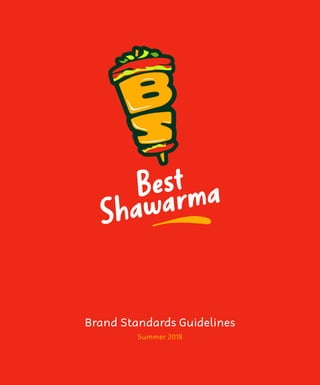
Best shawarma brand manual
- 3. Note that we do not claim the rights to the images used in this document; they are strictly for presentation purposes and the appropriate rights should be attributed to their respective owners.
- 4. This is a guide to the basic elements that make up Best Shawarma. Have a read, it will help ensure a consistent global presentation of the Best Shawarma identity, which is critical to the success of our brand. BS. - The Brand The Visual Identity Our Color Palette Our Brand Typeface Secondary brand elements Photography Usage Guidelines 06 08 28 31 33 41 Packaging Branding Branded wearables Corporate Stationeries Other Branded Materials In Summary 47 53 60 63 68 04
- 5. Brand Introduction A brief bio on the brand - Best Shawarma, also referred to as BS. - the brand acronym.
- 6. BS. - The Brand Best Shawarma Co. is a Shawarma delivery shop located in Toronto that provides high quality, healthy and rich Shawarma wraps delivered to your doorsteps. Best Shawarma (B.S.) plans to serve/deliver only on Saturdays and Sundays as a pilot standard of practice to effectively capture the juicy desires and appetite needs of our customers while embracing the company/industry culture. B.S. The Best Shawarma Co. slogan is “Juicy B.S.” which can be dynamically used for marketing & publication purposes e.g. ‘The most Juicy B.S. ever!’. Best Shawarma Co. (also known as B.S.) - as unique as the name sounds, and an acronym synonymous to the urban use - B.S, has been carved out of a groaning niche desire for a fusion of food artistry and culinary fulfill- ments established with the aim of remaining relevant in its existing marketplace. B.S. supports healthy living with a core focus on nutrients, quality-control ingredients and a choice for customers to pick and build. Our Mission Statement is... To serve high quality, healthy & rich Shawar- ma wraps, to be delivered effectively to the request of our customers. To ensure we satisfy the groaning desire for culinary fusion, with the aim of remaining relevant as a leader in today’s marketplace. Our Vision is... To be dynamically innovative & original in creating a unique blend of ingredients; for rich & healthy culinary recipes- with high quality, in order to remain relevant as a leader in today’s marketplace. Target Market Our target market is to “Humanity” and to be equally privileged to feed a ballpark percent- age of the world’s population. 06
- 7. Our Logo and Wordmark The rationale behind our logo, the different variations of the logo and usage guidelines.
- 8. The Visual Identity Our visual identity comprises primarily of the full BS. logo shown in the figure to the right. This entity - the full logo, is our first and most important ambassador anywhere and every- where. The secondary representative elements are discussed further in this manual.. The BS. Logo as a whole also comprises of two independent/separable parts: The BS. Symbol, and The Best Shawarma wordmark. We advise the full logo not be used when the space on which the logo is to be pasted is congested in terms of the presence of foreign elements or the amount of clearspace availa- ble.. Therefore, if one of the two parts must be used without the other, the orientation of the space must be taken into consideration. More specifically, the BS. Symbol alone should only be used on a portrait-oriented space while the wordmark alone must only be used on a landscape -oriented space. TheBS.Symbol The Best Shawarma wordmark 08
- 9. The BS. symbol The Best Shawarma symbol is custom and unique to the brand name acronym - BS. The symbol revolves around the letters BS and is a graphical representation of a Sha- warma wrap. The letters, stacked tightly on top of each other, are made to look fat, sump- tuous and juicy; giving anybody an idea of the kind of Shawarma to expect from BS. The symbol effortlessly stimulates the appetite of a person who happens to just be staring at the symbol; the next step he or she is taking from that moment is to order a wrap. The symbol also has elements of green vege- tables in it, pointing to the fact that BS. is a health conscious brand as well as the fact that freshly grown organic vegetables are part of the BS. recipe. The symbol is slightly tilted with the right side of it aligning closely to the vertical axis. This should never be altered for any reason including when the symbol is used alone. 09
- 10. The Wordmark The wordmark is basically our name written out in our primary headline typeface (see the typeface section of this manual on page 31) also rotated slightly to the left; this should not be altered as well in any case. The wordmark also includes a ‘juicy’ under- line which is as important as the brand name in our brand representation; the underline should never be omitted even when the wordmark is being used alone 10
- 11. The full logo therefore is standard and the relative sizes of the symbol and the word- mark should never be altered as well as the relative positions and combined orientation. To be safe, anyone who is to use the full logo should only use the EPS or AI file included in the brand elements archives and should never try to recreate the whole logo or join the symbol and wordmark together. 11
- 12. Full Logo Clearspace In order to maintain the visual impact of our full logo, there needs to be a sufficient amount of clearspace (allowable space around the logo) surrounding the full logo inside of which no foreign elements should fall within. Computation To calculate the exact amount of minimum space that should surround the full logo, take the width of the BS. symbol and divide by 2. Minimum Size Our logo is flexible in size to accomodate a variety of demands of use. However, to ensure readibility and integrity of the full logo, we have determined a minimum size in which the full logo should be applied which is at least 1.4” in height. 2x x 1.4” (30.9mm, 88px) 12
- 13. In order to maintain the visual impact of our BS. symbol when applied on its own, there needs to be a sufficient amount of clearspace surrounding the symbol inside of which no foreign elements should fall within. Computation To calculate the exact amount of minimum space that should surround the BS. symbol whenever it is applied on its own, take the width of the symbol and divide by 2. Minimum Size The BS. symbol is flexible in size to accomo- date a variety of demands of use. However, to ensure readibility and integrity of the symbol, we have determined a minimum size in which the symbol should be applied which is at least 0.7” in height. BS. Symbol Clearspace 2x x 0.7” (17.2mm, 49px) 13
- 14. Wordmark Clearspace In order to maintain the visual impact of our wordmark whenever it is used on its own, there needs to be a sufficient amount of clearspace surrounding the wordmark inside of which no foreign elements should fall within. Minimum Size The wordmark is flexible in size to accomo- date a variety of demands of use. However, to ensure readibility and integrity of the word- mark, we have determined a minimum size in which the wordmark should be applied which is at least 1.4” in height. Computation To calculate the exact amount of minimum space that should surround the wordmark, take the height of the letter ‘S’. x x 0.5” (14mm, 82px) 14
- 15. Logo Variants Our logo will from time to time be used on backgrounds other than the most common background color - White. In such cases, we have a couple of logo variants that should be used on specific background colors that are not white. It is advised that background colors for any visual communication medium should be confined to our brand colors (see the color section of this manual on page 28). There are dark and light colors to choose from and then there are corresponding logo variants for these dark and light backgrounds. Our most preferred background color is the BS. Red but we understand that when Red covers a considerable amount of space area like large banners, it could have negative impact on the audience’ eyes, so our second most preferred background is then white. The following pages showcase the different logo variants on their respective back- grounds; at the bottom of the pages are notes on the distinctive properties of the logo variants. Be sure to pay attention to them. 15
- 16. Full logo_B, Red background Symbol stays the same with White wordmark (Juicy underline stays BS. Gold)
- 17. Full logo_A (Primary logo variant), White background Symbol stays the same with Dark Green wordmark (Juicy underline stays BS. Gold)
- 18. Full logo_C, BS. Gold Background Symbol stays the same with Dark Green wordmark Juicy underline changes to Red
- 19. Full logo_B, Dark Green background As it were on the Red background
- 20. Full logo_C, Lime Green Background As it were on the BS. Gold background
- 21. Full logo_A, Green Background As it were on the White background
- 22. Full logo_B, Orange Background As it were on the Red background
- 23. Full logo_D (Monochrome), Black/dark Backgrounds Symbol outline has been omitted in this variant leaving only the inner fill When design theme is not black and white, this logo variant should be used only on dark backgrounds in BS. Gold
- 24. Full logo_E (Monochrome), White/light Backgrounds Symbol fill has been omitted in this variant leaving only the outline When design theme is not black and white, this logo variant should be used only on light backgrounds in Orange
- 25. Full logo_B, Photo Background with slight dark overlay to provide contrast As it were on the Red background
- 26. Bad Logo Applications The guidelines in this manual have been developed to help with the correct and consistent use of all the elements of the BS. identity. This page illustrates many common errors to watch for and avoid, such as alter- ing the logo’s typography, modifying the graphic design, changing the brand colours, and placing the logo on backgrounds that interfere with its visibility. Do not apply the logo in any other color other than the BS. brand colors. Do not alter proportions. Do not omit the ‘juicy’ underline. Do not alter the wordmark typeface, not even to our secondary brand typeface. Do not place the logo on a patterned back- ground, not even on our brand pattern. Do not redraw or recreate the logo or any of its elements. Do not apply any graphic effects on the logo such as drop shadow, etc. Do not make the logo transparent. 26
- 27. Our Colors The colors that make up part of our visual identity and their specifictions.
- 28. Our Color Palette Color is an integral part of the BS. brand identity. Our primary colors are found in the BS. Logo symbol and are properly defined on this page. These Primary colors are to be used extensive- ly as they are rich, vibrant and represent all that we stand for as a brand. The colors are arranged in order of preference with the most preferred color to the right. BS. Red Hex: #EF2917 RGB: 239/41/23 CMYK: 0/82/90/6 Pantone: Bright Red C BS. Gold Hex: #FFAE03 RGB: 255/174/3 CMYK: 0/31/98/0 Pantone: 137 C BS. Dark Green Hex: #033321 RGB: 3/51/33 CMYK: 94/0/35/80 Pantone: 627 C BS. Green Hex: #72B01D RGB: 114/176/29 CMYK: 35/0/83/30 Pantone: 369 C 28
- 29. Secondary Color Palette The secondary color palette was created to support the primary colors on visual commu- nication materials. These colors are defined on this page. These secondary colors are to be used spar- ingly and not as extensively as the primary colors. The colors are arranged in order of preference with the most preferred color to the right. Orange Hex: #FB6107 RGB: 251/97/7 CMYK: 0/76/100/0 Pantone: 165 C Lime Green Hex: #C6F91F RGB: 198/249/31 CMYK: 27/0/100/0 Pantone: 381 C Yellow Hex: #F1D302 RGB: 241/211/2 CMYK: 7/12/100/0 Pantone: 3945 C Light Grey Hex: #C7D6D5 RGB: 199/214/213 CMYK: 21/8/14/0 Pantone: 552 C Black Hex: #000000 RGB: 0/0/0 CMYK: 75/68/67/90 Pantone: Black 6 C Mahogany Hex: #BB4D00 RGB: 187/77/0 CMYK: 20/80/100/10 Pantone: 167 C Deep Red Hex: #A31621 RGB: 163/22/33 CMYK: 24/100/98/19 Pantone: 704 C Brown Hex: #590004 RGB: 89/0/4 CMYK: 38/95/86/60 Pantone: 1545 C 29
- 30. Our Brand Typeface Our official brand typeface(s) and typography guidelines
- 31. Headline Typeface It’s all about giving us an ownable brand presence as we communicate both outwardly and to ourselves. Part of that brand presence is the font chosen to display our written words. Our primary typeface is ‘Well Bred’, a seem- ingly handwritten font that is modern, clean and legible. Thus, Well Bred represents our brand as casual, friendly and approachable. Well Bred comes in only one weight which is sufficient to serve as our major and domi- nant typeface. Well Bred, being our primary typeface should be applied in headline texts and short copies/payoffs on visual communication materials. In cases where the copy or head- line is short and on its own, i.e without body text or subtext, the text can be tilted and/or rotated - similar to the wordmark on our full logo. We recommend that you completely avoid applying our primary typeface in all caps as that would not represent the BS. brand well. A B C D E F G H I J K L M N O P Q R S T U V W X Y Z a b c d e f g h i j k l m n o p q r s t u v w x y z ( . , : ; ? ! £ $ & @ * ) 0 1 2 3 4 5 6 7 8 9 Bb *Skewed upwards and rotated slightly counter-clockwise 31
- 32. Body Text Typeface Our Secondary typeface is ‘Robaga Rounded Light’, a Sans Serif font that is modern, rounded, clean and legible. Thus, Robaga Rounded Light represents our brand as casual, friendly and approachable. Well Bred comes in a full family of various weights and styles, but we recommend using the light weight for displaying body text. However, the bold weight can be applied on words that are meant to be emphasized. Well Bred, being our secondary typeface should only be applied in body texts and long body copies on visual communication materials. We also recommend increasing the leading (line spacing) sufficiently but not too spaced apart We strongly advise that you allow enough breathing space between the headline text and the body text on all communication materials; as much space as the available working area can allow. Also, always make sure the body text font size is, at most, halfthe font size of the headline text for proper typography contrast. We recommend that you completely avoid applying our secondary typeface in all caps as that would not represent the BS. brand well. ABCDEFGHIJKLMNOPQRSTUVWXYZ abcdefghijklmnopqrstuvwxyz (.,:;?!£$&@*) 0123456789 Bb 32
- 33. Secondary Brand ELements Other brand elements that support the logo, color and typeface in representing the BS. brand
- 34. The ‘Juicy’ Underline Just line in the wordmark of our logo, we recommend applying the ‘juicy’ underline (shown in the figure below) underneath short headline texts and short headline copies. The ‘Juicy’ Underline is essentially a single brush stroke that looks like a singular splash or drip of juice onto a flash surface. We frown against using a redrawn or recreated version of this element; always make sure you use the vector EPS or AI file of the stroke, in an appropriate color, resizing and/or rotating to fit. 34
- 35. The BS. Pattern There would be cases where some of our design materials would not need text content or even our logo applied on the space. In such cases, it would not be visually pleasing to leave the space blank; wether or not the space is filled with one of our brand colors. Hence, we have come up with a pattern, which is essentially the letters in the BS. symbol extracted, alongside a short brush stroke; duplicated, mirrored vertically and horizon- tally, stepped and repeated abroad. You would not need to recreate the pattern as we have the EPS and AI vector file formats availa- ble upon request. We advise that the pattern be allowed breath- ing space/margin around the surrounding edges away from the edge of the canvas. In other words, avoid cropping the pattern off at the edges of the working area and make sure the margin around the pattern is sufficient. See the pattern in the following pages and notice the margin surrounding the pattern. The pattern can be applied in any of our brand colors, making sure the BS symbols are in a different color from the tiny brush strokes. 35
- 38. BS. Brand Icons The BS. icons (shown below) provide colourful graphic elements to complement the BS. Visual Identity. Designers are free to use this set of beautiful icons creatively while main- taining a consistent BS. look. The icons are recommended to be used exact- ly as shown here, they can also be rotated to fit the working area but not skewed or distorted. However in certain instances, it is permissable to use these icons in outlined singular colors as shown in the next page. 38
- 40. BS. Brand Imagery This section discusses how photo- graphs are to be treated on visual communication materials
- 41. Photography Usage Guidelines We are also very particular about how photos should look on any of our visual communicatiom materials. Whether stock photos or photos shot by us or your agency. As from time to time, it may be necessary to display real life scenarios of our products and its impact on everyday life. The following guidelines (adjacent column) are to be adhered to strictly for the sake of consistency in our brand perception: Examples of images that resonate with the BS. brand personality can be found in the following pages for visual guidance. Photos must be well lit and profession- ally shot. Images must feel unique as opposed to generic stock photos seen everywhere. Always avoid low-res images at all cost. Finally, we adivise against any kind of filters over images used in our visual communication materials. All images should be in full, original colors. We recommend that you endeavor, as much as possible to use exciting images of people; no dull faces, no dull environment, no dull colored outfits. It is very important to tone up the saturation of the colors of all photos being used on our visua communica- tion materials. The color saturation should be increased to the most ade- quate value. 41
- 46. Product Packaging Visual guidelines on how our product should be packaged.
- 47. Packaging Branding We are very particular about how our prod- uct looks when delivered to our customers. Hence why we have, in the following pages, made mockups of our product packaging which should be adhered to as much as possible to ensure a consistent brand image from visual communication to product pack- aging. 47
- 48. The Cover. Logo appears front and back The Base Wrap. Pattern wraps round
- 52. BS. Branded Clothing Items This section displays how BS. cloth- ing items should look to guide the producers/printers.
- 53. Branded Wearables The essence of this brand manual is to ensure the consistent look, feel and visual aesthetics of all visual communication materials as well as branded objects/items. Hence, all wearable items that are associated with the brand should have a consistent design. The following pages showcase the BS. cloth- ing items that would most likely be produced. They are listed on this page as well. Apron Face Cap TShirt Polo Shirt (front and back) Mockups of the above listed items are contained in the following pages. 53
- 60. Corporate Stationeries In the following pages are specifica- tions on the brand’s stationeries’ branding
- 61. The Letterhead Specifications Paper size: A4 - 8.27” × 11.69” (210 X 297mm) Paper weight: 90g/m Paper texture: Uncoated white Print mode: CMYK 61
- 62. The Business Card Specifications Dimension: 3.5” × 2” (210 X 297mm) Paper weight: 400g/m Print mode: CMYK 62
- 63. Other Branded Materials A few other branded items asides the brand product packaging and wearables
- 68. In Summary Thank you for paying attention to our brand manual. We care about consistent use of the elements that make up our visual identity and we appreciate you sharing our concern. This manual was prepared for our design team as well as agencies handling our brand’s media communications. 68
- 69. “Best Shawarma’s savor knows no bounds on every taste bud, with a unique recipe artistry, styled & fashioned to create a blend of culture x lifestyle all in one single B.S. wrap.”
- 70. © 2018 Best Shawarma Co.