1. Introduction
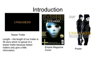
Length – the length of our trailer is
55 secs which is typical of a
teaser trailer because teaser
trailers only give a little
information.
Empire Magazine
Cover
Poster
Teaser Trailer
2. Title
Gold – Connotes
thriller because the
gold colour
represents money
which is a common
motive to commit
crimes in thriller
films.
The title –
“UNMASKED”
Represents the
battle between
good and
evil, where good
is trying to solve
a crime and
unmask the
criminals. This
connotes thriller
because of the
criminal element
within the trailer.
The font – Is New Times
Roman which gives a harsh
feel to the trailer. This
connotes the criminals lack
of empathy, which is typical
in a thriller film.
Background – the black background
represents the darkness of the plot and
the death represented in the trailer. This
connotes thriller because usually thriller
films revolve around darkness and
death.
3. Setting/Location
The house – victims
house represent the
murder scene and
the robbery that
happens later in the
trailer. This house is
seen as the main
element in the thriller
trailer.
The crime
scene tape –
this symbolises
that a crime has
been committed
which is typical
for a thriller
because thriller
plots are based
around
crime/crimes.
The body – represents that a murder has
happened and because the crime is in front
of a house (victim’s house), it symbolises
fear and uncertainty which is typical in
thriller films.
4. Costumes
The masks –
represents the
emotionless of
the criminals
because they are
represented as
faceless which
links with the title
where the “good
people” are trying
to unmask the
criminals. This is
also typical of
thriller films, good
fighting against
unknown bad
people.
The black clothes
– these
represents the
darkness of the
criminal
characters which
shows that they
are dangerous.
These characters
and costumes
are usually
featured in thriller
film. This shows
that the
characters are
more dangerous
because they act
like they have
nothing to lose
5. Props
The keys - close up of the keys
represents that the victim drop
her keys when she was
attacked. This also represents
fear because it symbolises that
she was near her home which is
personal.
The knife – the close up of the
knife with blood represents that the
knife was used in a violent crime.
This is usually typical iconography
in horror films. However, knives
are used in thrillers usually as a
secondary weapon. First weapon
typically being guns.
6. Camerawork
Two shot - this two shot of the criminals is the very
last shot of our trailer. This image comes after the title
and “coming soon” to represent that there is more to
this thriller that the audience believes . This is used in
our thriller trailer as a lasting image, the final shot that
the audience sees. This is used to entice the audience
into watching the full film, if we made one.
7. Editing (3 part structure)
Part 1 - our thriller trailer
starts off with a crime scene
and throughout the trailer we
see what has happened. This
starts off somewhere in the
middle of the full story plot
which breaks continuity. This
is typical for a trailer because
a trailer is supposed to show
the parts of the full film which
entices the audience to watch
the full film.
Part 2 – the black and
white (representing
past) shot of the victim
being killed by the 2
criminals represents
that this part is before
the first shot, breaking
continuity.
Part 3 – the final shot
represents the last part
on the 3 part structure
where two shot only
shows the main
characters, leaving
questions about the
plot. This also breaks
continuity because the
audience does not
know where this shot
will fit in the plot.
8. Captions
Caption 1 - “death
without remorse”
connotes that our
thriller plot will
have violence and
crime, which is
stereotypical of
thriller films.
Tagline – “Every action
has a price” is our thriller
tagline. This connotes
that the plot is about the
ripple effect and
consequence of the
decision that are made.
This is typical of thrillers
to have a dark tagline
which connotes bad
things will happen.
9. Key Character Traits
Criminal traits – this shot
shows that the characters
in black are
violent, ruthless criminals
that are willing to kill. This
is stereotypical in thrillers
where the criminals are
very violent and
dangerous.
Police traits – this shot represents the police
officers walking under the crime scene tape
to examine what has taken place. These
characters are represented as good fighting
against the criminals. The costumes that the
police are wearing are lighter than the
criminals, representing that they are good.
However, the costumes are still quite dark
which connotes that they have seen evil and
part of themselves may have become
corrupt.
10. Special effects
Flash from Camera – this
flash is used in our trailer
when one of the police
officers are taking pictures
of the keys and knife which
then flashbacks to how the
keys and knife got there.
Black and White – the
black and white
saturation is used in
our thriller trailer to
connote that what is
happening is in the
past.
11. Soundtrack
Hunted – the soundtrack we first chose was hunter
which sounded eerie and more like horror which did not
connotes the thriller film we were hoping to achieve.+
Slowly creep – this is the music track that we
decided for our trailer because it gave a scene of
suspense which is typical in thrillers.
12. Magazine cover
The glow around the
empire letters is
similar to “The Dark
Knight” magazine.
However, we went
with gold instead of
green to link all our
products together.
The close up of the criminals face
shares similar characteristics with
the “joker” cover because it
emphasises on the bad character
rather than on the good character.
Most empire covers doesn’t
have the masthead on top of
the image. This is where we
got the idea from to put the
masthead on top of our
image.
13. Poster
The gold title is similar to
the “Halloween” poster.
We kept the colour
scheme because the gold
represents the money that
the criminals are stealing
in part of the trailer.
We changed the
iconography
because the knife
in the “Halloween”
poster connotes
horror and we
wanted to connote
thriller. So we
changed the
weapon to a gun
which is typical
thriller
iconography. We got the idea to put
our tagline in the top
left corner because it
stands out on the white
background.