SlideShare a Scribd company logo
1 of 2
Download to read offline
Geoms - Sử dụng geom để biểu diễn các điểm dữ liệu, sử dụng các thuộc tính của aes để biểu diễn các biến. Mỗi hàm sẽ tạo ra một lớp
a <- ggplot(seals, aes(x = long, y = lat))
b <- ggplot(economics, aes(date, unemploy))
a + geom_blank()
a + geom_curve(aes(yend = lat + delta_lat,
xend = long + delta_long, curvature = z))
x, xend, y, yend, alpha, angle, color, curvature,
linetype, size
b + geom_path(lineend="butt",
linejoin="round’, linemitre=1)
x, y, alpha, color, group, linetype, size
b + geom_polygon(aes(group = group))
x, y, alpha, color, fill, group, linetype, size
a + geom_rect(aes(xmin = long, ymin = lat,
xmax= long + delta_long, ymax = lat + delta_lat))
xmax, xmin, ymax, ymin, alpha, color, fill, linetype,
size
b + geom_ribbon(aes(ymin=unemploy - 900,
ymax=unemploy + 900))
x, ymax, ymin, alpha, color, fill, group, linetype,
size
a + geom_segment(aes(yend=lat + delta_lat,
xend = long + delta_long))
x, xend, y, yend, alpha, color, linetype, size
a + geom_spoke(aes(yend = lat + delta_lat,
xend = long + delta_long))
x, y, angle, radius, alpha, color, linetype, size
Các thuộc tính hình học cơ bản
c + geom_area(stat = "bin")
x, y, alpha, color, fill, linetype, sizec +
geom_area(aes(y = ..density..), stat = "bin")
c + geom_density(kernel = "gaussian")
x, y, alpha, color, fill, group, linetype, size,
weight
c + geom_dotplot()
x, y, alpha, color, fill
c + geom_freqpoly()
x, y, alpha, color, group, linetype, size
c + geom_histogram(binwidth = 5)
x, y, alpha, color, fill, linetype, size, weight
a + geom_histogram(aes(y = ..density..))
Biến rời rạc
d <- ggplot(mpg, aes(fl))
d + geom_bar()
x, alpha, color, fill, linetype, size, weight
Biến liên tục
c <- ggplot(mpg, aes(hwy))
Biểu đồ một biến
l + geom_contour(aes(z = z))
x, y, z, alpha, colour, group, linetype, size,
weight
seals$z <- with(seals, sqrt(delta_long^2 + delta_lat^2))
l <- ggplot(seals, aes(long, lat))
l + geom_raster(aes(fill = z), hjust=0.5,
vjust=0.5, interpolate=FALSE)
x, y, alpha, fill
l + geom_tile(aes(fill = z))
x, y, alpha, color, fill, linetype, size, width
Biểu đồ ba biến
Biến X rời rạc, biến Y rời rạc
g <- ggplot(diamonds, aes(cut, color))
g + geom_count()
x, y, alpha, color, fill, shape, size, stroke
Biến X rời rạc, biến Y liên tục
f <- ggplot(mpg, aes(class, hwy))
f + geom_bar(stat = "identity")
x, y, alpha, color, fill, linetype, size, weight
f + geom_boxplot()
x, y, lower, middle, upper, ymax, ymin, alpha,
color, fill, group, linetype, shape, size, weight
f + geom_dotplot(binaxis = "y",
stackdir = "center")
x, y, alpha, color, fill, group
f + geom_violin(scale = "area")
x, y, alpha, color, fill, group, linetype, size, weight
Biến X liên tục, biến Y liên tục
e <- ggplot(mpg, aes(cty, hwy))
e + geom_label(aes(label = cty), nudge_x= 1,
nudge_y = 1, check_overlap = TRUE)
x, y, label, alpha, angle, color, family, fontface,
hjust, lineheight, size, vjust
e + geom_jitter(height = 2, width = 2)
x, y, alpha, color, fill, shape, size
e + geom_point()
x, y, alpha, color, fill, shape, size, stroke
e + geom_quantile()
x, y, alpha, color, group, linetype, size, weight
e + geom_rug(sides = "bl")
x, y, alpha, color, linetype, size
e + geom_smooth(method = lm)
x, y, alpha, color, fill, group, linetype, size,
weight
e + geom_text(aes(label = cty), nudge_x = 1,
nudge_y= 1, check_overlap = TRUE)
x, y, label, alpha, angle, color, family, fontface,
hjust, lineheight, size, vjust
A
B
C
A
B
C
Hàm liên tục
i <- ggplot(economics, aes(date, unemploy))
i + geom_area()
x, y, alpha, color, fill, linetype, size
i + geom_line()
x, y, alpha, color, group, linetype, size
i + geom_step(direction = "hv")
x, y, alpha, color, group, linetype, size
Hai biến phân phối liên tục
h <- ggplot(diamonds, aes(carat, price))
j + geom_crossbar(fatten = 2)
x, y, ymax, ymin, alpha, color, fill, group,
linetype, size
j + geom_errorbar()
x, ymax, ymin, alpha, color, group, linetype,
size, width (also geom_errorbarh())
j + geom_linerange()
x, ymin, ymax, alpha, color, group, linetype,
size
j + geom_pointrange()
x, y, ymin, ymax, alpha, color, fill, group,
linetype, shape, size
Trực quan hóa sai số
df <- data.frame(grp = c("A", "B"), fit = 4:5, se = 1:2)
j <- ggplot(df, aes(grp, fit, ymin = fit-se, ymax = fit+se))
data <- data.frame(murder = USArrests$Murder,
state = tolower(rownames(USArrests)))
map <- map_data("state")
k <- ggplot(data, aes(fill = murder))
k + geom_map(aes(map_id = state), map = map) +
expand_limits(x = map$long, y = map$lat)
map_id, alpha, color, fill, linetype, size
Bản đồ
h + geom_bin2d(binwidth = c(0.25, 500))
x, y, alpha, color, fill, linetype, size, weight
h + geom_density2d()
x, y, alpha, colour, group, linetype, size
h + geom_hex()
x, y, alpha, colour, fill, size
Biểu đồ hai biến
Kiến thức cơ bản
Vẽ biểu đồ với ggplot() hoặc qplot()
ggplot2 dựa trên khái niệm “ngữ pháp của
biểu đồ”, trong đó tất cả các biểu đồ đều có thể
được xây dựng từ những thành phần giống
nhau: data - tập dữ liệu, geoms – mô tả cách
thức thể hiện dữ liệu, và coordinate - một hệ
tọa độ.
Để hiển thị các điểm dữ liệu, cần phải sắp xếp
các biến trong dữ liệu với các thuộc tính hình
học (geom) như kích cỡ, màu sắc, trục tọa độ x
& y
ggsave("plot.png", width = 5, height = 5)
Lưu biểu đồ đã tạo gần nhất với kích thước 5’ x
5’, lưu với tên “plot.png” tại thư mục làm việc
qplot(x = cty, y = hwy, color = cyl, data = mpg, geom = "point")
Tạo một biểu đồ hoàn chỉnh với dữ liệu, geom & thuộc
tính cho trước. Hỗ trợ nhiều chế độ mặc định
ggplot(data = mpg, aes(x = cty, y = hwy))
Thêm các lớp (layer) vào biểu đồ đã tạo, hỗ trợ
nhiều loại biểu đồ hơn qplot().
ggplot(mpg, aes(hwy, cty)) +
geom_point(aes(color = cyl)) +
geom_smooth(method ="lm") +
coord_cartesian() +
scale_color_gradient() +
theme_bw()
Thêm các lớp với
dấu +
Lớp (layer) =
geom + default
stat + các thuộc
tính khác
Các thành phần
khác
Thêm lớp mới trong biểu đò với hàm geom_*()
hoặc stat_*(). Mỗi hàm sẽ xác định một
"geom", là một nhóm các thuộc tính hình học,
các tính toán mặc đinh và sự sắp xếp vị trí
trong biểu đồ.
last_plot()
Trả về biểu đồ đã tạo gần nhất
Trực quan hóa số liệu
với ggplot2
Cheat Sheet
RStudio® is a trademark of RStudio, Inc. • CC BY RStudio • info@rstudio.com • 844-448-1212 • rstudio.com Xem thêm: docs.ggplot2.org • ggplot2 2.0.0 • Updated: 12/15
Sắp xếp thuộc tính aes
Dữ liệu
Dữ liệu geom
Translator: ranalytics.vn
RStudio® is a trademark of RStudio, Inc. • CC BY RStudio • info@rstudio.com • 844-448-1212 • rstudio.com
Mỗi stat sẽ tạo thêm các biến mới ứng với các
các thuộc tính hình hình học Các biến này sử
dụng cấu trúc thông thường ..name..
Hàm stat và geom đều kết hợp một stat với một
geom để tạo một lớp (layer) mới, VD.
stat_count(geom="bar") cho ra kết quả tương tự
như geom_bar(stat="count")
Stats – cách thức khác để tạo biểu đồ
ggplot() + stat_function(aes(x = -3:3),
fun = dnorm, n = 101, args = list(sd=0.5))
x | ..x.., ..y..
e + stat_identity(na.rm = TRUE)
ggplot() + stat_qq(aes(sample=1:100), distribution = qt,
dparams = list(df=5))
sample, x, y | ..sample.., ..theoretical..
e + stat_sum()
x, y, size | ..n.., ..prop..
e + stat_summary(fun.data = "mean_cl_boot")
h + stat_summary_bin(fun.y = "mean", geom = "bar")
e + stat_unique()
i + stat_density2d(aes(fill = ..level..),
geom = "polygon", n = 100)
Biến mới tạo qua
biến đổi dữ liệu
c + stat_bin(binwidth = 1, origin = 10)
x, y | ..count.., ..ncount.., ..density.., ..ndensity..
c + stat_count(width = 1)
x, y, | ..count.., ..prop..
c + stat_density(adjust = 1, kernel = "gaussian")
x, y, | ..count.., ..density.., ..scaled..
e + stat_bin_2d(bins = 30, drop = TRUE)
x, y, fill | ..count.., ..density..
e + stat_bin_hex(bins = 30)
x, y, fill | ..count.., ..density..
e + stat_density_2d(contour = TRUE, n = 100)
x, y, color, size | ..level..
e + stat_ellipse(level = 0.95, segments = 51, type = "t")
l + stat_contour(aes(z = z))
x, y, z, order | ..level..
l + stat_summary_hex(aes(z = z), bins = 30, fun = mean)
x, y, z, fill | ..value..
l + stat_summary_2d(aes(z = z), bins = 30, fun = mean)
x, y, z, fill | ..value..
f + stat_boxplot(coef = 1.5)
x, y | ..lower.., ..middle.., ..upper.., ..width.. , ..ymin.., ..ymax..
f + stat_ydensity(adjust = 1, kernel = "gaussian", scale = "area")
x, y | ..density.., ..scaled.., ..count.., ..n.., ..violinwidth.., ..width..
e + stat_ecdf(n = 40)
x, y | ..x.., ..y..
e + stat_quantile(quantiles = c(0.25, 0.5, 0.75), formula = y
~ log(x),
method = "rq")
x, y | ..quantile..
e + stat_smooth(method = "auto", formula = y ~ x, se =
TRUE, n = 80,
fullrange = FALSE, level = 0.95)
x, y | ..se.., ..x.., ..y.., ..ymin.., ..ymax..
Biểu đồ
một biến
Biểu đồ
hai biến
Biểu đồ
ba biến
So sánh
Hàm số
Cách dùng
thông dụng
Một số biểu đồ hiển thị dữ liệu đã được biến đổi. Sử
dụng stat để lựa chọn hình thức biến đổi dữ liệu, VD.
a + geom_bar(stat = "count")
Scales – Tỷ lệ
Scales – Tỷ lệ quy định cách thức biểu đồ sắp xếp
dữ liệu với các thuộc tính hình học trên biểu đồ. Để
thay đổi cách sắp xếp này, cần thay đổi tỷ lệ.
n <- b + geom_bar(aes(fill = fl))
n
n + scale_fill_manual(
values = c("skyblue", "royalblue", "blue", "navy"),
limits = c("d", "e", "p", "r"), breaks =c("d", "e",
"p", "r"),
name = "fuel", labels = c("D", "E", "P", "R"))
scale_
aes cần
thay đổi
Sắp xếp tỷ lệ
để sử dụng
Các giá trị
thuộc tính
Khoảng giá trị cho
sắp xếp lại tỷ lệ
Tên sử dụng
cho chú giải
Nhãn sử dụng
cho chú giải
Các giá trị được
dùng cho chú giải
Cách sử dụng thường dùng
Sử dụng với các giá trị aes:
alpha, color, fill, linetype, shape, size
scale_*_continuous() – Sử dụng cho các biến liên tục
scale_*_discrete() – Sử dụng cho các biến rời rạc
scale_*_identity() – Sử dụng giá trị của tập dữ liệu
scale_*_manual(values = c()) – Sắp xếp các biến rời
rạc với các giá trị tùy biến
X and Y location scales
Màu sắc
Hình dạng
Kích cỡ
Sử dụng với các thuộc tính của trục x hoặc y
(phần dưới đây chỉ mô tả trục hoành x)
scale_x_date(date_labels = "%m/%d"),
date_breaks = "2 weeks") - Coi x như biến ngày
tháng.Xem thêm ?strptime về nhãn (label)
scale_x_datetime() - Coi x như biến ngày tháng, sử
dụng các tham số như scale_x_date()
scale_x_log10() – Thê hiện x với tỷ lệ log10
scale_x_reverse() – Giữ nguyên hướng của trục x
scale_x_sqrt() – Thể hiện x với tỷ lệ căn bậc hai
Biến rời rạc Biến liên tục
n <- d + geom_bar(
aes(fill = fl))
o <- c + geom_dotplot(
aes(fill = ..x..))
n + scale_fill_brewer(
palette = "Blues")
Lựa chọn bảng màu:
library(RColorBrewer)
display.brewer.all()
n + scale_fill_grey(
start = 0.2, end = 0.8,
na.value = "red")
o + scale_fill_gradient(
low = "red",
high = "yellow")
o + scale_fill_gradient2(
low = "red", high = "blue",
mid = "white", midpoint = 25)
o + scale_fill_gradientn(
colours = terrain.colors(6))
Xem thêm: rainbow(),
heat.colors(), topo.colors(),
cm.colors(),
RColorBrewer::brewer.pal()
p <- e + geom_point(
aes(shape = fl, size = cyl))
p + scale_shape(
solid = FALSE)
p + scale_shape_manual(
values = c(3:7))
Gía trị thuộc tính hình dạng
trong bảng bên
Giá trị thuộc tính hình dạng
p + scale_size_area(
max_scale = 6)
Kích cỡ dạng tròn
p + scale_radius(
range=c(1,6))
p + scale_size()
r + coord_cartesian(xlim = c(0, 5))
xlim, ylim
Hệ tọa độ Đề-các mặc định
r + coord_fixed(ratio = 1/2)
ratio, xlim, ylim
Hệ tọa độ Đề-các, tỷ lệ x và y cố định
r + coord_flip()
xlim, ylim
Đổi trục tọa độ
r + coord_polar(theta = "x",
direction=1 )
theta, start, direction
Hệ tọa độ cực
r + coord_trans(ytrans = "sqrt")
xtrans, ytrans, limx, limy
Biến đổi hệ tọa độ Đề-các,
r <- d + geom_bar()
π + coord_map(projection = "ortho",
orientation=c(41, -74, 0))
projection, orientation, xlim, ylim
Sử dụng packages mapproj (mercator (mặc định),
azequalarea, lagrange,...)
Coordinate – Hệ tọa độ
Translator: ranalytics.vn
s + geom_bar(position = "dodge")
Đặt các giá trị cạnh nhau
s + geom_bar(position = "fill")
Đặt các giá trị chồng lên nhau, thay đổi tỷ
lệ theo phần trăm
e + geom_point(position = "jitter")
Thêm các yếu tố ngẫu nhiên (random
noise) để tránh chống lấn các điểm trên
biểu đồ
e + geom_label(position = "nudge")
Đặt các nhãn bên cạnh các điểm
s + geom_bar(position = "stack")
Đặt các giá trị chồng lên nhau
s <- ggplot(mpg, aes(fl, fill = drv))
Cách thức sắp xếp các thuộc tính hình học
(geom) trên biểu đồ
Vị trí trong biểu đồ có thể được thay đổi lại thành một
hàm với các tham số của chiều dài và chiều rộng
s + geom_bar(position = position_dodge(width = 1))
A
B
Điều chỉnh vị trí
t + coord_cartesian(
xlim = c(0, 100), ylim = c(10, 20))
Thay đổi dữ liệu
(Loại bỏ các dữ liệu ngoài vùng phân tích)
t + xlim(0, 100) + ylim(10, 20)
t + scale_x_continuous(limits = c(0, 100))
+ scale_y_continuous(limits = c(0, 100))
Không thay đổi dữ liệu (Nên dùng)
Zooming – Phóng tó biểu đồ
n + theme(legend.position = "bottom")
Thay đổi vị trí chú giải: ”up”,“bottom”, “right”,”left”
n + guides(fill = "none")
Quy đinh chú giải cho mỗi thuộc tính: colorbar,
legend, hoặc “none" (không để chú giải)
n + scale_fill_discrete(name = "Title",
labels = c("A", "B", "C", "D", "E"))
Sử dụng hàm tỷ lệ (scale) cho tiêu đề & nhãn trong
chú giải
Chú giải
t <- ggplot(mpg, aes(cty, hwy)) + geom_point()
Chia nhỏ biểu đồ dựa trên giá trị của một hoặc
nhiều biến rời rạc
t + facet_grid(. ~ fl)
Cột chứa biến fl
t + facet_grid(year ~ .)
Hàng chưa biến year
t + facet_grid(year ~ fl)
Chia nhỏ biểu đồ theo cả hàng và cột
t + facet_wrap(~ fl)
Tự động sắp xếp biểu đồ
Quy định tỷ lệ để giới hạn các trục của biểu đồ
khi sử dụng facet
t + facet_grid(drv ~ fl, scales = "free")
Giới hạn trục x & y theo từng biểu đồ
• "free_x" – Tự động điều chỉnh giới hạn trục x
• "free_y" – Tự động điều chỉnh giới hạn trục y
Đặt nhãn, tiêu đồ cho các biểu đồ khi dùng facet
t + facet_grid(. ~ fl, labeller = label_both)
t + facet_grid(fl ~ ., labeller = label_bquote(alpha ^ .(fl)))
t + facet_grid(. ~ fl, labeller = label_parsed)
fl: c fl: d fl: e fl: p fl: r
c d e p r
Hàm stat aes
geom Tham số
Faceting – Chia nhỏ biểu đồ
t + ggtitle("New Plot Title")
Thêm tên biểu đồ
t + xlab("New X label")
Thay đổi tên trục x
t + ylab("New Y label")
Thay đổi tên trục y
t + labs(title =" New title", x = "New x",
y = "New y")
Thay đổi tên biểu đồ và các trục x, y
Sử dụng các hàm tỷ
lệ (scale) để thay đổi,
cập nhật các chú giải
Labels – Tiêu đề & nhãn
r + theme_classic()
Nền classic
r + theme_minimal()
Nền minimal
r + theme_void()
Để trống hình nền
r + theme_bw()
Nền trắng
r + theme_gray()
Nền xám (theme
mặc định)
r + theme_dark()
Nền tối
Themes – Hình nền trong biểu đồ
Xem thêm: docs.ggplot2.org • ggplot2 2.0.0 • Updated: 12/15

More Related Content

Featured

Social Media Marketing Trends 2024 // The Global Indie Insights
Social Media Marketing Trends 2024 // The Global Indie InsightsSocial Media Marketing Trends 2024 // The Global Indie Insights
Social Media Marketing Trends 2024 // The Global Indie Insights
Kurio // The Social Media Age(ncy)
 

Featured (20)

Skeleton Culture Code
Skeleton Culture CodeSkeleton Culture Code
Skeleton Culture Code
 
PEPSICO Presentation to CAGNY Conference Feb 2024
PEPSICO Presentation to CAGNY Conference Feb 2024PEPSICO Presentation to CAGNY Conference Feb 2024
PEPSICO Presentation to CAGNY Conference Feb 2024
 
Content Methodology: A Best Practices Report (Webinar)
Content Methodology: A Best Practices Report (Webinar)Content Methodology: A Best Practices Report (Webinar)
Content Methodology: A Best Practices Report (Webinar)
 
How to Prepare For a Successful Job Search for 2024
How to Prepare For a Successful Job Search for 2024How to Prepare For a Successful Job Search for 2024
How to Prepare For a Successful Job Search for 2024
 
Social Media Marketing Trends 2024 // The Global Indie Insights
Social Media Marketing Trends 2024 // The Global Indie InsightsSocial Media Marketing Trends 2024 // The Global Indie Insights
Social Media Marketing Trends 2024 // The Global Indie Insights
 
Trends In Paid Search: Navigating The Digital Landscape In 2024
Trends In Paid Search: Navigating The Digital Landscape In 2024Trends In Paid Search: Navigating The Digital Landscape In 2024
Trends In Paid Search: Navigating The Digital Landscape In 2024
 
5 Public speaking tips from TED - Visualized summary
5 Public speaking tips from TED - Visualized summary5 Public speaking tips from TED - Visualized summary
5 Public speaking tips from TED - Visualized summary
 
ChatGPT and the Future of Work - Clark Boyd
ChatGPT and the Future of Work - Clark Boyd ChatGPT and the Future of Work - Clark Boyd
ChatGPT and the Future of Work - Clark Boyd
 
Getting into the tech field. what next
Getting into the tech field. what next Getting into the tech field. what next
Getting into the tech field. what next
 
Google's Just Not That Into You: Understanding Core Updates & Search Intent
Google's Just Not That Into You: Understanding Core Updates & Search IntentGoogle's Just Not That Into You: Understanding Core Updates & Search Intent
Google's Just Not That Into You: Understanding Core Updates & Search Intent
 
How to have difficult conversations
How to have difficult conversations How to have difficult conversations
How to have difficult conversations
 
Introduction to Data Science
Introduction to Data ScienceIntroduction to Data Science
Introduction to Data Science
 
Time Management & Productivity - Best Practices
Time Management & Productivity -  Best PracticesTime Management & Productivity -  Best Practices
Time Management & Productivity - Best Practices
 
The six step guide to practical project management
The six step guide to practical project managementThe six step guide to practical project management
The six step guide to practical project management
 
Beginners Guide to TikTok for Search - Rachel Pearson - We are Tilt __ Bright...
Beginners Guide to TikTok for Search - Rachel Pearson - We are Tilt __ Bright...Beginners Guide to TikTok for Search - Rachel Pearson - We are Tilt __ Bright...
Beginners Guide to TikTok for Search - Rachel Pearson - We are Tilt __ Bright...
 
Unlocking the Power of ChatGPT and AI in Testing - A Real-World Look, present...
Unlocking the Power of ChatGPT and AI in Testing - A Real-World Look, present...Unlocking the Power of ChatGPT and AI in Testing - A Real-World Look, present...
Unlocking the Power of ChatGPT and AI in Testing - A Real-World Look, present...
 
12 Ways to Increase Your Influence at Work
12 Ways to Increase Your Influence at Work12 Ways to Increase Your Influence at Work
12 Ways to Increase Your Influence at Work
 
ChatGPT webinar slides
ChatGPT webinar slidesChatGPT webinar slides
ChatGPT webinar slides
 
More than Just Lines on a Map: Best Practices for U.S Bike Routes
More than Just Lines on a Map: Best Practices for U.S Bike RoutesMore than Just Lines on a Map: Best Practices for U.S Bike Routes
More than Just Lines on a Map: Best Practices for U.S Bike Routes
 
Ride the Storm: Navigating Through Unstable Periods / Katerina Rudko (Belka G...
Ride the Storm: Navigating Through Unstable Periods / Katerina Rudko (Belka G...Ride the Storm: Navigating Through Unstable Periods / Katerina Rudko (Belka G...
Ride the Storm: Navigating Through Unstable Periods / Katerina Rudko (Belka G...
 

data-visualization_vi.pdf

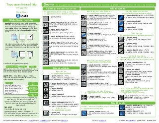
  • 1. Geoms - Sử dụng geom để biểu diễn các điểm dữ liệu, sử dụng các thuộc tính của aes để biểu diễn các biến. Mỗi hàm sẽ tạo ra một lớp a <- ggplot(seals, aes(x = long, y = lat)) b <- ggplot(economics, aes(date, unemploy)) a + geom_blank() a + geom_curve(aes(yend = lat + delta_lat, xend = long + delta_long, curvature = z)) x, xend, y, yend, alpha, angle, color, curvature, linetype, size b + geom_path(lineend="butt", linejoin="round’, linemitre=1) x, y, alpha, color, group, linetype, size b + geom_polygon(aes(group = group)) x, y, alpha, color, fill, group, linetype, size a + geom_rect(aes(xmin = long, ymin = lat, xmax= long + delta_long, ymax = lat + delta_lat)) xmax, xmin, ymax, ymin, alpha, color, fill, linetype, size b + geom_ribbon(aes(ymin=unemploy - 900, ymax=unemploy + 900)) x, ymax, ymin, alpha, color, fill, group, linetype, size a + geom_segment(aes(yend=lat + delta_lat, xend = long + delta_long)) x, xend, y, yend, alpha, color, linetype, size a + geom_spoke(aes(yend = lat + delta_lat, xend = long + delta_long)) x, y, angle, radius, alpha, color, linetype, size Các thuộc tính hình học cơ bản c + geom_area(stat = "bin") x, y, alpha, color, fill, linetype, sizec + geom_area(aes(y = ..density..), stat = "bin") c + geom_density(kernel = "gaussian") x, y, alpha, color, fill, group, linetype, size, weight c + geom_dotplot() x, y, alpha, color, fill c + geom_freqpoly() x, y, alpha, color, group, linetype, size c + geom_histogram(binwidth = 5) x, y, alpha, color, fill, linetype, size, weight a + geom_histogram(aes(y = ..density..)) Biến rời rạc d <- ggplot(mpg, aes(fl)) d + geom_bar() x, alpha, color, fill, linetype, size, weight Biến liên tục c <- ggplot(mpg, aes(hwy)) Biểu đồ một biến l + geom_contour(aes(z = z)) x, y, z, alpha, colour, group, linetype, size, weight seals$z <- with(seals, sqrt(delta_long^2 + delta_lat^2)) l <- ggplot(seals, aes(long, lat)) l + geom_raster(aes(fill = z), hjust=0.5, vjust=0.5, interpolate=FALSE) x, y, alpha, fill l + geom_tile(aes(fill = z)) x, y, alpha, color, fill, linetype, size, width Biểu đồ ba biến Biến X rời rạc, biến Y rời rạc g <- ggplot(diamonds, aes(cut, color)) g + geom_count() x, y, alpha, color, fill, shape, size, stroke Biến X rời rạc, biến Y liên tục f <- ggplot(mpg, aes(class, hwy)) f + geom_bar(stat = "identity") x, y, alpha, color, fill, linetype, size, weight f + geom_boxplot() x, y, lower, middle, upper, ymax, ymin, alpha, color, fill, group, linetype, shape, size, weight f + geom_dotplot(binaxis = "y", stackdir = "center") x, y, alpha, color, fill, group f + geom_violin(scale = "area") x, y, alpha, color, fill, group, linetype, size, weight Biến X liên tục, biến Y liên tục e <- ggplot(mpg, aes(cty, hwy)) e + geom_label(aes(label = cty), nudge_x= 1, nudge_y = 1, check_overlap = TRUE) x, y, label, alpha, angle, color, family, fontface, hjust, lineheight, size, vjust e + geom_jitter(height = 2, width = 2) x, y, alpha, color, fill, shape, size e + geom_point() x, y, alpha, color, fill, shape, size, stroke e + geom_quantile() x, y, alpha, color, group, linetype, size, weight e + geom_rug(sides = "bl") x, y, alpha, color, linetype, size e + geom_smooth(method = lm) x, y, alpha, color, fill, group, linetype, size, weight e + geom_text(aes(label = cty), nudge_x = 1, nudge_y= 1, check_overlap = TRUE) x, y, label, alpha, angle, color, family, fontface, hjust, lineheight, size, vjust A B C A B C Hàm liên tục i <- ggplot(economics, aes(date, unemploy)) i + geom_area() x, y, alpha, color, fill, linetype, size i + geom_line() x, y, alpha, color, group, linetype, size i + geom_step(direction = "hv") x, y, alpha, color, group, linetype, size Hai biến phân phối liên tục h <- ggplot(diamonds, aes(carat, price)) j + geom_crossbar(fatten = 2) x, y, ymax, ymin, alpha, color, fill, group, linetype, size j + geom_errorbar() x, ymax, ymin, alpha, color, group, linetype, size, width (also geom_errorbarh()) j + geom_linerange() x, ymin, ymax, alpha, color, group, linetype, size j + geom_pointrange() x, y, ymin, ymax, alpha, color, fill, group, linetype, shape, size Trực quan hóa sai số df <- data.frame(grp = c("A", "B"), fit = 4:5, se = 1:2) j <- ggplot(df, aes(grp, fit, ymin = fit-se, ymax = fit+se)) data <- data.frame(murder = USArrests$Murder, state = tolower(rownames(USArrests))) map <- map_data("state") k <- ggplot(data, aes(fill = murder)) k + geom_map(aes(map_id = state), map = map) + expand_limits(x = map$long, y = map$lat) map_id, alpha, color, fill, linetype, size Bản đồ h + geom_bin2d(binwidth = c(0.25, 500)) x, y, alpha, color, fill, linetype, size, weight h + geom_density2d() x, y, alpha, colour, group, linetype, size h + geom_hex() x, y, alpha, colour, fill, size Biểu đồ hai biến Kiến thức cơ bản Vẽ biểu đồ với ggplot() hoặc qplot() ggplot2 dựa trên khái niệm “ngữ pháp của biểu đồ”, trong đó tất cả các biểu đồ đều có thể được xây dựng từ những thành phần giống nhau: data - tập dữ liệu, geoms – mô tả cách thức thể hiện dữ liệu, và coordinate - một hệ tọa độ. Để hiển thị các điểm dữ liệu, cần phải sắp xếp các biến trong dữ liệu với các thuộc tính hình học (geom) như kích cỡ, màu sắc, trục tọa độ x & y ggsave("plot.png", width = 5, height = 5) Lưu biểu đồ đã tạo gần nhất với kích thước 5’ x 5’, lưu với tên “plot.png” tại thư mục làm việc qplot(x = cty, y = hwy, color = cyl, data = mpg, geom = "point") Tạo một biểu đồ hoàn chỉnh với dữ liệu, geom & thuộc tính cho trước. Hỗ trợ nhiều chế độ mặc định ggplot(data = mpg, aes(x = cty, y = hwy)) Thêm các lớp (layer) vào biểu đồ đã tạo, hỗ trợ nhiều loại biểu đồ hơn qplot(). ggplot(mpg, aes(hwy, cty)) + geom_point(aes(color = cyl)) + geom_smooth(method ="lm") + coord_cartesian() + scale_color_gradient() + theme_bw() Thêm các lớp với dấu + Lớp (layer) = geom + default stat + các thuộc tính khác Các thành phần khác Thêm lớp mới trong biểu đò với hàm geom_*() hoặc stat_*(). Mỗi hàm sẽ xác định một "geom", là một nhóm các thuộc tính hình học, các tính toán mặc đinh và sự sắp xếp vị trí trong biểu đồ. last_plot() Trả về biểu đồ đã tạo gần nhất Trực quan hóa số liệu với ggplot2 Cheat Sheet RStudio® is a trademark of RStudio, Inc. • CC BY RStudio • info@rstudio.com • 844-448-1212 • rstudio.com Xem thêm: docs.ggplot2.org • ggplot2 2.0.0 • Updated: 12/15 Sắp xếp thuộc tính aes Dữ liệu Dữ liệu geom Translator: ranalytics.vn
  • 2. RStudio® is a trademark of RStudio, Inc. • CC BY RStudio • info@rstudio.com • 844-448-1212 • rstudio.com Mỗi stat sẽ tạo thêm các biến mới ứng với các các thuộc tính hình hình học Các biến này sử dụng cấu trúc thông thường ..name.. Hàm stat và geom đều kết hợp một stat với một geom để tạo một lớp (layer) mới, VD. stat_count(geom="bar") cho ra kết quả tương tự như geom_bar(stat="count") Stats – cách thức khác để tạo biểu đồ ggplot() + stat_function(aes(x = -3:3), fun = dnorm, n = 101, args = list(sd=0.5)) x | ..x.., ..y.. e + stat_identity(na.rm = TRUE) ggplot() + stat_qq(aes(sample=1:100), distribution = qt, dparams = list(df=5)) sample, x, y | ..sample.., ..theoretical.. e + stat_sum() x, y, size | ..n.., ..prop.. e + stat_summary(fun.data = "mean_cl_boot") h + stat_summary_bin(fun.y = "mean", geom = "bar") e + stat_unique() i + stat_density2d(aes(fill = ..level..), geom = "polygon", n = 100) Biến mới tạo qua biến đổi dữ liệu c + stat_bin(binwidth = 1, origin = 10) x, y | ..count.., ..ncount.., ..density.., ..ndensity.. c + stat_count(width = 1) x, y, | ..count.., ..prop.. c + stat_density(adjust = 1, kernel = "gaussian") x, y, | ..count.., ..density.., ..scaled.. e + stat_bin_2d(bins = 30, drop = TRUE) x, y, fill | ..count.., ..density.. e + stat_bin_hex(bins = 30) x, y, fill | ..count.., ..density.. e + stat_density_2d(contour = TRUE, n = 100) x, y, color, size | ..level.. e + stat_ellipse(level = 0.95, segments = 51, type = "t") l + stat_contour(aes(z = z)) x, y, z, order | ..level.. l + stat_summary_hex(aes(z = z), bins = 30, fun = mean) x, y, z, fill | ..value.. l + stat_summary_2d(aes(z = z), bins = 30, fun = mean) x, y, z, fill | ..value.. f + stat_boxplot(coef = 1.5) x, y | ..lower.., ..middle.., ..upper.., ..width.. , ..ymin.., ..ymax.. f + stat_ydensity(adjust = 1, kernel = "gaussian", scale = "area") x, y | ..density.., ..scaled.., ..count.., ..n.., ..violinwidth.., ..width.. e + stat_ecdf(n = 40) x, y | ..x.., ..y.. e + stat_quantile(quantiles = c(0.25, 0.5, 0.75), formula = y ~ log(x), method = "rq") x, y | ..quantile.. e + stat_smooth(method = "auto", formula = y ~ x, se = TRUE, n = 80, fullrange = FALSE, level = 0.95) x, y | ..se.., ..x.., ..y.., ..ymin.., ..ymax.. Biểu đồ một biến Biểu đồ hai biến Biểu đồ ba biến So sánh Hàm số Cách dùng thông dụng Một số biểu đồ hiển thị dữ liệu đã được biến đổi. Sử dụng stat để lựa chọn hình thức biến đổi dữ liệu, VD. a + geom_bar(stat = "count") Scales – Tỷ lệ Scales – Tỷ lệ quy định cách thức biểu đồ sắp xếp dữ liệu với các thuộc tính hình học trên biểu đồ. Để thay đổi cách sắp xếp này, cần thay đổi tỷ lệ. n <- b + geom_bar(aes(fill = fl)) n n + scale_fill_manual( values = c("skyblue", "royalblue", "blue", "navy"), limits = c("d", "e", "p", "r"), breaks =c("d", "e", "p", "r"), name = "fuel", labels = c("D", "E", "P", "R")) scale_ aes cần thay đổi Sắp xếp tỷ lệ để sử dụng Các giá trị thuộc tính Khoảng giá trị cho sắp xếp lại tỷ lệ Tên sử dụng cho chú giải Nhãn sử dụng cho chú giải Các giá trị được dùng cho chú giải Cách sử dụng thường dùng Sử dụng với các giá trị aes: alpha, color, fill, linetype, shape, size scale_*_continuous() – Sử dụng cho các biến liên tục scale_*_discrete() – Sử dụng cho các biến rời rạc scale_*_identity() – Sử dụng giá trị của tập dữ liệu scale_*_manual(values = c()) – Sắp xếp các biến rời rạc với các giá trị tùy biến X and Y location scales Màu sắc Hình dạng Kích cỡ Sử dụng với các thuộc tính của trục x hoặc y (phần dưới đây chỉ mô tả trục hoành x) scale_x_date(date_labels = "%m/%d"), date_breaks = "2 weeks") - Coi x như biến ngày tháng.Xem thêm ?strptime về nhãn (label) scale_x_datetime() - Coi x như biến ngày tháng, sử dụng các tham số như scale_x_date() scale_x_log10() – Thê hiện x với tỷ lệ log10 scale_x_reverse() – Giữ nguyên hướng của trục x scale_x_sqrt() – Thể hiện x với tỷ lệ căn bậc hai Biến rời rạc Biến liên tục n <- d + geom_bar( aes(fill = fl)) o <- c + geom_dotplot( aes(fill = ..x..)) n + scale_fill_brewer( palette = "Blues") Lựa chọn bảng màu: library(RColorBrewer) display.brewer.all() n + scale_fill_grey( start = 0.2, end = 0.8, na.value = "red") o + scale_fill_gradient( low = "red", high = "yellow") o + scale_fill_gradient2( low = "red", high = "blue", mid = "white", midpoint = 25) o + scale_fill_gradientn( colours = terrain.colors(6)) Xem thêm: rainbow(), heat.colors(), topo.colors(), cm.colors(), RColorBrewer::brewer.pal() p <- e + geom_point( aes(shape = fl, size = cyl)) p + scale_shape( solid = FALSE) p + scale_shape_manual( values = c(3:7)) Gía trị thuộc tính hình dạng trong bảng bên Giá trị thuộc tính hình dạng p + scale_size_area( max_scale = 6) Kích cỡ dạng tròn p + scale_radius( range=c(1,6)) p + scale_size() r + coord_cartesian(xlim = c(0, 5)) xlim, ylim Hệ tọa độ Đề-các mặc định r + coord_fixed(ratio = 1/2) ratio, xlim, ylim Hệ tọa độ Đề-các, tỷ lệ x và y cố định r + coord_flip() xlim, ylim Đổi trục tọa độ r + coord_polar(theta = "x", direction=1 ) theta, start, direction Hệ tọa độ cực r + coord_trans(ytrans = "sqrt") xtrans, ytrans, limx, limy Biến đổi hệ tọa độ Đề-các, r <- d + geom_bar() π + coord_map(projection = "ortho", orientation=c(41, -74, 0)) projection, orientation, xlim, ylim Sử dụng packages mapproj (mercator (mặc định), azequalarea, lagrange,...) Coordinate – Hệ tọa độ Translator: ranalytics.vn s + geom_bar(position = "dodge") Đặt các giá trị cạnh nhau s + geom_bar(position = "fill") Đặt các giá trị chồng lên nhau, thay đổi tỷ lệ theo phần trăm e + geom_point(position = "jitter") Thêm các yếu tố ngẫu nhiên (random noise) để tránh chống lấn các điểm trên biểu đồ e + geom_label(position = "nudge") Đặt các nhãn bên cạnh các điểm s + geom_bar(position = "stack") Đặt các giá trị chồng lên nhau s <- ggplot(mpg, aes(fl, fill = drv)) Cách thức sắp xếp các thuộc tính hình học (geom) trên biểu đồ Vị trí trong biểu đồ có thể được thay đổi lại thành một hàm với các tham số của chiều dài và chiều rộng s + geom_bar(position = position_dodge(width = 1)) A B Điều chỉnh vị trí t + coord_cartesian( xlim = c(0, 100), ylim = c(10, 20)) Thay đổi dữ liệu (Loại bỏ các dữ liệu ngoài vùng phân tích) t + xlim(0, 100) + ylim(10, 20) t + scale_x_continuous(limits = c(0, 100)) + scale_y_continuous(limits = c(0, 100)) Không thay đổi dữ liệu (Nên dùng) Zooming – Phóng tó biểu đồ n + theme(legend.position = "bottom") Thay đổi vị trí chú giải: ”up”,“bottom”, “right”,”left” n + guides(fill = "none") Quy đinh chú giải cho mỗi thuộc tính: colorbar, legend, hoặc “none" (không để chú giải) n + scale_fill_discrete(name = "Title", labels = c("A", "B", "C", "D", "E")) Sử dụng hàm tỷ lệ (scale) cho tiêu đề & nhãn trong chú giải Chú giải t <- ggplot(mpg, aes(cty, hwy)) + geom_point() Chia nhỏ biểu đồ dựa trên giá trị của một hoặc nhiều biến rời rạc t + facet_grid(. ~ fl) Cột chứa biến fl t + facet_grid(year ~ .) Hàng chưa biến year t + facet_grid(year ~ fl) Chia nhỏ biểu đồ theo cả hàng và cột t + facet_wrap(~ fl) Tự động sắp xếp biểu đồ Quy định tỷ lệ để giới hạn các trục của biểu đồ khi sử dụng facet t + facet_grid(drv ~ fl, scales = "free") Giới hạn trục x & y theo từng biểu đồ • "free_x" – Tự động điều chỉnh giới hạn trục x • "free_y" – Tự động điều chỉnh giới hạn trục y Đặt nhãn, tiêu đồ cho các biểu đồ khi dùng facet t + facet_grid(. ~ fl, labeller = label_both) t + facet_grid(fl ~ ., labeller = label_bquote(alpha ^ .(fl))) t + facet_grid(. ~ fl, labeller = label_parsed) fl: c fl: d fl: e fl: p fl: r c d e p r Hàm stat aes geom Tham số Faceting – Chia nhỏ biểu đồ t + ggtitle("New Plot Title") Thêm tên biểu đồ t + xlab("New X label") Thay đổi tên trục x t + ylab("New Y label") Thay đổi tên trục y t + labs(title =" New title", x = "New x", y = "New y") Thay đổi tên biểu đồ và các trục x, y Sử dụng các hàm tỷ lệ (scale) để thay đổi, cập nhật các chú giải Labels – Tiêu đề & nhãn r + theme_classic() Nền classic r + theme_minimal() Nền minimal r + theme_void() Để trống hình nền r + theme_bw() Nền trắng r + theme_gray() Nền xám (theme mặc định) r + theme_dark() Nền tối Themes – Hình nền trong biểu đồ Xem thêm: docs.ggplot2.org • ggplot2 2.0.0 • Updated: 12/15