Data visualization - Courtland Jeffrey - Phoenix NewsTrain - 4.07.18
•
0 likes•29 views

Courtland Jeffrey prepared this handout for journalists attending APME's Phoenix NewsTrain on April 6-7, 2018. In it, he gives an overview of different websites to use to create maps and charts. In particular, he discusses using Google My Maps and Infogram. Jeffrey is a data visualizer at KNXV-ABC15 in Phoenix. It accompanies his presentation called, "Create your own simple graphics." NewsTrain is a training initiative of Associated Press Media Editors (APME). More info: http://bit.ly/NewsTrain

Recommended
More Related Content
Similar to Data visualization - Courtland Jeffrey - Phoenix NewsTrain - 4.07.18
Similar to Data visualization - Courtland Jeffrey - Phoenix NewsTrain - 4.07.18 (20)
More from News Leaders Association's NewsTrain
More from News Leaders Association's NewsTrain (20)
Recently uploaded
Recently uploaded (20)
Data visualization - Courtland Jeffrey - Phoenix NewsTrain - 4.07.18
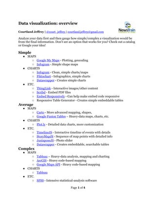
- 1. Page 1 of 4 Data visualization: overview Courtland Jeffrey | @court_jeffrey | courtland.jeffrey@gmail.com Analyze your data first and then gauge how simple/complex a visualization would be from the final information. Don’t see an option that works for you? Check out a catalog or Google your idea! Simple ● MAPS ○ Google My Maps - Plotting, geocoding ○ Infogram - Simple shape maps ● CHARTS ○ Infogram - Clean, simple charts/maps ○ Piktochart - Infographics, simple charts ○ Datawrapper - Creates simple charts ● ETC. ○ ThingLink - Interactive images/other content ○ Scribd - Embed PDF files ○ Embed Responsively - Can help make embed code responsive ○ Responsive Table Generator - Creates simple embeddable tables Average ● MAPS ○ Carto - More advanced mapping, shapes, ○ Google Fusion Tables – Heavy-data maps, charts, etc. ● CHARTS ○ Plot.ly - Detailed data charts, more customization ● ETC. ○ TimelineJS - Interactive timeline of events with details ○ StoryMapJS - Sequence of map points with detailed info ○ JuxtaposeJS - Photo slider ○ Datawrapper - Creates embeddable, searchable tables Complex ● MAPS ○ Tableau – Heavy-data analysis, mapping and charting ○ ArcGIS - Heavy code-based mapping ○ Google Maps API - Heavy code-based mapping ● CHARTS ○ Tableau ● ETC. ○ SPSS - Intensive statistical-analysis software
- 2. Page 2 of 4 ○ SQL - Higher-level data-analysis tools ○ Unity - VR software engine Catalogs ● Journalist’s Toolbox ● Digitalstory.tools
- 3. Page 3 of 4 Data visualization: maps Overview Interactive maps help tell the story using location and geography. Maps can be useful with just a couple of points plotted or with multiple layers of heavy data. Popular mapping tools 1. Google My Maps 2. Carto 3. ArcGIS Creating a Google My Maps map 1. Log into your Google account. 2. Go to the Google My Maps website. 3. Create a new map. 4. Begin adding to the map in one of a few ways: a. Search for locations. b. Manually plot points. c. Draw regions. 5. Customize map: change map icons, region colors, icon details, etc. 6. Source map’s data, if necessary. Publishing a Google My Maps map 1. Click on the “share” button. 2. Click on “Change…” under “Who has Access.” 3. Change the setting from “private” to “on - public on the web” and click save. 4. Click “done.” 5. Click on the 3 dots in the upper right of the menu and choose “embed on my site.”
- 4. Page 4 of 4 Data visualization: charts Overview Interactive charts help tell the story by utilizing and displaying detailed data in a digestible manner. Charts can be a useful way to elaborate on statistics and add interactivity to a story without overwhelming the audience. Popular chart/infographic tools 1. Piktochart (Infographics/charts)- piktochart.com 2. Infogram (Infographics/charts)- infogram.com 3. Plotly (charts)- plot.ly Key creation elements 1. Valid data/information 2. Purpose for the information (what do you want to show the audience?) 3. SOURCING SOURCING SOURCING Creating an Infogram chart/infographic 1. Create a new chart in Infogram and title your project. 2. Select a chart option from the side menu. 3. Choose “edit data” on the right-side menu, then import/copy over data. 4. In “settings” right-side menu, change chart properties. 5. Add title, sourcing. 6. Share/embed your project. Example data 1. Largest wildfires: https://goo.gl/x9TK1S