july-15-2015-presentation
•
0 likes•137 views

Mobile device usage has dramatically increased, with 64% of American adults now owning smartphones. Websites and emails need to be optimized for mobile to have the best chance of engagement. A/B testing of website designs for a nonprofit found that simplifying the message and calls-to-action increased conversions by over 100%. Proper design helps ensure organizations make a good first impression on mobile and that users have a positive experience.

Recommended
Recommended
More Related Content
What's hot
What's hot (20)
Viewers also liked
Similar to july-15-2015-presentation
Similar to july-15-2015-presentation (20)
july-15-2015-presentation
- 2. Marisa Porter Meg Delagrange web architect creative director @virtuallymarisa @coloringspirit
- 3. First, let us take a group selfie. #humansareawesome Stand up and put your hands in the air
- 4. The Extent of Mobile Use A Case Study Or Two Power up With Design
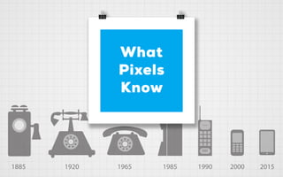
- 5. 64% of American adults now own a smartphone of some kind, up from 35% in the spring of 2011. For many, these devices are a key entry point to the online world. /The Pew Report
- 6. 64% of American adults now own a smartphone of some kind, up from 35% in the spring of 2011. For many, these devices are a key entry point to the online world. /The Pew Report 67% use their phone to share pictures, videos, or commentary about events happening in their community, with 35% doing so frequently. /The Pew Report
- 7. 70% of mobile searches lead to action on websites within one hour. That’s assuming that the website is mobile-friendly, otherwise 40% will choose another result. /TechCrunch Report 72% of web page views are on smartphones. People searching online using a smartphone will increase from 800 million to 1.9 billion users in 2015. /Business2Community Report 70% A Few Mobile Search Statistics
- 8. 75% of Gmail users access their accounts on mobile devices. Gmail now has 900 million users. /Google Report 91% of consumers check their email at least once per day on their smartphone, making it the most used functionality. /ExactTarget “Mobile Behavior Report If an email does not display correctly, 71.2% will delete it immediately. 91% 75% 71% A Few Responsive Email Statistics
- 9. You have 3-5 seconds on mobile to get a user’s attention. 55% of visitors spend fewer than 15 seconds on your website. Every second counts.
- 10. 48% of users say that if they arrive on an organization’s site that isn’t working well on mobile, they take it as an indication of the organization simply not caring. /MarginMedia ?
- 11. Customers are five times more likely to visit a competitor after having a frustrating mobile experience. /npENGAGE 5x
- 12. Mobile Giving is Growing Among 343 nonprofits studied, an average of 9.5 percent of donations came via mobile devices. For the top one-fourth of nonprofits with the highest mobile-to-desktop giving ratio, that average climbed to 17.8 percent.
- 13. 47% of donors give up because the online journey is too cumbersome and complicated.
- 14. “If you’ve created an urgency for your donors to act, don’t let a conversion slip away because your website is not optimized for mobile.” /npENGAGE
- 15. Let’s talk about design.
- 16. First impressions are 94% design-related. 94%
- 17. Visuals are processed 60,000X faster in the brain than text.
- 18. This allows viewers to make their own decisions without feeling pressure from your organizations. Visuals show your mission without telling people about it.
- 19. This breaks through the overwhelming clutter of online content. Good design expresses ideas quickly - in a snapshot.
- 20. Building thoughtful websites with clear intentions shows that you care, makes choices more comfortable, and leads to a better overall experience.
- 21. It’s been found that 68% of users who give up did so because they think you don’t care about them. (Which we know isn’t true!)
- 22. People engage with attractive, newsworthy content. 53% of what people share on social media are news articles and blog posts. 60% of people are more likely to click on an organization whose images appear in search results. Posts with visuals receive 94% more page visits and engagement than those without. 53% 94% 60%
- 23. An anynomous third party case study showed how one organization’s re-design of only 3 key elements on their homepage saw a conversion increase of 106%. 1 0 6 %
- 24. 1 2 3 They swapped a vague headline with a clear headline and sub-headline that clearly answered “Who, What, Where, and Why”. They placed a clear call-to-action button above the fold, Something as simple as changing a call-to-action button from “See Plans and Pricing” to “Get Started Today” increased their conversions by 252%. They combined information to create beautiful white space for the eye to rest and added quality images and graphics that clearly communicated their message.
- 25. 1 2 3 They swapped a vague headline with a clear headline and sub-headline that clearly answered “Who, What, Where, and Why”. They placed a clear call-to-action button above the fold, Something as simple as changing a call-to-action button from “See Plans and Pricing” to “Get Started Today” increased their conversions by 252%. They combined information to create beautiful white space for the eye to rest and added quality images and graphics that clearly communicated their message.
- 26. 1 2 3 They swapped a vague headline with a clear headline and sub-headline that clearly answered “Who, What, Where, and Why”. They placed a clear call-to-action button above the fold, Something as simple as changing a call-to-action button from “See Plans and Pricing” to “Get Started Today” increased their conversions by 252%. They combined information to create beautiful white space for the eye to rest and added quality images and graphics that clearly communicated their message.
- 27. “You never get a second chance to make a first impression.” —Oscar Wilde
- 29. Email Case Study After: The number of people who clicked through links on the CiviCRM email increased by 40% after the mobile responsive design. /CIVI Newsletter Stats 40%
- 33. Marisa Porter Meg Delagrange web architect creative director @virtuallymarisa @coloringspirit