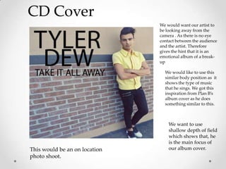
1. CD Cover
We would want our artist to
be looking away from the
camera . As there is no eye
contact between the audience
and the artist. Therefore
gives the hint that it is an
emotional album of a break-
up
We would like to use this
similar body position as it
shows the type of music
that he sings. We got this
inspiration from Plan B’s
album cover as he does
something similar to this.
We want to use
shallow depth of field
which shows that, he
is the main focus of
This would be an on location our album cover.
photo shoot.
2. BACK ALBUM COVER
We wanted to use a plain
back cover to keep it simple
TITLES OF SONGS
and follow the colour
-
scheme.
-
-
-
3. INSERT 1
We wanted to use this type of
body language, which is a
similar concept to a scene in a
music video.
4. INSERT 2
We would like to use
this similar concept
with the use of the
photo booth
photograph that we
had in our music
video. We are still
deciding if we should
burn the photos or
use the photos as
normal
5. CD
For our CD we decide to keep
it simple and easy to read
which goes with one of our
Amerie case studies as we
used her single.
7. Colour scheme
• These are the colours that we would be using
through out the single which is followed through in
all of our case studies. We decided to use:
• Green
• Black
• White
• Grey