2. 1.
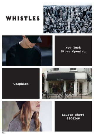
C O N T E N T S
2.
About Whistles
3.
The Brief
4.
The Competitors:
ACNE
5.
The Competitors:
Rag & Bone
6.
The Competitors:
SANDRO
7.
The Store
8.
Floor Plan:
Ground Floor
9.
Floor Plan:
1st Floor
10.
Floor Plan:
2nd Floor
11.
Floor Plan:
3rd Floor
12.
Floor Plan:
4th Floor
13.
Store Navigation
Floors- G,1,2
14.
Store Navigation
Floors- 3,4
15.
Inside The Store
16.
The Atmosphere
17.
Pendant Lighting
18.
Illumination
19.
Lighting in VM
20.
Flooring
21.
Fixtures
22.
First Sight Focal Points
23.
Display Techniques
24.
Accessory Displays
25-26.
Changing Rooms
27.
Conclusion
28-33.
Sketchup Images
34-37.
Appendices
3. 2.
A B O U T
Whistles is a London based fashion brand with former
Brand Director to fashion giant Topshop, Jane
Shepherdson as its Chief Executive. Relaunched in
2008, it is Whistles effortless aesthetic and
attention to detail that has helped make Whistles
pieces a wardrobe staple for women of every
industry.
“Whistles encapsulates an intelligent sense of
design with timeless and luxurious pieces”.
In 2014 Whistles launched their menswear department
in selected stores and online. The first collection
saw classic, easy to wear styles combined with
contemporary design giving a luxurious yet refined
feel.
4. THE BRIEF:Whistles are a worldwide brand who are currently sold in the following
places....
LONDON
39 stores.
WIDER UK
61 stores.
IRELAND
5 stores.
ASIA
6 stores. EUROPE
19 stores.
USA
4 stores.
As it stands within the US, Whistles is only sold at concessions within
Bloomingdales. It is our aim to create a stand alone Whistles store in
New York City that will contain both mens and womens collections.
3.
Fig2.
5. Stockholm based, Acne is the “creator of ready-to-wear, magazines,
furniture, books and exhibitions”. Eclectic use of materials and
attention to detail is what makes their look sleek and modern with
a dose of Scandinavian cool.
In store Acne is extremely minimal. For each piece only 1, 2 or 3
is put onto the shop floor and art installations are not uncommon.
Current fixtures include chrome bookcases, closed draws and simple
rails.
For Whistles: Whistles could also use such bookcases and turn
them into a feature, displaying clothing and accessories. Simple,
smaller rails would also work as they could be used to clearly
display an interesting colour story. However it may be in Whistles
favour to display more of each piece so that the store still feels
accessible and the consumer is encouraged to try pieces on.
THE COMPETITORS
4.
Fig3.
6. THE COMPETITORS
Rag & Bones mix of British tailoring and American influence creates
a look that is casual yet refined. Pieces are modern yet refined.
It’s name is taken from “Rag & Bone Man” who used to sell unwanted
things to merchants. Slightly off beat connotations associated with
the name can be seen in store.
In store Rag & Bone have a fair amount of product on the shop floor
and this is counteracted by their clever use of thinner metal
fixtures. Wood and exposed brick are key features whilst worn,
trunks, wire mannequins and vintage photos give personality to the
store.
For Whistles: Thinner fixtures would be great to display statement
pieces to avoid clutter. Having props around store would also be a
good idea to give American consumers a clear picture of the
Whistles woman. Wooden floors may also be a good option as they add
character to a space, whilst the smooth finish injects an air of
refinement.
5.
Fig4.
7. For Whistles: The all white and cream decor seen above makes a
great base for pops of colour in the clothing that Whistles often
have. Use of tables at the front to store key products would also
suit Whistles well as this is the first thing consumers see and
would be more inclined to impulse buy something small.
THE COMPETITORS
Feminine, Versatile and unmistakably French is what makes Sandro.
Their collections see classic pieces reworked and given a chic and
fresh twist in all 202 boutiques worldwide.
“The shops have been thought of like a jewel box combined
with simple and trendy features. The stores have herringbone
floors, painted mirrors and more than 190 styles, along with a
selection of art books and music, providing the comfort of a
British club, while offering it pieces of the
season.”
6.
Fig5.
8. 7.
- Constructed in
1870
- An old Art
Gallery
- Big enough to
showcase
mens and womenswear
- Optimum space for
window displays
- Abundance of
light will
illuminate clothing
THE STORE:
Fig6.
9. 8.
F L O O R P L A N
Groundfloor - Womens
The floorplan to the right shows
our Ground Floor. As mentioned
previously 101 Spring Street was
used as an art gallery and so we
have aimed to showcase a gallery
aesthetic within store. This
will give an air of refinement
and exclusiveness that is
associated with art.
This can be seen in the circular
plinth towards the back of the
store. On this will be a couple
of mannequins in a small scene
that is appropriate to the sea-
son. For example around
Valentines Day there will be two
mannequins sitting have dinner.
We will include props and
furniture into the scene in
order to relate it to the
consumer so they can begin to
imagine themselves in Whistles
clothing in the same scene.
At the front of the store we
have a large table as a first
sight focal point. This will
have on it lookbooks, accesso-
ries and small add on
items that may act as in impulse
purchase for the customer in the
hope that they may pick up a
top or dress that goes with the
bag the saw at the front of the
store.
KEY:
- Pendant Lighting
- Track Lighting
10. 9.
F L O O R P L A N
1st Floor - Womenswear
Our 1st floor is a continuation of
Womenswear and so we wanted it to
have the same modern and spacious
feel. In order to do so I have in-
cluded understated fixtures that will
be made of marble and showcase piec-
es in a luxurious way. To keep true
to the Whistles brand I have includ-
ed large mirrors and tables in key
spaces.
KEY:
- Wall Lighting
11. 10.
F L O O R P L A N
2nd Floor - Womens & Mens Accessories
Research showed us that accessories
generate 30% of profits for Whistles
in the American market.
For this reason I have made our
accessories floor a destination for
shoppers. I decided to combine mens
and womens so that when shopping
together it did not exclude one half
of a couple. The aim was to create
an area in which shoppers could feel
relaxed, spend a while browsing and
come out with something for each of
them.
To encourage shoppers to do so there
is a large seating area in the
middle of the shop floor and symmetry
on either side of this. Symmetry was
included so that there was a
unisex feel to the floor and neither
sex would feel uncomfortable to be
shopping there.
12. F L O O R P L A N
3rd Floor - Menswear
For our menswear floor it was
important to include multiple
mannequins which can be seen as the
consumer first enters the shop floor.
Men are notorious for being less keen
for shopping and research showed that
Americans are more inclined to buy
pieces after seeing the styled on a
mannequin. Between the mannequins is
a table that will showcase
accessories that can be seen on the
mannequins so they can readily pick
up these too.
Rails have been angled to draw the
eye gradually further to the back of
the store and encourage shoppers to
explore the full length of the store.
In order to sustain our gallery
aesthetic I have chosen to include
miniature spotlights. These will be
strategically focused and angled to
highlight the clothes and will vary
in brightness between bulbs to create
a relaxed atmosphere.
KEY:
- Mannequin
11.
13. F L O O R P L A N
4th Floor - Personal Shopping
Extra attention to detail was
necessary when designing the
Personal Shopping floor in order to
allow the customer to have the best
experience possible. Luxuriousness is
a key feature and can be seen in the
extra large changing room, table to
hold welcoming refreshments and large
seating area.
At the back of the floor there are to
be a group of mannequins that will
model statement pieces so that the
shopper is encouraged to try them on.
There will also be a selection on ba-
sics and accessories on hand that the
consumer may want to add on to their
purchase.
14. STORE NAVIGATION
By placing both sets of stairs in the same place on each floor
it means the customer has to circumnavigate the shop floor in
order to get to the next level.
13.
17. THE
A T M O S P H E R E
COOL
REFINED
U
N
STYLISHintelligent
CONTEMPORARY
RELAXED
MODERN Directional
Inspiring
LUXURIOUS
CALM
EFFORTLESS
L
A
I
D
B
A
C
K
TIMELESS
INTERESTING
INTRIGUING
ArtisticWELCOMING
Fig8.
16.
18. As previously mentioned at 101 Spring Street there is ample space, which
is perfect for displaying Whistles’ collections. However we must ensure
that space is not wasted or that the shop does not feel too empty. One
of the best features of 101 Spring Street is it’s high ceilings. To
truly show this off we have cut off parts of floor 1-4 to create a
balcony space and draw the consumers eye upwards. So this space does not
seem baron I have researched into types of pendant lighting which would
optimise this space.
Above different types of hanging lighting can be seen. The exposed bulbs
are a simple but effective idea. They look almost industrial which would
fit in with the overall feel and minimal aesthetic of our building. They
create a statement without looking too fussy or opulent. Hanging bulbs
from a beam or wooden block is a smart idea, but may be too rustic and
unrefined for Whistles and so the lights pictured in the bottom right
would be our best option for the store.
P
E
N
D
A
N
T
L
I
G
H
T
I
N
G
Fig9.
17.
19. Lights That:
I L L U M I N A T E
In order to ensure that the collections are presented in the best way pos-
sible there will need to be lighting that will illuminate the clothing. For
inspiration I have looked to galleries, museums and our competitors. The
in-ceiling striplight that is pictured on the bottom right is minimalistic
with its clean lines but may appear too futuristic. The track lighting that
can be seen in the bottom left hand picture would be perfect as we could
adjust the angle of each light, the brightness of each bulb and intensity
so to highlight the collections perfectly.
Fig10.
18.
20. Lighting For:
V I S U A L M E R C H A N D I S I N G
To incorporate a fun element into our store
and avoid a clinical atmosphere we could use
interesting lighting. Ways we could feature
this include a lit up item of clothing (
taking inspiration from the lit up bike pic-
tured), a neon sign, lit up directions or a
lit up quote or phrase.
Due to the vibrant nature of neon it could
be considered off brand and so I believe our
best option would be to have lit up arrows
pointing to statement pieces or the new
collection.
On my floor plans I have included an
uplighter at the bottom of each set of
stairs. This will illuminate our floor
directory.
Fig11.
19.
21. Flooring
As we have chosen such a large store and are choosing to be sparing
with our fixtures, flooring will be one of the first things consumers
notice and it is key in creating the right atmosphere. We have already
established that Marble fixtures will be used and so to have entirely
marble floors may appear superfluous. The geometric tiling in the bottom
left corner is interesting and unique but to have it on such a large
area may distract from clothing and appear too busy.
The right wooden flooring would create a welcoming feel and also fit
with our relaxed aesthetic. The wooden flooring on the top left is a
little too destroyed and the print from old cases may be considered
too unrefined for the Whistles brand. The flooring on the bottom right
however is perfect as it is good quality and warm in colour.
Fig12.
20.
22. FIXTURES
To tie in with our refined and stylish atmosphere fixtures should be
minimal and have the capacity to showcase clothing in interesting
ways and even be able to showcase multiple types of product.
Fig13.
21.
23. FIRST SIGHT FOCAL POINTS
Valentines Day
Mothers Day
4th of July
For the Valentines Day table
top I have included small
items of varying price range
and that would suit
different types of female
consumer.
The hearts would be made of
tissue paper and scattered
over the tabletop to attract
the consumer.
As Mothers Day falls in
the Spring I have
included a floral top and
actual Daffodils to keep
the theme consistent.
The shoes and cuff go well
with the top and would
encourage consumers to
purchase all three.
Americans are notorious for
their patriotism and so the
red white and blue theme is
key.
The overall look of the
tabletop is to resemble the
American flag and add to keep
the store current.
22.
24. Display Techniques.
Wardrobing
Feature Wall
Alternative Fixtures
Use of alternative fixtures adds an
air of creativity to a store. These
vintage trunks would fit in with our
new element as this would be
something the Whistles consumer may
want to purchase.
Wardrobing will be key to our store.
We have chosen fixtures that can
showcase a multitude of product to
create the look of a refined wardrobe
to encourage consumers to pick up
colour co-ordinated pieces and
matching sets.
Whistles do not currently have
such feature walls in store,
but is something that our store
could include due to its ample
space and high ceilings. To tie
in with our gallery
aesthetic more literally we
could use dramatic frames and
use them to highlight key pieces
when hung on a wall.
Fig14.
23.
25. ACCESSORY DISLPAYS
As our accessory floor is a destination area it is essential
that our fixtures display the accessories in the most
aesthetically pleasing way possible. The clear and gold boxes
would be great to create a dressing table look and would also
be an a small item that consumers would be inclined to buy and
put in their own homes.
Fig15.
24.
26. CHANGING
A chest of drawers would be a more
stylish way of storing rejects.
Black curtains are a sleek and easy way
of dividing each cubicle.
Use of Persian-esque rugs
make for an interesting
feature and are an easy way
to add colour to a
neutral space. They also
add a quirky touch.
Fig16.
25.
27. ROOMS Strip lighting around the
mirror creates a flattering
and even light which would
show the clothes off whilst
flattering the consumer.
An elegantly
framed balanced
mirror adds an
air of luxury
to the changing
area. These could
also be used on
the shop floor.
Small touches
like the
sideboard and
flowers make the
customer feel
more at ease and
help to create
a feel for the
brand.
This wedding shop changing room is the
kind of size and style that Whistles
should have on personal shopping. Using 2x
curtains shows attention to detail and its
bigger size allows customers to change and
try on with ease.26.
28. CONCLUSION
I started off by identifying Whistles’ key competitors,
looking at their signature styles and then examining how
this is show in store and if Whistles could take anything
from this when expanding into their first stand alone store
in America. I found Sandro to be mostly inspirational to
Whistles, the clean lines of their fixtures and pops of
colour go well together and create an enjoyable shopping
experience. Whistles could take elements of the rustic
touches in Rag & Bone to create atmosphere within store and
could aspire to the likes of Acne in creating an interest-
ing space which is intriguing to the consumer.
Our store is the perfect choice in terms of size, space and
original features which are refined and timeless much like
the Whistles ethos. Our ground floor of the store is
spacious and our seasonal mannequin scene will be something
that customers will resonate with and remember. Throughout
all floors fixtures have been kept minimal with the
ability to show a multitude of products for example rails
with shelving on top or bookcases that showcase a variety
of accessories. Special attention was paid to detail on
personal shopping and this is seen in the large changing
room, refreshment and seating areas.
Throughout everything the Whistles brand has been kept in
mind and a balance between furthering the brand and staying
true to its core values has been struck. From the graphics
ideas proposed the American consumer will be able to get a
firm understanding of who Whistles are and will be encour-
aged to buy into this time and time again.
27.