2. Logo Font: English157 BT
Subhead Font: Proxima Nova Bold
Original logo was derived from a font designed on Vista Print, prior to client recieving
consultation, the recreation process went through a swift investigation on similar fonts, and
concluded with client that this would be the permanent fit for the company logo.
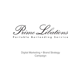
Logo Recreation
3. Preferred Logo Swatches:
Gold - Used for
white or dark
backgrounds. Not
applicable for photo
backgrounds.
C: 18
M: 28
Y: 95
K: 0
White - Used for
Dark Backgrounds.
Applicable for darker
photo backgrounds.
C: 0
M: 0
Y: 0
K: 0
Black - Used for
lighter backgrounds.
Applicable for lighter
photo backgrounds.
C: 0
M: 0
Y: 0
K: 100
Logo Guidelines
4. Objectives + Strategy
Originally client came for postcard design, after reviewing client website and social strategy
we recommended that the entire brand needed to connect and tell a compelling story. Client
seeked holistic branding for future promotion. The objective was simple, to create a consistent
branding strategy and execution across all company touchpoints.
Lifestyle
PHOTOGRAPHY
Capturing the
essence of the
brand & identity.
Making families,
corporations &
social audiences
connect with
the visual
representation of
the brand.
Visual Appeal
BRANDED SITE
Giving a clear
understandable
concept of what
the company
does, how it
started & an
elegant feel
to create an
attraction
amongst the
target market.
Story Telling
SOCIAL MEDIA
Establishing
the base of
communication
between brand
& consumers.
Providing
educational
material
on drinks,
atmosphere
& industry
expertise.
Geo-Targeting
GEOGRAPHICS
Understanding
and identifying
the kind of
desired client.
Establishing
parameters and
geographical
targeting
locations for
Facebook, Digital
Ads & future
EDDM mailings.
Tangible Media
MAIL POSTCARD
Consistent
branding with
website and
photography,
introducing
first Direct Mail
postcard design
with specific zip-
code targeted
locations for more
ROI on direct mail
marketing.
5. Photo Execution
Creating a unique brand look through compelling imagery of alcoholic beverages, serving
brands, portable bar imagery and business lifestyle.
7. Social Strategy
MONDAY
• Motivational
Monday quotes
• Drink of the day
TUESDAY
• Drink of the day
#TuesdayBoozeday
WEDNESDAY
• Drink of the day
• Industry Article
• Educational
Material
THURSDAY
• Drink of the day
#ThirstyThursdays
FRIDAY
• Drink of the day #TGIF
• Promotional Piece bi-
weekly with purpose
of promoting business
prior to weekends to
increase prospecting
opportunities
8. Geo-Targeting
Geographics
Identified local zipcode areas that meet the client profiles based on income, lifestyle and purchasing habits.
These locations connect with both print media for direct mailing and digital advertising based on geographical
areas. Such as:
33076, 33067, 33073, 33071, 33063, 33068, 33066, 33060, 33064, 33062
9. Mail Postcard
Direct Mail Postcard Design
Using compelling photography, the postcard
illustrates the look and feel of the brand.
Demonstrating a sophisticated design yet
warm and friendly colors establishing a trust
relationship with prospect clients that will
recieve the postcard.
Direct Mail Postcard Copy
Along with warm and friendly colors, it was
important to establish a similar tone that
will ignite trust between the brand and
the buyer. The goal is to project an honest
approach to where the audience will feel
comfortable to call and interact with the
brand. Along with this first Direct Mail
piece, there is a projected total of 6 mailing
campaigns to finish in order to see a full ROI
of 3-4%.
10. All work was researched, conceptualized, designed and strategically executed by John Gordillo.
For more information on Digital Marketing, Branding & Design solutions contact John Gordillo at:
P. 305.213.2421 | E. john.gordillo24@gmail.com | W. johngord.com
John Gordillo
Digital Marketing + Brand Strategist