
Recommended
More Related Content
What's hot
What's hot (19)
Similar to Music Magazine analysis
Similar to Music Magazine analysis (20)
Recently uploaded
Recently uploaded (20)
Music Magazine analysis
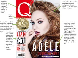
- 1. Main Medium Close up Shot really big and not being overlapped on the face because it is the main focus point of the Cover. Main Title behind the main image as the main image is the main focus point of the cover. Slogan next to the title. Special Edition is a bold gold colour to show the achievements of the magazine and to make them stand out as there is no other gold on the page. Description of what is in the magazine with the names of music artists other than the rest of the text to show off which artists will be featured in the magazine. Title of main featured artist in bold to show that the magazine managed to get a high profile singer/songwriter to appear in their magazine. They use this to grab the attention of consumers that are looking at a magazine rack as it has a high profile name standing out.
- 2. The cover story in bold again in the contents so that readers who have purchased the magazine just to read the cover story can easily find the cover story. Magazine section shown clearly at bottom right so that if a reader just wants to read a certain part/section of the magazine they will be able to find it clearly. A range of pictures and different types of pictures like medium close ups and Long shots of artists that would be featuring in the magazine. Numbers shown clearly so that it is easy for readers to find certain articles they may want to read. Colour scheme continues throughout both the contents page and front cover. Which keeps it looking professional. Names of featured artists in bold and standing out again so that any consumers quickly looking at the contents page can see the artists which will help to draw the consumer towards the magazine. Simple layout so that the reader does not get overwhelmed and puts the magazine down.
- 3. Large image of featured artist which is used to attract people to the article due to the artist’s high profile. Magazine’s website so that readers know where to go if they want to find out more about the interview. Artists name in bold at the top of the page so that if someone is flicking through the magazine it will stand out to them and make them want to read the article. Issue date, page number and logo so that people know what magazine the article is from.
- 4. Large title stands out from black and white background so that everyone can see the name of the magazine clearly. Bright and eye catching article title to draw the reader in which uses eye catching vocabulary and punctuation. Competition standing out on the front cover to grab consumer attention to make them buy the magazine so that they can try to win the competition. No images or text above the main artist’s face so that he can be clearly seen against everything else for consumers so that they can identify him easily. Statistics and numbers in bold which stand out and draw the audience in. Barcode and bar number so that the magazine can be sold. Issue date and price so that the consumer can see how much the magazine costs.
- 5. Continuous theme throughout both pages so that image retains it’s image. List of all music artists featured in this edition with page numbers so that if the reader wants to find an article about a certain artist they will easily be able to find it. NME put this in their magazine so that people who pick up the magazine thinking to buy it can quickly see who is featured in the magazine which will make the consumer want to buy it. Subscription offer in bold so that anyone who reads will have their attention drawn towards purchasing the magazine on a weekly basis. Issue date again so that any person who looks back through magazines can see when exactly this issue was released. List of the magazine’s main features which stand out so that people flicking through the contents page can see the main features of the magazine which will draw them in to purchase the magazine. Unique shape at the bottom of the page so that an advert for a guide included in the magazine is shown clearly and slightly stands out from other things like the pages on articles.
- 6. Large image of artist to make the main focus point of the double page spread which advertises the article. Large quote from the artist standing out from other text to draw the reader in to the quote and then using the quote to make the reader want to keep on reading the article. Artist’s name stands out from the rest of the text to draw readers who know her name into the article. White background so that no attention is taken away from the image of the artist and the headline.
- 7. Promotional offer to draw people in to buying the magazine so that they can get the ‘free cd’. Magazine Title in bold and very large but behind the main artist because the it is an established magazine so people will know what magazine it is just by seeing parts of the title. Artist’s face in front of everything so that it is not covered up by anything because it is going to be one of the main selling points of the magazine whereas other parts of the artist like the arms are covered up because they are not needed to identify the artist. Special large article in bold as it is in a bright red box which stands out on the page. The magazine have done this because it would have taken time to make so they will want people to read it. Other artists featured listed on the cover which are in a white text whereas the rest of the text is white so that the names stand out. Free CD with the magazine to entice the consumer into buying the magazine at the thought of a free cd when they buy the magazine. Barcode to sell the magazine.
- 8. Magazine title again so that if someone only sees the contents page and likes what the magazine has in it then they will be able to see the magazine name and then go and buy the magazine. Features with numbers so that readers can see what articles are on what pages. Cover Story with short synopsis and page number so that people who buy the magazine for the cover story can find it quickly. Issue Number Large High Angle shot of artist featured in the Cover Story. Extract from article to show readers what the article is about and draw them into the article with page number.
- 9. Font matches the music genre draws in fans of the music genre so that they read the article. Large Image of Artist taking up a whole page with a ‘gothic’ image in the background appealing to people into that music genre. Clear gothic colour scheme with a lot of black and white and a bit of gold to stop the page from looking a bit dull. Picture caption so that readers know exactly when and where the photo is taken.