
Recommended
More Related Content
What's hot
What's hot (11)
Similar to Effective Presentations using Data Visualization
Similar to Effective Presentations using Data Visualization (20)
Recently uploaded
Recently uploaded (17)
Effective Presentations using Data Visualization
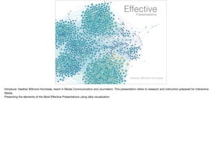
- 1. EffectivePresentations Heather Wilmore Hornbeak Introduce: Heather Wilmore Hornbeak, teach in Media Communication and Journalism. This presentation refers to research and instruction prepared for Interactive Media. Presenting the elements of the Most Effective Presentations using data visualization
- 2. More than 30 million presentations are created everyday.
- 3. Over 6 million teachers use PowerPoint or Keynote.
- 4. Dr. John Bohannon, a scientist and writer who runs the annual Dance Your Ph.D. contest has his PhD. in molecular biology. Even with his educational background, even he has a difficult time understanding concepts from other biologist. With the Dance your Ph.D. program, scientists explain their research with dance.
- 5. “…bad PowerPoint presentations are a serious threat to the global economy.” Bohannon proposes “…bad PowerPoint presentations are a serious threat to the global economy.”…(assuming each day collects one) half-hour presentation for an average audience of four people with salaries of 35,000 dollars, and it conservatively assumes that about a quarter of the presentations are a complete waste of time, and given that there are some apparently 30 million PowerPoint presentations created every day, that would indeed add up to an annual waste of 100 billion dollars.”
- 6. Bohannon may seem a bit extreme but other research has confirmed this idea. Using visuals to aid our instruction has transitioned from once a luxury to an expected tool which must compliment any lecture or lab. Thoughtful slides without fancy transitions and complicated backgrounds provide the best learning tools for students. Edward Tufte, considered a pioneer of data visualization, designed this info graph on the history of Rock N Roll. He suggests the more data depicted, the better. However, in order to simplify, reduce the scale.
- 7. For example, take a look at the transition this chart goes through when this “chartjunk” is removed. He calls non-data visuals “chartjunk”- which is the unnecessary use of graphical effects.
- 8. The Data-Ink Ratio recommends the ink used to represent data
- 9. should be greater than the ink used to show non-data.
- 10. And finally, stripping away unnecessary shapes and text allows the information to become more efficient and useful to our eyes.
- 11. Many individuals involved in academia are experiencing information “glutny”. That is why our learning resources committee has become an important part of the university.
- 12. Good design is the best way to navigate information overload. Here is a simple example of data which once lived on an excel spreadsheet. Increasingly, visualizing information, seeing patterns and connections, tells a story while allowing educators to focus on the information that’s most important.
- 13. Here is an info graph I created representing the number of ordering choices customers have when they enter a Starbucks. Approximately 87,000 to be exact.
- 14. Representing instruction can turn power point presentations like this…
- 15. To this… Data can be more interesting and engaging in visual form when the information is categorized using color, scale, movement urging the viewer to explore the subject rather than memorize.
- 16. At the intersection of art and science, Data journalist, David McCandless turns complex data sets, such as, () worldwide military spending, ()media buzz, () even lighter subjects such as peak-break up times according to facebook updates, into beautiful, simple diagrams which reveal unseen patterns and connections.
- 17. Tor Norretranders, a Danish physicist () converted the bandwidth of the senses into computer terms. Your sense of sight is the fastest. It has the same bandwidth as a computer network. Next you have touch, which is about the speed of a USB key. Then you have hearing and smell, translating to the capability of a hard disk. Next, there’s taste, barely the power of a pocket calculator. Finally that little white square in the corner you barely notice. A tiny .7 percent. This square represents the amount we're actually aware of. The bulk of our senses is visual. Visual comprehension is so easy for our brains to retain, it’s effortless. The eye is delightfully sensitive to patterns in variations of color, shape and pattern.
- 18. Color, shape and pattern are the eye’s alphabet. If you combine the language of the eye with text, numbers and concepts, essentially two languages are speaking to the brain simultaneously- each language complimenting the other. Starting with feeding the eye attractive color, pattern and shape, following with hands on activity, all while providing verbal instruction allows the entire brain to ultimately engage with the subject.
- 19. Last year, while preparing for my Interactive Media’s Keynote assignment, I began exploring some of the greatest speeches. I came across two very different motivators and speeches made by Steve Jobs and Martin Luther King, Jr.
- 20. However, their speeches had a surprisingly similar pattern. They talked in a pattern of what is and what could be, giving contrast to their message. There is one indisputable attribute of a good story: there must be some kind of conflict or imbalance perceived by the audience that your presentation resolves. This sense of discord is what persuades audiences to care enough to take action.
- 21. If you watch Steve Jobs’ MacWorld 2007 iPhone Launch, Steve Jobs has the uncanny ability to make audience engagement appear simple and natural. His presentations compel an audience’s undivided attention for an hour and a half or more—something that very few presenters can do. Carmine Gallo said, “Steve Jobs does not deliver a presentation. He offers an experience.” Jobs sets up WHAT IS in perfect form by giving an update on the market and performance of several Apple products (Intel transition, retail store, iPods, iTunes and Apple TV.) Establishes WHAT COULD BE with, “This is a day I’ve been looking forward to for two and half years. Every once in a while, a revolutionary product comes along that changes everything…” And he proceeds to introduce the iPhone as three products in one.
- 22. If you listen to Martin Luther King, Jr’s I Have a Dream speech, he talks in the same What Is vs What Could Be pattern. He starts his speech with scriptures and songs and political promises that are familiar to the people. At the end of first What Is he says, “America has given the negro people a bad check, a check that has come back marked insufficient funds.” And then the people really started to scream at the first What Could Be by saying, “So we’ve come to cash this check, a check that will give us upon demand the riches of freedom and the security of justice.” And he goes back and forth and back and forth between What Is and What Could Be. Eventually saying the “I have a dream that one day…” line. The both end their presentation having describe what the world is in this new bliss.
- 23. What is Martin Luther King, Jr. had powerpoint?? As part of my interactive media design class, I give students the opportunity to make a powerpoint or keynote for Martin Luther King, Jr.’s “I have a dream speech” as in- class assignment using a video of his speech and the transcript. It urges students to translate King’s message visually.
- 24. In Werner Hertzog’s recent documentary, Lo and Behold, he interviews these researchers who are attempting to unleash the power of reading the human brain’s thoughts. They explain if a person watches a video of an elephant walking across the Sahara vs. reading a sentence that says “An elephant walked across the Sahara”, the brain receives the information very similarly. Therefore, if we show an image as well as discuss what the image is doing, our brains receive the information twice resulting in better comprehension.
- 25. information information information information information information information McCandless mentions “by visualizing information, we turn it into a landscape that you can explore with your eyes, a sort of information map. When you are lost in information, an information map is useful.”
- 26. In the same way a picture paints a thousand words, data visualization and Infographics allow the brain to easily digest…
- 27. complex data quickly and accurately.
- 28. McCandless, David. “The Beauty of Data Visualization.” David McCandless: The Beauty of Data Visualization | TED Talk | TED.com, TED, July 2010, www.ted.com/talks/david_mccandless_the_beauty_of_data_visualization?language=en. “Information Is Beautiful.” Information Is Beautiful, informationisbeautiful.com/. Duarte, Nancy. “The Secret Structure of Great Talks.” Nancy Duarte: The Secret Structure of Great Talks | TED Talk | TED.com, www.ted.com/talks/nancy_duarte_the_secret_structure_of_great_talks. Boulton, Jim. 100 Ideas That Changed the Web. London, England: Laurence King, 2014. Print. McCandless, David. The Visual Miscellaneum: A Colorful Guide to the World's Most Consequential Trivia. New York, NY: Harper Design, an Imprint of HarperCollinsPublishers, 2012. Print.