
Recommended
More Related Content
More from GurjitSembi
Recently uploaded
Recently uploaded (20)
Magazine cover analysis 6
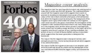
- 1. Magazine cover analysis The magazine cover has very large title to make it eye catching and to make sure it can be seen from far distances. The masthead dictates around half the magazine cover which suggests that is wants to promote its branding to make people more aware of the logo. The colour of the text is black and white which gives a formal/business look which the magazine must be aiming for. The background of the magazine cover is grey which makes the content on the magazine cover stand out and it also gives a neutral feel. The atmosphere of the magazine is calm and peaceful because there's not many things going on in the magazine cover and the colour scheme is not bright with exotic colours such as yellow, orange and lime. In the lower half of the magazine cover there's a picture of Jay-z and Warren Buffett, the picture of Jay-z is in front of Warren Buffett and Jay-z is also taller which suggests that the newer generation is taking over the businesses. The reason I like the magazine cover is because it sends a calm atmosphere and it has a formal and professional look which suggests it has useful information. The reason I dislike the magazine is because it is to simplistic and I think the masthead should be smaller and the photographs of the Jay-z and Warren Buffet should be bigger so they can dominate the page