
Recommended
More Related Content
Recently uploaded
Recently uploaded (17)
Featured
Featured (20)
Front Cover Analysis
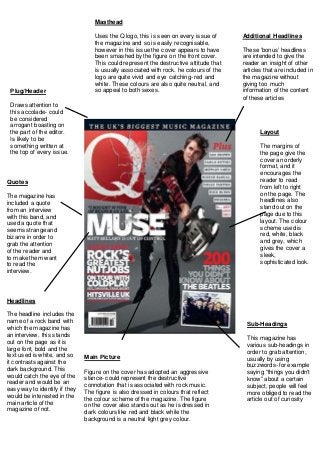
- 1. Layout The margins of the page give the cover an orderly format, and it encourages the reader to read from left to right on the page. The headlines also stand out on the page due to this layout. The colour scheme used is red, white, black and grey, which gives the cover a sleek, sophisticated look. Main Picture Figure on the cover has adopted an aggressive stance- could represent the destructive connotation that is associated with rock music. The figure is also dressed in colours that reflect the colour scheme of the magazine. The figure on the cover also stands out as he is dressed in dark colours like red and black while the background is a neutral light grey colour. Masthead Uses the Q logo, this is seen on every issue of the magazine and so is easily recognisable, however in this issue the cover appears to have been smashed by the figure on the front cover. This could represent the destructive attitude that is usually associated with rock. he colours of the logo are quite vivid and eye catching- red and white. These colours are also quite neutral, and so appeal to both sexes.Plug/Header Draws attention to this accolade- could be considered arrogant boasting on the part of the editor. Is likely to be something written at the top of every issue. Sub-Headings This magazine has various sub-headings in order to grab attention, usually by using buzzwords- for example saying “things you didn't know” about a certain subject, people will feel more obliged to read the article out of curiosity Quotes The magazine has included a quote from an interview with this band, and used a quote that seems strange and bizarre in order to grab the attention of the reader and to make them want to read the interview. Headlines The headline includes the name of a rock band with which the magazine has an interview, this stands out on the page as it is large font, bold and the text used is white, and so it contrasts against the dark background. This would catch the eye of the reader and would be an easy way to identify if they would be interested in the main article of the magazine of not. Additional Headlines These ‘bonus’ headlines are intended to give the reader an insight of other articles that are included in the magazine without giving too much information of the content of these articles