Introduction to TechSoup’s Digital Marketing Services and Use Cases
Double page evaluation
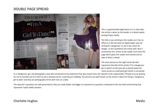
1. DOUBLE PAGE SPREAD
This is a good double page layout as it is clear who
the article is about as the header is in blood capital
writing (Taylor Swift)
The title is eye catching to the readers as it has an
effect to it like the loom of ripped paper and red
writing for ‘dangerous’ as red is the colour for
danger, so this symbolizes the article well. Also it
summarises the article as the reader turns onto the
page which gives the reader and interest and an
idea of what is ahead.
The main picture on the right hand side well
represents the title of the article (‘I’m a dangerous
girl to date!’) as the way she is posed makes her
come across as a wild party girl which is connected
to a ‘dangerous’ girl, the photograph is also well connected to the statement that was chosen from the reporter to be made bolder (‘People are just waiting
for me to stumble out of a club’) as she is dressed up for a evening out clubbing. The pictures are well chosen as the article is about her being a ‘dangerous
girl to date’ and they are photographs of her with men on a date.
The reporter’s questions are well presented as they are made bolder and bigger to represent his questions compared to the non bold small writing that
represents Taylor Swifts answers.
Charlotte Hughes Media