1. Masthead analysis
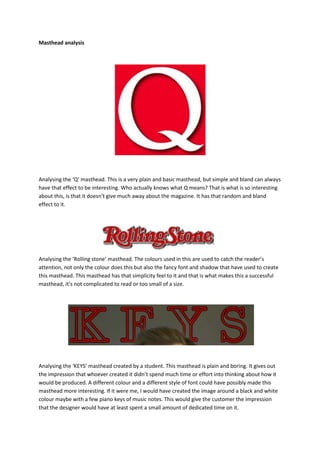
Analysing the ‘Q’ masthead. This is a very plain and basic masthead, but simple and bland can always
have that effect to be interesting. Who actually knows what Q means? That is what is so interesting
about this, is that it doesn’t give much away about the magazine. It has that random and bland
effect to it.
Analysing the ‘Rolling stone’ masthead. The colours used in this are used to catch the reader’s
attention, not only the colour does this but also the fancy font and shadow that have used to create
this masthead. This masthead has that simplicity feel to it and that is what makes this a successful
masthead, it’s not complicated to read or too small of a size.
Analysing the ‘KEYS’ masthead created by a student. This masthead is plain and boring. It gives out
the impression that whoever created it didn’t spend much time or effort into thinking about how it
would be produced. A different colour and a different style of font could have possibly made this
masthead more interesting. If it were me, I would have created the image around a black and white
colour maybe with a few piano keys of music notes. This would give the customer the impression
that the designer would have at least spent a small amount of dedicated time on it.