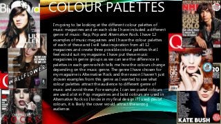
COLOUR PALETTES
I’m goingto be looking at the different colour palettes of
music magazines and on each slide I have included a different
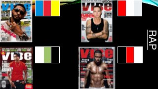
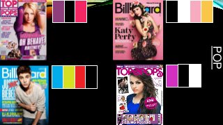
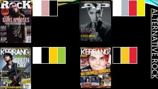
genre of music- Rap, Pop and Alternative Rock. I have 12
examples of music magazines and I have the colour palettes
of each of these and I will take inspiration from all 12
magazines and create three possible colour palettes that I
feel would suit my magazine. I have put these music
magazines in genre groups as we can see the difference in
palettes in each genre which tells me how the colours change
depending on the music genre. The genre I have chosen for
my magazine is Alternative Rock and the reason I haven’t just
chosen examples from this genre as I wanted to see what
colour palettes attract the audience to different genre of
music and avoid these. For example, I can see pastel colours
are used a lot in Pop magazines and bold colours are used in
Alternative Rock so I know in my final design if I used pastel
colours, it is likely the cover would attract the wrong
audience.
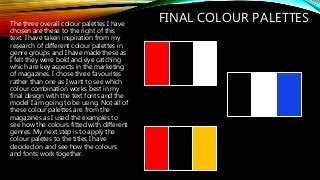
FINAL COLOUR PALETTESThethree overall colour palettes I have
chosen are these to the right of this
text. I have taken inspiration from my
research of different colour palettes in
genre groups and I have made these as
I felt they were bold and eye catching
which are key aspects in the marketing
of magazines. I chose three favourites
rather than one as I want to see which
colour combination works best in my
final design with the text fonts and the
model I am going to be using. Not all of
these colour palettes are from the
magazines as I used the examples to
see how the colours fitted with different
genres. My next step is to apply the
colour paletes to the titles I have
decided on and see how the colours
and fonts work together.