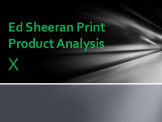
SlideShare a Scribd company logo
1 of 4
X
Ed Sheeran Print
Product Analysis
Digipak
The X digipak follows a strict black and Green colour scheme which follows on
from Ed Sheeran’s branding techniques of Orange and white, in which he used
in his first album +. By keeping a strict colour scheme within his respective
albums, Ed Sheeran has been able to be associated with this colour scheme
above any artist and make it a trade mark for his tour or album. The green and
black are neutral colours which does not isolate any gender when trying to sell
his music, it is not strictly for Men or Women which leaves his branding, music
and image open to all.
The inside cover of the album follows the same colour scheme but with black becoming the dominant
colour over the green. The imagery of blood cells paired with the darker colour scheme connotes the
idea that, though the artist may seem brighter and happier on the outside, he has a darker inside
which coincides with his music and lyrics having depressed ideas to them (Such as break ups and
death). There is a link between a song on his album and this imagery, Bloodstream is very much about
the affects that alcohol and drugs have on your insides when under the influence; by using imagery of
this song in his album he is connoting that the lyrics in the song are a driving force for his album (due
to experiences with alcohol and drugs). There is an X shaped cell which is linked to his album name,
indicating that his album is deep within his blood and therefore is heavily linked with is ideas and not
just manufactured music used to sell; it means something to him.
His album back cover again follows the same colour scheme, similar to the inside cover is dominantly
black which, as well as the reasons mentioned in the earlier analysis, creates a subtlety to his album
art instead of being totally in your face which is useful for Ed Sheeran’s type of music. The main focus
of the cover here is a outlined picture of Ed Sheeran looking sombre. This is a very interesting piece of
art as it creates a cartoon image of the singer, this indicates that he is being made to look fake by his
industry ; the sadness of the image held by the artist indicates that it is not the music that is making
him sad but the way the industry are portraying him and diluting the genre. The idea that music is
manufactured is held by many different genres, with pop being the main controversy, as Ed Sheeran
is part of both the pop and folk genres he gets to make a comment on the way the industry is
handled. This image is also the only picture of the artist that we get on his album, the exclusion gives
focus to his music and not to him as an artist, something that subverts his first album which is focused
around his image.
Font
The lack of writing as a focus on the album cover is important for his growth as
an artist, he is using a symbol to advertise his image. The X (Standing for
multiply) is shown to be very artistic, upon close analysis is appears to have an
effect which makes it look painted which creates a more personal and less
artificial image. By adding some of texture to the image a personality is added
to the symbol, had it just been left clean and unedited the image may have
come across to impersonal and simple. The connotations of the painted style is
that this album is artistic (due to paintings being a widely used symbol of art in
general).
The font used through his
advertising campaign is bold and
holds a similar, artsy, painted style
as the X does on his album cover.
This creates a good contrast
against the bright green colour
used as a supporting colour to the
black.
By following a similar font style as well as
colour scheme, Ed Sheeran is able to associate
himself with very simple imagery. This is good
as it is only his second album so he is not yet
the biggest established style in the music
imagery so by following such strict imagery he
is able to attract attention and recognition
through very little effort. The fun connotations
of the drawn font allow for people who are
unfamiliar with his work to view him as an
enjoyable artist and a fun person, this would
create a good image for him and therefore
boost his attention.
Ed Sheeran’s advertising campaign is unlike the rest of his print products for his X series as it is
centred around him as a person and not his music or any form of symbolism.This opposition to his
regular way of branding centres him as the main image, this would create a hype from his existing
audience as they would instantly recognise the large, brightly coloured image of the artist. On top
of this large image of Ed Sheeran, the artist logo is very large and bold which serves the same
purpose as the large image of Ed Sheeran as it is easily eye catching and creates interest for the
existing audience who would instantly recognise the artist; the name also justifies who the artist is
to anew audience who may not recognise him through his image.The focus on the image of the
artist is the first time that we get real imagery of Ed throughout his marketing campaign for his
new album which is arguably to do with the album being focused on his music with the lyrics and
tunes being more significant than the star image.The tour (and music videos) can then be more
centred around Ed Sheeran as a person/ musician as of course he will feature heavily.This connotes
that the music is not his, it means different things to different people so his influence will not be
there opt effect it; his appearance in the tour advertising is because you are paying to see him as a
person on tour – connecting with the audience in different manners is important for a pop artist as
they often have a large fan base which needs to be addressed.
Advertisement
The font sizes are all very similar excluding the name ‘Ed Sheeran’ which is significantly larger than the other bits of information.
This is evidently due to marketing reasons and an attempt to attract attention, something that is used in the vast majority of
genres and band’s advertisements. The font for the tour dates seem to fit on Ed’s T-Shirt and creates the colour scheme that he
has used for his X album, green and black. This contrasts well and draws attention to the information whilst sticking to the colour
scheme.

More Related Content

Viewers also liked

Target Audience of Pop
Target Audience of PopTarget Audience of Pop
Target Audience of Pop
meltfc
 
AS Biology Lesson 2 - Measuring Cells
AS Biology Lesson 2 - Measuring CellsAS Biology Lesson 2 - Measuring Cells
AS Biology Lesson 2 - Measuring Cells
MrOakes
 
Target audience for indie rock music
Target audience for indie rock musicTarget audience for indie rock music
Target audience for indie rock music
marinasoph
 
Indie Genre Conventions
Indie Genre ConventionsIndie Genre Conventions
Indie Genre Conventions
lindax9
 
Evaluating Vulnerability in the 2011 Japan Earthquake and the 2010 Haiti Eart...
Evaluating Vulnerability in the 2011 Japan Earthquake and the 2010 Haiti Eart...Evaluating Vulnerability in the 2011 Japan Earthquake and the 2010 Haiti Eart...
Evaluating Vulnerability in the 2011 Japan Earthquake and the 2010 Haiti Eart...
Tom McLean
 
Target Audience of Indie Rock music magazines
Target Audience of Indie Rock music magazinesTarget Audience of Indie Rock music magazines
Target Audience of Indie Rock music magazines
jonese3
 
Persuasive Techniques
Persuasive TechniquesPersuasive Techniques
Persuasive Techniques
mrdservello
 

Viewers also liked (17)

Diamond and box factoring student version
Diamond and box factoring student versionDiamond and box factoring student version
Diamond and box factoring student version
 
Target audience research
Target audience researchTarget audience research
Target audience research
 
Abortion
AbortionAbortion
Abortion
 
Target Audience of Pop
Target Audience of PopTarget Audience of Pop
Target Audience of Pop
 
Indie Pop Genre and its Codes and Conventions
Indie Pop Genre and its Codes and ConventionsIndie Pop Genre and its Codes and Conventions
Indie Pop Genre and its Codes and Conventions
 
AS Biology Lesson 2 - Measuring Cells
AS Biology Lesson 2 - Measuring CellsAS Biology Lesson 2 - Measuring Cells
AS Biology Lesson 2 - Measuring Cells
 
Target audience for indie rock music
Target audience for indie rock musicTarget audience for indie rock music
Target audience for indie rock music
 
Instruments Of The Orchestra
Instruments Of The OrchestraInstruments Of The Orchestra
Instruments Of The Orchestra
 
Indie Genre Conventions
Indie Genre ConventionsIndie Genre Conventions
Indie Genre Conventions
 
Advantages and disadvantages of nuclear power
Advantages and disadvantages of nuclear power Advantages and disadvantages of nuclear power
Advantages and disadvantages of nuclear power
 
Evaluating Vulnerability in the 2011 Japan Earthquake and the 2010 Haiti Eart...
Evaluating Vulnerability in the 2011 Japan Earthquake and the 2010 Haiti Eart...Evaluating Vulnerability in the 2011 Japan Earthquake and the 2010 Haiti Eart...
Evaluating Vulnerability in the 2011 Japan Earthquake and the 2010 Haiti Eart...
 
Victoria's secret
Victoria's secretVictoria's secret
Victoria's secret
 
Seed, Seed Types and Seed Quality
Seed, Seed Types and Seed QualitySeed, Seed Types and Seed Quality
Seed, Seed Types and Seed Quality
 
Iconography of the thriller genre
Iconography of the thriller genreIconography of the thriller genre
Iconography of the thriller genre
 
Coastal Management
Coastal ManagementCoastal Management
Coastal Management
 
Target Audience of Indie Rock music magazines
Target Audience of Indie Rock music magazinesTarget Audience of Indie Rock music magazines
Target Audience of Indie Rock music magazines
 
Persuasive Techniques
Persuasive TechniquesPersuasive Techniques
Persuasive Techniques
 

Recently uploaded

Jual Obat Aborsi Hongkong ( Asli No.1 ) 085657271886 Obat Penggugur Kandungan...
Jual Obat Aborsi Hongkong ( Asli No.1 ) 085657271886 Obat Penggugur Kandungan...Jual Obat Aborsi Hongkong ( Asli No.1 ) 085657271886 Obat Penggugur Kandungan...
Jual Obat Aborsi Hongkong ( Asli No.1 ) 085657271886 Obat Penggugur Kandungan...
ZurliaSoop
 

Recently uploaded (20)

FSB Advising Checklist - Orientation 2024
FSB Advising Checklist - Orientation 2024FSB Advising Checklist - Orientation 2024
FSB Advising Checklist - Orientation 2024
 
Micro-Scholarship, What it is, How can it help me.pdf
Micro-Scholarship, What it is, How can it help me.pdfMicro-Scholarship, What it is, How can it help me.pdf
Micro-Scholarship, What it is, How can it help me.pdf
 
On National Teacher Day, meet the 2024-25 Kenan Fellows
On National Teacher Day, meet the 2024-25 Kenan FellowsOn National Teacher Day, meet the 2024-25 Kenan Fellows
On National Teacher Day, meet the 2024-25 Kenan Fellows
 
This PowerPoint helps students to consider the concept of infinity.
This PowerPoint helps students to consider the concept of infinity.This PowerPoint helps students to consider the concept of infinity.
This PowerPoint helps students to consider the concept of infinity.
 
Jual Obat Aborsi Hongkong ( Asli No.1 ) 085657271886 Obat Penggugur Kandungan...
Jual Obat Aborsi Hongkong ( Asli No.1 ) 085657271886 Obat Penggugur Kandungan...Jual Obat Aborsi Hongkong ( Asli No.1 ) 085657271886 Obat Penggugur Kandungan...
Jual Obat Aborsi Hongkong ( Asli No.1 ) 085657271886 Obat Penggugur Kandungan...
 
Mehran University Newsletter Vol-X, Issue-I, 2024
Mehran University Newsletter Vol-X, Issue-I, 2024Mehran University Newsletter Vol-X, Issue-I, 2024
Mehran University Newsletter Vol-X, Issue-I, 2024
 
How to setup Pycharm environment for Odoo 17.pptx
How to setup Pycharm environment for Odoo 17.pptxHow to setup Pycharm environment for Odoo 17.pptx
How to setup Pycharm environment for Odoo 17.pptx
 
Kodo Millet PPT made by Ghanshyam bairwa college of Agriculture kumher bhara...
Kodo Millet  PPT made by Ghanshyam bairwa college of Agriculture kumher bhara...Kodo Millet  PPT made by Ghanshyam bairwa college of Agriculture kumher bhara...
Kodo Millet PPT made by Ghanshyam bairwa college of Agriculture kumher bhara...
 
Making communications land - Are they received and understood as intended? we...
Making communications land - Are they received and understood as intended? we...Making communications land - Are they received and understood as intended? we...
Making communications land - Are they received and understood as intended? we...
 
Holdier Curriculum Vitae (April 2024).pdf
Holdier Curriculum Vitae (April 2024).pdfHoldier Curriculum Vitae (April 2024).pdf
Holdier Curriculum Vitae (April 2024).pdf
 
Python Notes for mca i year students osmania university.docx
Python Notes for mca i year students osmania university.docxPython Notes for mca i year students osmania university.docx
Python Notes for mca i year students osmania university.docx
 
Fostering Friendships - Enhancing Social Bonds in the Classroom
Fostering Friendships - Enhancing Social Bonds  in the ClassroomFostering Friendships - Enhancing Social Bonds  in the Classroom
Fostering Friendships - Enhancing Social Bonds in the Classroom
 
Unit 3 Emotional Intelligence and Spiritual Intelligence.pdf
Unit 3 Emotional Intelligence and Spiritual Intelligence.pdfUnit 3 Emotional Intelligence and Spiritual Intelligence.pdf
Unit 3 Emotional Intelligence and Spiritual Intelligence.pdf
 
Basic Civil Engineering first year Notes- Chapter 4 Building.pptx
Basic Civil Engineering first year Notes- Chapter 4 Building.pptxBasic Civil Engineering first year Notes- Chapter 4 Building.pptx
Basic Civil Engineering first year Notes- Chapter 4 Building.pptx
 
SKILL OF INTRODUCING THE LESSON MICRO SKILLS.pptx
SKILL OF INTRODUCING THE LESSON MICRO SKILLS.pptxSKILL OF INTRODUCING THE LESSON MICRO SKILLS.pptx
SKILL OF INTRODUCING THE LESSON MICRO SKILLS.pptx
 
Graduate Outcomes Presentation Slides - English
Graduate Outcomes Presentation Slides - EnglishGraduate Outcomes Presentation Slides - English
Graduate Outcomes Presentation Slides - English
 
HMCS Vancouver Pre-Deployment Brief - May 2024 (Web Version).pptx
HMCS Vancouver Pre-Deployment Brief - May 2024 (Web Version).pptxHMCS Vancouver Pre-Deployment Brief - May 2024 (Web Version).pptx
HMCS Vancouver Pre-Deployment Brief - May 2024 (Web Version).pptx
 
TỔNG ÔN TẬP THI VÀO LỚP 10 MÔN TIẾNG ANH NĂM HỌC 2023 - 2024 CÓ ĐÁP ÁN (NGỮ Â...
TỔNG ÔN TẬP THI VÀO LỚP 10 MÔN TIẾNG ANH NĂM HỌC 2023 - 2024 CÓ ĐÁP ÁN (NGỮ Â...TỔNG ÔN TẬP THI VÀO LỚP 10 MÔN TIẾNG ANH NĂM HỌC 2023 - 2024 CÓ ĐÁP ÁN (NGỮ Â...
TỔNG ÔN TẬP THI VÀO LỚP 10 MÔN TIẾNG ANH NĂM HỌC 2023 - 2024 CÓ ĐÁP ÁN (NGỮ Â...
 
Spatium Project Simulation student brief
Spatium Project Simulation student briefSpatium Project Simulation student brief
Spatium Project Simulation student brief
 
Unit-V; Pricing (Pharma Marketing Management).pptx
Unit-V; Pricing (Pharma Marketing Management).pptxUnit-V; Pricing (Pharma Marketing Management).pptx
Unit-V; Pricing (Pharma Marketing Management).pptx
 

Ed sheeran print product

  • 2. Digipak The X digipak follows a strict black and Green colour scheme which follows on from Ed Sheeran’s branding techniques of Orange and white, in which he used in his first album +. By keeping a strict colour scheme within his respective albums, Ed Sheeran has been able to be associated with this colour scheme above any artist and make it a trade mark for his tour or album. The green and black are neutral colours which does not isolate any gender when trying to sell his music, it is not strictly for Men or Women which leaves his branding, music and image open to all. The inside cover of the album follows the same colour scheme but with black becoming the dominant colour over the green. The imagery of blood cells paired with the darker colour scheme connotes the idea that, though the artist may seem brighter and happier on the outside, he has a darker inside which coincides with his music and lyrics having depressed ideas to them (Such as break ups and death). There is a link between a song on his album and this imagery, Bloodstream is very much about the affects that alcohol and drugs have on your insides when under the influence; by using imagery of this song in his album he is connoting that the lyrics in the song are a driving force for his album (due to experiences with alcohol and drugs). There is an X shaped cell which is linked to his album name, indicating that his album is deep within his blood and therefore is heavily linked with is ideas and not just manufactured music used to sell; it means something to him. His album back cover again follows the same colour scheme, similar to the inside cover is dominantly black which, as well as the reasons mentioned in the earlier analysis, creates a subtlety to his album art instead of being totally in your face which is useful for Ed Sheeran’s type of music. The main focus of the cover here is a outlined picture of Ed Sheeran looking sombre. This is a very interesting piece of art as it creates a cartoon image of the singer, this indicates that he is being made to look fake by his industry ; the sadness of the image held by the artist indicates that it is not the music that is making him sad but the way the industry are portraying him and diluting the genre. The idea that music is manufactured is held by many different genres, with pop being the main controversy, as Ed Sheeran is part of both the pop and folk genres he gets to make a comment on the way the industry is handled. This image is also the only picture of the artist that we get on his album, the exclusion gives focus to his music and not to him as an artist, something that subverts his first album which is focused around his image.
  • 3. Font The lack of writing as a focus on the album cover is important for his growth as an artist, he is using a symbol to advertise his image. The X (Standing for multiply) is shown to be very artistic, upon close analysis is appears to have an effect which makes it look painted which creates a more personal and less artificial image. By adding some of texture to the image a personality is added to the symbol, had it just been left clean and unedited the image may have come across to impersonal and simple. The connotations of the painted style is that this album is artistic (due to paintings being a widely used symbol of art in general). The font used through his advertising campaign is bold and holds a similar, artsy, painted style as the X does on his album cover. This creates a good contrast against the bright green colour used as a supporting colour to the black. By following a similar font style as well as colour scheme, Ed Sheeran is able to associate himself with very simple imagery. This is good as it is only his second album so he is not yet the biggest established style in the music imagery so by following such strict imagery he is able to attract attention and recognition through very little effort. The fun connotations of the drawn font allow for people who are unfamiliar with his work to view him as an enjoyable artist and a fun person, this would create a good image for him and therefore boost his attention.
  • 4. Ed Sheeran’s advertising campaign is unlike the rest of his print products for his X series as it is centred around him as a person and not his music or any form of symbolism.This opposition to his regular way of branding centres him as the main image, this would create a hype from his existing audience as they would instantly recognise the large, brightly coloured image of the artist. On top of this large image of Ed Sheeran, the artist logo is very large and bold which serves the same purpose as the large image of Ed Sheeran as it is easily eye catching and creates interest for the existing audience who would instantly recognise the artist; the name also justifies who the artist is to anew audience who may not recognise him through his image.The focus on the image of the artist is the first time that we get real imagery of Ed throughout his marketing campaign for his new album which is arguably to do with the album being focused on his music with the lyrics and tunes being more significant than the star image.The tour (and music videos) can then be more centred around Ed Sheeran as a person/ musician as of course he will feature heavily.This connotes that the music is not his, it means different things to different people so his influence will not be there opt effect it; his appearance in the tour advertising is because you are paying to see him as a person on tour – connecting with the audience in different manners is important for a pop artist as they often have a large fan base which needs to be addressed. Advertisement The font sizes are all very similar excluding the name ‘Ed Sheeran’ which is significantly larger than the other bits of information. This is evidently due to marketing reasons and an attempt to attract attention, something that is used in the vast majority of genres and band’s advertisements. The font for the tour dates seem to fit on Ed’s T-Shirt and creates the colour scheme that he has used for his X album, green and black. This contrasts well and draws attention to the information whilst sticking to the colour scheme.