
Recommended
More Related Content
Similar to Seasonal Theme Inspiration Board
Similar to Seasonal Theme Inspiration Board (20)
Seasonal Theme Inspiration Board
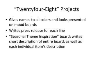
- 1. “Twentyfour-‐Eight” Projects • Gives names to all colors and looks presented on mood boards • Writes press release for each line • “Seasonal Theme InspiraCon” board: writes short descripCon of enCre board, as well as each individual item’s descripCon
- 2. Grapefruit Pink Bougainvillea Sea Salt Black Pearl “Calypso” “Neptune’s Net” Arranged LeL to Right “Horizons” “Pink Sand” “Salacia” “Siren” “Oceanus”
- 3. Coral Reef With each new season comes a Cme for fresh beginnings. Inspired by the tropics and coastal flair of the south of France, “Coral Reef” explodes in edgy cuts mixed with sunny, bright colors. Blending innovaCve textures and designs with tradiConal paUerns such as horizontal stripes and color blocking, “Coral Reef” manages to mix the avant-‐garde with the chic and sophisCcated. Grapefruit and pink bougainvillea light up the mood of this board, and are picturesquely contrasted against the sea salt and black pearl, creaCng a space for the seaside state of mind to come alive. This look is all about being independent, with a sense of adventure and poise. There is a focus on serenity, inspired by the horizon during sunset and the colorful buildings as they stand against the shores of the islands of France. The water inspires a sense of peace and fluidity, while the colorful, vibrant reefs and powerful, shining sun inspire a brightness and sense of excitement. Accessorize this effervescent look with jewels that match the rocky seaside of southern France. Earrings that branch out mirror the look of coral as it spreads to form a reef, while necklaces that make a statement pop with the power of the shining sun. Paired with any of the “Coral Reef” looks, these gems make for a splash of exhilaraCon that is consistent with the spirited energy of the islands from which they were inspired. Anyone who’s spent Cme in the south of France will instantly feel as though they have returned to the tropical vacaCon of a lifeCme aLer they’ve stepped into these tranquil yet lively garments. And for all those who have not been lucky enough to experience the beauCful reefs of this island, they’ll surely be dreaming of long and lovely weekends.
- 5. Overboard! Hang on to your railings…. Season 2014 is se^ng sail! These ocean vibes will keep you smiling from ear to ear, as every day is sunny and bright when wearing the “Overboard” collecCon. Inspired by the deep blue sea and all things nauCcal, “Overboard” is filled to the brim with tradiConal paUerns like horizontal and verCcal stripes, color blocks, and piping. Taking a Cmeless style and blending it with the freshest trends of the season, “Overboard” successfully guides buyers of 2014 into a breezy, blissful summer. Pink Snapper, NauCcal Navy, Regal Tang, Piña Colada, and Rose Murex color this mood board, bringing to life this sea themed extravaganza. This look manages to stay sophisCcated and suave while expressing a laidback summerCme vibe; its all about the good life with “Overboard,” whether you’re sailing the seven seas on a five star yacht, tanning by the pool with your friends and family, or grabbing dinner by the beach. Accessorize this phenomenal yet nonchalant look with jewelry that will have you looking like a treasure from the briny deep. With earrings that flow with the nauCcal message or bracelets that adorn garments with sparkle and shine, you’re sure to be a queen in any of these “Overboard” looks. Whether you’re suffering from too liUle vacaCon Cme or too liUle sunshine, these looks will be your cure. Step into “Overboard,” and take that much needed vacaCon by the sea!
- 9. • Use of InDesign and various photo ediCng applicaCons. • Styling, photography, and make-‐up
- 10. • Cover page to self-‐made, mini-‐editorial. • “AADA” is a ficConal clothing company created by “Soundtrek,” a ficConal musical group, made up of 2 Indian sisters. • Interview is the ficConal work of Brianna Darling. • Editorial created using InDesign. • Styling, photography, and make up by Brianna Darling.
- 13. • “Straight-‐ups” • Editorial created using InDesign.
- 15. Window Display Shop Reports This is window display for Louis VuiUon is simple and elegant. The black, white and gold coloring choices emphasize the classic Louis VuiUon look, enhancing the appearance of the well-‐known “LV” logo. Surprisingly, the purse on display sCll manages to take center stage, despite the flashy logo it stands in front of. The lighCng choices clearly work to highlight the bag. This River Island display incorporates fonts and props with clothes following a denim, yellow, and nude color scheme. The big monkey in the background is fun and playful, blending well with the wording behind the mannequins. The yellow and nude colors of the clothes are enhanced by the simple, quirky design, and create a successful display.
- 16. Converse chooses a more graphic appearance for this window display. With a black, white, and red color scheme, the display appears edgy yet inviCng, largely due to the hanging hearts (a symbol of warmth and joy) blended with the art-‐pop like graphics. The shoes don’t quite shine as much as they could, and would be beUer emphasized were they raised up in front of the hearts, rather than standing under them. Mango’s storefront display is all denim, with a few balloons and a big red heart out front. This display is easy going and clearly all about the clothes. The matching mannequins could do with a pop of color and a liUle more variety so as to draw the eye of shoppers to the store. The balloons are fun but appear random and misplaced.
- 17. Versace’s window display is busy and aUenCon demanding; there seems to be a lot going on all over the place in this display, yet it carries the same theme and décor throughout. Black, white, and gold take center stage, and there seems to be an art-‐pop like theme on display here. The clothes are the major focus of the display. This window display is for a lingerie store; the mannequins are topless and wearing loose fi^ng jeans, with paint splashed across their upper halves. The denim allows the neon orange and pink to really pop out of the display, and it definitely drags aUenCon to the mannequins’ breasts, which is the only real connecCon to the lingerie sold in the store. The bright colors and graphic design really grabs the aUenCon of by standers in a simple way.
- 18. Kama Sutra Brand Overhaul Press Release