- The document summarizes Bradley Santon's summer assignment from 2014 where he visited the National Portrait Gallery for inspiration and created a triptych self-portrait based on the styles of artists he saw.
- He chose four portraits to copy and studied them in pencil before selecting Duncan Grant's style using stippling to paint his self-portrait triptych depicting himself with happy, calm and angry expressions.
- Bradley found drawing himself from a mirror difficult and had to redo one of the portraits to make the scale consistent. He was pleased with how the monochromatic colors showed depth but felt the head sizes could have been better matched.
2. THE NATIONAL PORTRAIT GALLERY
On the 8th of July I took a trip to the portrait gallery to find inspiration for the style, colour and imagery for my triptychs.
Although none of the pieces I chose to copy are SELF PORTRAITS, I like them for different reasons as explained below.
Duncan Grant –1912
Portrait of ‘ George Mallory’
Oil on panel
Matthew Smith – 1944
Portrait of ‘Roald Dahl’
Oil painting
Julian Opie – 2000
Portait of ‘Blur’
Digital paintings of the
band members
Gauthier Hubert – 2014
Man looking like Van
Gogh
Oil on canvas
The way the artist has used
only a few shades of blue for
the background, gives an
illusion of nothing else being
there – then you begin to
see his shoulders and shirt.
The blue colour is also a
visual link to Van Gogh
The artist blends the use of two
dimensional and three
dimensional aspects together in
a unique way, giving the
impression of a digital painting.
I liked the realistic 3D
affect that this painting
gives and the interesting
shadows created using
thick brush stokes .
A monochromatic stippled
effect that the artist has
applied to his work
creates emotion, depth
and definition
3. STUDIES OF THE PORTRAIT PAINTINGS
I decide to do all the studies in pencil to see if I could achieve the same effects without the use of colours.
I first drew this picture in pencil
then went over it in fine liner
because it looked a bit boring
and had no depth. I was going to
leave it like that but then decided
to try even thicker overlay to
emphasise prominent features
which added to the overall feel
of the copy.
I drew the picture in
pencil with very little
shading or detail and no
background shading. This
was the only way that I
could create the same
stark feeling as the
original portrait.
I drew this picture in
pencil and then shaded
heavily to create the
same sort of 3D effect
that the original has.
Once again I drew this
picture in pencil with very
little shading or detail
and because knew that
this was the portrait that I
was going to copy in a
painted format..
4. PRACTICAL STUDY OF OTHERS WORK
Duncan Grant –1912
Portrait of ‘ George Mallory’
The artist has used a combination of
techniques, such as stippling and
possible finger painting in the same
tones using darker tones for the
background. This makes the subject
within the painting (the man) stand out
boldly and give areas of the painting
texture, creating detail, changes in
light and three dimensional aspects.
This painting can suggest that the artist
wanted the man (George Mallory), to
be the main focus of the image.
Mallory was part of the first three
expeditions up Mount Everest in the
1920’s soon after the picture was
painted. This is perhaps why the artist
has made him feel important yet
contemplative within this painting.
I used acrylics in lighter tones in my
study to emphasise the subject against
the darker background.
I used this style of painting for my
triptychs and trying to show depth
using monochromatic tones of the
same colour palette.
My copy of the Duncan Grant portrait Oil on panel
5. PRACTICAL STUDY OF IMAGES FOR TRIPTYCH
Once I had decided the style of painting, I found it really useful to look at triptychs which had been done by others and also to
do small drawn and photographed studies of what kind of images I could use for my pieces. I looked at quite a lot of styles but
finally decided on the ones shown below as shown below.
This was based on the triptych (below left). I simply
split the outer images in half like the original.
However in my final pieces I used three images,
making the outer two have different expressions,
e.g. Happy, Calm and Angry.
Like the picture by Grant that I copied, these pictures use tones of one colour to
represent depth and light.
This triptych uses a very similar technique of painted style to the style I
used for my triptych. The images in this painting are also what I was going
for as far as strength of image and ease of drawing in front of a mirror.
The colours are bold but I used different monochromatic colours for
each part of the triptych.
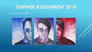
6. SUMMARY OF THE TRIPTYCH PROCESS
I started with hand drawn of images of me in the mirror . This process was really difficult and meant that my first attempt at the central
picture was really distorted and out of scale with the others. So I re-did the central picture and it looked more in scale against the others. I
then painted each portrait using one colour with black and white acrylics to create the depth and shadows. All portraits were done in the
painting style of Duncan Grant – a kind of stippling mark making.
My final triptych portraits
‘HAPPY/CALM/ANGRY’
7. EVALUATION OF THE SELF-PORTRAIT PROJECT
The original brief of the project asked for a triptych of painted self portraits based on the style of a portrait by
My favourite part of the project was the experiments in trying to decide what I would use for my
portraits. I looked at loads of ideas and did loads of drawings and photographs and colour
palettes before finally settling on the content and colours which formed my final pieces.
Generally, I liked the way the
final pieces looked together
but they would have been
better if the head was the
same size in all of them. I really
pleased with the way that the
shadowing and depth was
achieved using three
monochromatic tones – Blues,
Purples and Reds. And they do
look like me!
another artist.
I enjoyed the trip to the
National portrait gallery
but I found it limited in
the styles that I actually
liked. I finally found a
style that was similar to
my actual painting style
and this is why I chose to
use it.
I found the process of drawing myself
from a mirror really hard! I did the
actual drawings with the mirror and
then painted them without the mirror.
Using the mirror also meant that the
scale of the faces did not match
because I was closer for the HAPPY
picture so my head is slightly larger in
this painting overall. My first attempt at
the purple painting was really out of
scale and distorted – see above - so I
decided to re-draw this one and am
much happier with it.
8. PROFESSIONAL PRACTICE CASE STUDY
AN ILLUSTRATED CASE STUDY OF AN INTERIOR DESIGN PRACTICE
LYNNE HUNT LONDON
Interior design studio in London
I chose to look at LHL interior design company because my
parents are interior designer’s and they have worked with the
main designer at the practise for over 20 years.
Lynne Hunt London are mainly concerned with 5* hotel projects
and high end residential properties. The project can be
traditional, modern or completely themed as can been seen in
some of these project photos.
A brief for the project is normally set by the client and given to the
principle designer for interpretation and research. The budget for
the job and the direction of the style of the job is also determined
at this stage.
At LHL, the designer’s do a lot of research about the area where
the property is located, and the style and colour of art and
landscape around that area are also considered. They then put
together colour boards which will show actual images of the
structure, furnishings and art that may be used together with
actual visuals of the space which are normally drawn by hand or
more recently , using . This is then presented to the client as an
initial look at the direction that the design is taking.
9. PROFESSIONAL PRACTICE CASE STUDY
AN ILLUSTRATED CASE STUDY OF AN INTERIOR DESIGN PRACTICE
After the initial presentation, the designer s then put
together a detailed package of drawings (using
AutoCAD) , finishes and furnishings ( using Virtual Design
Studio) which take into account any comments that the
client may have made and any time restrictions that are
in place which could which effect what is selected
because of availability.
The documentation is normally filtered through to the
client in phases and billed accordingly. Everything that is
selected will normally be scrutinised by the hotel or
property group to ensure that it is appropriate for its final
use – for example , in a hotel project everything has to be
contract quality which means that it will last longer and
withstand use and abuse by people using the hotel. The
price is also considered and any changes are made by
the designer’s prior to work commencing.
Once everyone is in agreement, work commences and
the final in-situ photos are taken which will be included
on the clients advertising and also in the LHL portfolio.
10. PROFESSIONAL PRACTICE CASE STUDY - SUMMARY
How do I feel, what have I learnt?
After meeting with Lynne and the team from Lynne Hunt London, I
was quite inspired to pursue a career in the design industry.
I now realise that any design job must involve a great degree of
research into the background of the product, area or client before
any creative decisions can be made.
Although interior design is very diverse and interesting, my preference
would be for smaller scale jobs on the graphic design side which
could involve signage within interior spaces, advertising or company
logos and identities.
I will definitely follow the DESIGN pathway in my second year of A
Level art and Design .
The kind of courses that I am looking at within universities are either
Graphic Design , Web Design or Digital Media Arts degrees that have
the most versatility for future employment opportunities.