Gantt
•Download as DOCX, PDF•
0 likes•139 views

The document describes the steps taken to create a basic Gantt chart in Excel based on a YouTube tutorial video. Key steps included: 1) Setting out data into a three column table with task names, planned dates, and task types. 2) Inserting a blank bar chart and adding the table data. 3) Reversing the axis order and changing axis labels to match the task names and types. 4) Removing surplus data from the table and bars, adjusting date ranges, and formatting the final chart.

Recommended
More Related Content
More from Zach Wilkins
More from Zach Wilkins (20)
Recently uploaded
Recently uploaded (20)
Gantt
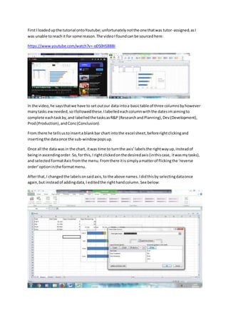
- 1. FirstI loadedupthe tutorial ontoYoutube;unfortunatelynotthe one thatwas tutor-assigned,asI was unable toreachit for some reason.The videoI foundcan be sourcedhere: https://www.youtube.com/watch?v=-oD50HSBBBI In the video,he saysthatwe have to set outour data intoa basictable of three columnsbyhowever manytasks ewneeded,soIfollowedthese.Ilabelledeachcolumnwiththe datesimaimingto complete eachtaskby,and labelledthe tasksasR&P (ResearchandPlanning),Dev(Development), Prod(Production),andConc(Conclusion). From there he tellsustoinserta blankbar chart intothe excel sheet,beforerightclickingand insertingthe dataonce the sub-window popsup. Once all the data wasin the chart, itwas time to turnthe axis’labelsthe rightwayup,insteadof beinginascendingorder.So,forthis,I rightclickedonthe desiredaxis(inthiscase, itwasmytasks), and selectedFormatAxis fromthe menu.Fromthere itissimplyamatterof flickingthe ‘reverse order’optioninthe formatmenu. Afterthat,I changedthe labelsonsaidaxis,to the above names.Ididthisby selectingdataonce again,but insteadof addingdata,I editedthe righthandcolumn.See below:
- 2. Thenit wastime for me to getrid of the surplusdatawithinmytable,andremoveditbyright clickingonthe bars firstand selecting‘FormatDataSeries’.Then,IwenttoFill,andsetitto ‘nofill’. And,finally,I adjustedthe datesbyaccessingthe formatoptionsagainandsettingthe minimumand maximumdatestowhatI needthemto be. Afterthat,it wasa matterof adjustingthe chartto lookhow I want itto before savingitand uploadingit.