2. ABOUT
This magazine started in a completely different form. I was working
on a different project for my class,where I was designing number cards
that had images of each female typeface designer and a blurb about
her.While I was working on that project,something just wasn’t feeling
right.So,when we were assigned a 16-page publication for our final
project,I put my journalism experience to use and created this mag-
azine about female typeface designers.Typeface designers alone are
the true unsung heroes behind so much graphic design work, as you
ususally have to do a lot of research to find out what fonts are used in
the work.I wanted to not only shine a light on typeface designers,but
I wanted it to be focused on females.Researching these designers that
I admire gave me so much inspiration to see this project through,and
to share their stories with people who may not be familiar with them
- like Nadine Chahine creating Kouifya,the first typeface with equal
Latin and Arabic parts,and Liron LaviTurkenich - creating an entire
alphabet, Avarit, that meshed the Hebrew and Arabic languages. It
humbled me to read about all of the work these women have done in
their career,and it motivated me to give more credit to the people who
created the typefaces I use in my design,which also affects the way I
purchase and use typefaces. I could not have chosen a better subject
matter for my final project.
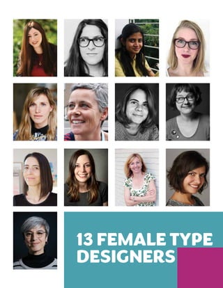
3. 1. Laura Worthington
2. Sara Soskolne
3. Pooja Saxena
4. Victoria Rushton
5. Liron Lavi Turkenich
6. Marina Chaccur
7. Veronika Burian
8. Nina StŐssinger
9. Nicole Dotin
10. Elena Schneider
11. Sibylle Hagmann
12. Nadine Chahine
13. Laura Meseguer
TABLEOF
CONTENTS
4. A
typeface designer in Washington State, Laura
Worthington was trained in graphic design and
started working as a designer in the mid-’90s.
In 2010, however, she was able to take her love
for lettering and typography and turn it into a business when
she published her first typeface, GrindelGrove. Since then, she
has published more than 80 typefaces and designed custom
typefaces for Fortune 500 companies. Her typefaces are based on
her own hand-lettering and calligraphy, something that she has been
interested in since the fourth grade, when her teacher taught her the
value of penmanship.
A pioneer in producing families of different display styles that work
together to evoke a particular aesthetic, Laura created Charcuterie,
which features ten distinctive faces inspired by artisanal French food
packaging. She has won awards for her type designs from Commu-
nication Arts,Typographica and MyFonts featured for her typefaces in
their “best of the year”lists for six years straight. She has been featured
in Communication Arts, HOW, Letter Arts Review, Computer
Arts, CreativePro and more publications and her work has been
used by companies like Microsoft, Starbucks and J.M. Smucker.
She has taught as an adjunct professor in the Visual Commu-
nications program at Highline Community College in Des Moines,
Washingtonforoverfiveyearsandhasalsotaughtover30workshopsfor
CreativeLive, SVCSeattle,Amazon.com,AIGA,TypeCon,TypeCamp.
On top of that,she has also spoken at The Kerning Conference in Italy,
Adobe Creative Jam and SVC Seattle.
Laura
Worthington
5. Born in 1970, Sara Soskolne is a Senior Type-
face Designer at Hoefler & Co, a swoon-worthy
type foundry that has been around for nearly
twenty years. She worked as a graphic designer
for ten years in her hometown of Toronto before
moving to England to study typeface design
at the University of Reading. She received her
MA in 2003 and since then, she has taught
type design at the Yale School of Art, the Book
Arts Institute at Wells College, and New York’s
School of Visual Arts and the Type@Cooper
Condensed Certificate Program. She joined
H&Co in 2005 and has contributed to the
design of many font families like Chronicle,
Gotham, Tungsten, Idlewild, Numbers, Sen-
tinel,Quarto,and most recently,Peristyle.She has
written about,and recently gave a speech at the San
Francisco Public Library about,the evolution of the
sans serif type.She also writes for Alphabettes.org
(a typography and type design network),juries for
different type showcases,teaches workshops and
participates in talks about type design.
6. POOJA SAXENA
A
typeface and graphic designer,Pooja Saxena graduated from
the National Institute of FashionTechnology and worked as
a graphic designer at Ishan Khosla Design before she pursued
her interest in type.She then received her MA inTypeface
Design at the Department of Typography and Graphic Com-
munication, University of Reading (UK) and also received the
Monotype Imaging Studentship to pursue her studies. This is
where she developed Cawnpore,a Latin-Devanagari typeface.
Pooja’s research about typography in India has been celebrated at
ATypI’s annual conference andTypography Day.She has taught work-
shops about typography at design schools in India like the National
Institute of Design and Srishti School of Design,Art andTechnology
in Bangalore and Pearl Academy in New Delhi. Her work has
been featured in publications such asTheTimes of India,The Hindu
BusinessLine Ink,TimeOut,Kyoorius Magazine and Creative Gaga.
She briefly worked on the font team at Apple,Inc.in late 2012 before
moving back to India, where she divides her time between typeface
design,consulting and digital design.
In addition to designing typefaces, Pooja also organizes events
like Typerventions in Bangalore, where participants create experi-
mental lettering using everyday material in the city’s public spaces.
She worked with Nirbheek Chauhan on the initiation, design and
development of the Bharti Braille Converter, a free online tool
that converts Hindi and Marathi text in the Devenagari script to
Bharati Braille. And most recently, they worked on The Ballot - a
bilingual (English and Hindi) compilation of information about
the Indian political system, which has been celebrated not only
for its impact, but also its multi-script design. She also has a
Flickr account dedicated to newspaper nameplates.
7. A graphic design class at the Rhode Island School of Design
took Victoria Rushton away from her Illustration major.And while
studying graphic design,she decided that type design would in fact be
the best direction.While in college,she worked on the typeface that
would become Marcia, a “practical and sturdy Modern featuring a
wealth of unusual ligatures and swash decorations,”which she released
in 2015. She trained as a type designer at Font Bureau, and later
opened her own independent foundry.
Victoria likes to make things with a purpose,and says that “that the
core of type design is a considered need, while contextual beauty
is a secondary concern.”She understands the importance of written
communication and views her role as a type designer as a way to “con-
tribute to the words we’re lucky enough to share with each other.”
Along with designing type, she is a contributor at alphabettes.
org and last year,she gave a talk about designing script typefaces at the
Typographics conference.
8. Image Credit: Liron Erel
Liron Lavi Turkenich is an Israeli Type and Graphic designer, researcher
and speaker.She was born and raised in Haifa,a mixed Jewish and Arab city,
and graduated from the Shenkar College of Design in Tel Aviv with a B.Des
in Visual Communications. She continued her studies at the University of
Reading,where she received her Masters of Arts in Typeface Design.
It was the road signs in her hometown that inspired her to create Ara-
vrit, a stylized writing system that merges the Hebrew and Arabic languages,
and has been labeled the “typography of peace.”According to the IsraeliTimes,
she realized that she ignored the Arabic lettering on the road signs that she and
most Israeli Jews cannot read,so she set out to change that.Starting six years
ago,she researched the work of French ophthalmologist Louis Emile Javal,who
in the late 19th century discovered that people can read using only the top half
of Latin letters.Liron experimented and realized that the same was true for
Arabic letters, and the opposite was true for Hebrew letters.With this in mind,
she combined the 22 letters in Hebrew and the 29 letters in Arabic to create
Aravrit,an alphabet with 638 characters that she is still developing.
Aravrit has been featured in several publications,YouTube channels and
it even has a Facebook page (https://www.facebook.com/aravrit). Liron has
spoken about typeface design at TYPO Talks,TypeCon and the Tel Aviv
chapter of Creative Mornings. She also participates in exhibits and gives
workshops, contributes to alphabettes.org and is a senior level events coordi-
nator at ATypI,organising the yearly conference and its routine activities.
9.
10. When Marina Chaccur first got into design college, she planned on
designing chairs for the rest of her life. But then she discovered her
love for graphic design,which turned into a love for typography,callig-
raphy,type design,and most importantly to her,lettering.She received
a degree in Design from Fundação Armando Alvares Penteado, an
MA in Graphic Design from the London College of Communication
and an MA inType and Media from the Koninklijke Academie van
Beeldende Kunsten.
She has taught at a few of the major Design Bachelor’s programs in
Sao Paulo and is continuously involved in conferences,lectures,work-
shops and exhibitions worldwide,and also served as board member for
the AssociationTypographique Internationale from 2010 - 2016.She
is currently living inThe Hague,working forType Network and her
own independent studio,Marina Chaccur Designs.
11. Veronika Burian met her partner José Scaglione while they were completing their Master’s in
Type Design at the University of Reading. Together, they run an independent, cosmopolitan
virtual type foundry, named TypeTogether. The foundry was established in 2006, while José was
living in Rosario/Argentina (where he still resides) and Veronika was living in Boulder, Colorado.
In 2010,TypeTogther was incorporated as a limited company in the Czech Republic, but there is
not a physical office and their whole team is spread across the globe. They focus on creating text
typography for intensive digital and print editorial use,and have been recognized in several international
competitions,such as Granshan,TDC,and ED-Awards.
Veronika and José also work with typeface design students as part of their Typeface Publishing
Incentive Program.Established in 2014,the program offers support and guidance to selected projects,
and the aim is to allow exceptional projects started during a course of study to be finalised and published
commercially at the end of the course.Any students enrolled in a postgraduate typeface design course
can apply through theTypeTogether website.
She also lectures and teaches workshops at international conferences and universities. In 2004,
her font Maiola received the TDC Certificate of Excellence in Type Design, amongst other awards.
She is also a contributor for alphabettes.org, showcase for research and work on lettering, type
design and typography by women.
12. A self-described type-obsessed designer and overall curious person, Nina Stoessinger is a Senior Type-
face Designer at Frere-JonesType.She graduated from Burg Giebichenstein University of Art and Design Halle
with a degree in multi-media design and also received a Certificate for her postgraduate typeface design studies
at Zurich (CASTypeDesign) and a Masters inTypeMedia atThe Hague.
She worked as independent graphic designer,typographer,type designer and coder in Basel and the Hague for
seven years before joining Frere-JonesType.Nina also joined the faculty at the Yale School of Art in 2016,where
she teaches type design in the Graphic Design MFA program and alternates semesters withTobias Frere-Jones.
Nina has carried her teaching onto screen typography classes at FH Dresden and Python scripting at esad
Amiens.She has also served as a guest critic at the School of Visual Arts and has spoken at numerous confer-
ences and events including TYPOBerlin,TYPOLabs,ATypI,Typecon,Typographics,Ampersand,Kerning
Conference,& TypeAmsterdam.
She currently serves on the board of directors of theType Directors Club and on the board of moderation at
TypeDrawers and she has been part of the typography,lettering and type design showcase,alphabettes.org,since
its inception.Her work has been awarded the Certificate of Typographic Excellence from the Type Directors
Club,the Certificate of Excellence from the International Society of Typographic Designers,the iF commu-
nication design award,the Award of Excellence from Communication Arts,and more; and exhibited in various
locations across three continents.
ImageCredit:MarcEckardt
13. nicole dotin
Typeface designer and partner at ProcessType Foundry,Nicole Dotin earned a degree in photography from the
University of Minnesota while documenting the exploding mid-90s hardcore scene through a self-published
magazine. It was the process of publishing the magazine that made her see what a powerful tool graphic
design was,and she decided to further pursue it,at the Minneapolis College of Art and Design,to be exact.She
received her MFA in Visual Studies and was exposed to typeface design,which led her to publish her graduate
thesis,exploring the nomenclature of font vs.typeface.
She started out working a professional graphic designer,then worked part-time for Process Type Foundry,
focusing on detailed typography and later taught typography at Minneapolis College of Art and Design.In 2006,
she overheard students discussing their study-abroad experiences and she decided to apply for the type design
program at the University of Reading in the UK,for which she was accepted.Before leaving for the University
of Reading,Nicole initiated Process Type Foundry’s rural studio experiment,moving the foundry to a remote
region of northern Minnesota for six month of work,reflection,and swimming after lunch.
While at the University of Reading,Nicole worked on a typeface for continuous reading and later emerged
with a Masters of Art in Typeface Design with distinction and started Elena,a serif typeface that she released
five years later,in 2011.She was a speaker at the TYPO Labs Conference in 2017 and has also contributed for
alphabettes.org,the showcase for women in typeface design,lettering and typography.
14. Elena Schneider is an independent type and logo designer from Germany,who is currently living with her
family in Husavik,Iceland.She received her Masters of Art inTypeface Design from the University of Reading
in the UK in 2011 and regularly collaborates with type foundries,design studios and agencies around the world.
Her typeface Halunke, which is featured in this article, was also used as a header on the website for
alphabettes.org in January of last year.
She collaborated with designer Büro Dirk Rudolph on a new logo for Engima, a German musical
project founded in 1990 by Romanian-German musician and producer Michael Cretu, and for Mit-
Vergüngen,a travel guide site for Berlin,Hamburg and Munich.She has created a corporate identity for
Coucou Couleur,a German furniture paint company and also created the logo and book design for a book titled
Into the Blue for Nuuna by brandbook.
Her typeface Eskorte, a serif family that she started while at University of Reading and was released
by Rosetta in 2013, was awarded Bronze by EdAwards 2014; 1st place by Granshan 2014 and was nominated a
German Design Award in 2015 and was included inTypographica’s Best of 2013.It was designed for 97 Latin
languages,Persian and Arabic.Another typeface,Paroli,designed for basic Latin,is considered the “ludic coun-
terpart of Eskorte”and was included inTypographica’s Best of 2014.
Image Credit: Julia Kneuse
15. Swiss-born type designer Sibylle Hagmann graduated from the Basel School of Design in Switzerland
in 1989 and continued her studies at CalArts (California Institute of Arts), where she received her Mas-
ters. Her award-winning Cholla typeface was originally commissioned by the Art Center College of Design and
was released by the type foundry Emigre in 1999; it was also among the winning entries of buvka:raz!,the type
design competition of the AssociationTypographique Internationale (ATypI) in 2001.
Sibylle founded the well-known Kontour creative studio in 2000, which started out with a projects
ranging from graphic, typographic and type design, but now focuses specifically on type design. She
has worked for high-profile clients, including CORE Program of the Museum of Fine Arts, Houston;
Dallas Museum of Art; and the Fisher Gallery of the University of Southern California (USC),Los Angeles.
Her typeface family Odille,which she published in 2006,was awarded the Swiss Federal Design award that year,
and has been featured in numerous publications and is recognized by theType Directors Club of New York and
Japan.
She has presented her work nationally and internationally at typography conferences and educational
institutions with occasional workshops over the years, and since 2002, has been a professor at the University
of Houston’s School of Art.
16. Dr.Nadine Chahine is an award-winning Lebanese type designer for Monotype,specializing in Arabic fonts.
She studied Graphic Design at the American University of Beirut before she explored the design possibilities
of Arabic type further and received her Masters in Typeface Design at the University of Reading in the UK in
2003.She then received her PhD from Leiden University in the Netherlands,while investigating the study of
legibility of Arabic script.
She started at Linotype,now Monotype,in 2005 and initially worked on combining design with sales and
marketing. However, as the company’s Arabic type design program became more prevalent, her focus
shifted more towards font development.Nadine was the first designer to create a typeface (Koufiya)that was has
matching Arabic and Latin parts that were designed concurrently,and she is now working as Monotype’s UK
Type Director.She also works with MIT AgeLab on extensive studies around legibility,focusing on glance-like
conditions like dashboards.
Nadine worked closely with Hermann Zapf to create Palatino Arabic, and has created Arabic versions of
Frutiger,Helvetica and Zapfino.Her team also worked with Transport for London on the remastered design
of the 100-year-old Johnston typeface. She has won several awards, including two for Excellence in Type
Design from theType Directors Club in 2008 and 2011,received a Certificate of Excellence for ISTD, and was
selected as one of Fast Company’s 100 Most Creative People in Business in 2012.
Her typefaces include: the best-selling Frutiger Arabic,Neue Helvetica Arabic,Univers Next Arabic,Palatino
Arabic and Palatino Sans Arabic, Koufiya, Hamra Str. and Big Vesta Arabic. She has designed custom
typefaces for clients such as The Executive Council of Dubai,mbc,Sony,H&M,An-Nahar newspaper,Abu
Dhabi Ministry of Interior,and Credit Suisse.Her typefaces have been used by numerous brand owners such
Emirates NBD,Etihad,Dubai Airports,mbc,OSN,and SKY News Arabia.Her work was also featured in the
5th edition of Megg’s History of Graphic Design.
17. Based in Barcelona,Spain,Laura Meseguer is a freelance graphic and type
designer who specializes in lettering,typeface design,identity,editorial design,
book design and other commissioned projects.She worked for different
advertising agencies and graphic design studios for over 20 years before opening
her own studio.She has worked on projects like the Anna Schuleit Haber’s
public art project called “The Alphabet”and has designed custom typefaces,
like La Rosa De Foc, which she designed for the documentary “Barcelo-
na.The Rose of Fire.” She is also the co-author of the book “Cómo crear
tipografías. Del boceto a la pantalla”, published by Tipo e, published in
Spanish and translated into Polish, Portuguese and English
From 2001-2002, she was the co-editor of the typographic bulletin
TypoRed with Allan Daastrup and she took a year off from her regular work
in 2003-2004 to study type design at the post-graduate course of Type]
Media at the Royal Academy of Arts in The Hague, the Netherlands. It was
there that she designed Rumba, which was awarded the TDC Certificate
of Excellence in 2005, “Our Favorite Typefaces” at Typographica in
2006 and the ATypI Prize Letter.2 in 2011.
She has participated in many exhibitions and conferences in Europe and
Spain and is a typography professor at Elisava and at the Master on Advanced
Typography at the Eina School of Art and Design,both in Barcelona.She also
authoredTypoMag:Typography in Magazines (published by Index Books in
July 2010) a publication devoted to the use of typography in contemporary
magazines.She designed,edited and curated a list that started at 200 and was
narrowed down to 29 magazines.
18. CREDITS
Sara Soskolne
Words: https://en.wikipedia.org/wiki/Sara_Soskolne
https://www.typography.com/about/
Image: Sara Soskolne
Name Font: Quarto Block by Sara Soskolne
Graphic: https://www.typography.com/blog/introducing-peristyle
Laura Worthington
Words: http://lauraworthingtontype.com/about-me/
http://www.myfonts.com/newsletters/cc/201008.html
Images: Laura Worthington
Font on the page: Boucherie Cursive (http://lauraworthington-
type.com/family/boucherie-collection/)
Publication
Fonts: Adobe Caslon Pro - Regular by Carol Twombly
Congenial -Black & Beloved Script by Laura Worthington
Illustrations: Amanda Branham
Layout and Design: Amanda Branham
Editor: Tom Fillebrown
Pooja Saxena
Words: http://www.poojasaxena.in/
https://poojasaxena.wordpress.com/
Image: Pooja Saxena
Flickr Account: (www.flickr.com/photos/anexasajoop/
sets/72157636584355224/)
Font: Farsan (https://www.urbanfonts.com/fonts/Farsan.font)
Victoria Rushton
Words: http://www.victoriarushton.com/index.html
https://victoriarushton.typenetwork.com/
https://typekit.com/foundries/victoria-rushton
http://create.adobe.com/2016/4/29/10_women_type_designers.
html
Graphics: http://www.victoriarushton.com
Image: Victoria Rushton
Lettering: Victoria Rushton
Veronika Burian
Words: https://www.fontshop.com/designers/veronika-burian
http://www.type-together.com/index.php?action=portal/view-
Content&cntId_content=3354
Image: Veronika Burian
Font: Karmina Italic
Marina Chaccur
Words: http://www.marinachaccur.design/about/
https://www.behance.net/marinachaccur
http://create.adobe.com/2016/4/29/10_women_type_designers.html
Image: Marina Chaccur
Font: Chic (not yet released)
Nina Stössinger
Words: http://ninastoessinger.com/about/
Images: Marc Eckardt
Font: Nordvest (http://ninastoessinger.com/typefaces/nordvest/)
Liron Lavi Turkenich
Words: http://www.lironlavi.com/about-2/
https://www.timesofisrael.com/can-you-read-aravrit-the-typog-
raphy-of-peace/
Image: Liron Erel
Font: Makeda (http://www.lironlavi.com/2013/07/08/make-
da-typeface/
Nicole Dotin
Words: https://processtypefoundry.com/about/biographies
https://www.typotalks.com/speakers/nicole-dotin/
Image: Nicole Dotin
Font: Pique (https://processtypefoundry.com/fonts/pique/)
19. Laura Meseguer
Words: http://ninastoessinger.com/about/
https://www.myfonts.com/person/Laura_Meseguer/
Image: http://www.laurameseguer.com/about/
Font: Magasin (http://type-o-tones.com/)
Elena Schneider
Words: http://elenaschneider.com/
http://blog.elenaschneider.com/
http://typographica.org/typeface-reviews/paroli/
http://typographica.org/typeface-reviews/eskorte/
https://en.wikipedia.org/wiki/Enigma_(musical_project)
Image: Julia Kneuse
Font: Work-In-Progress (http://elenaschneider.com/)
Sibylle Hagmann
Words: https://www.kontour.com/about/
https://www.myfonts.com/newsletters/cc/201304.html
http://www.uh.edu/kgmca//art/About-the-School/Faculty/hag-
mann-s.php
http://vcfa.edu/graphic-design/faculty/sibylle-hagmann
Image: https://www.fontshop.com/content/fontshop-cele-
brates-women-in-design-sibylle-hagmann
Font: Cholla (http://www.kontour.com/typeface/cholla/)
Nadine Chahine
Words: http://www.printmag.com/design-education/from-the-
inside-from-the-heart-type-designer-nadine-chahine/
http://www.monotype.com/people/nadine-chahine/
https://www.linotype.com/5282/nadine-chahine.html
Image: http://www.monotype.com/people/nadine-chahine/
Font: Badiya-Bold (https://www.linotype.com/5282/nadine-cha-
hine.html)
RESOURCES
alphabettes.org - a network for type designers and letterers
typequality.com - a platform for discovering and sharing typefaces designed by women
https://www.fontshop.com/content/women-in-type-design
http://create.adobe.com/2016/4/29/10_women_type_designers.html
http://www.designworklife.com/2014/04/09/lady-type-designers/
http://www.typophile.com/node/80648
This is not an exhaustive list.There are some really awesome
female typeface designers that were not featured here. You
can find more information at the sites below.
20. Thank You
This magazine would have nothing in it if it wasn’t for all of the ladies who
responded to my e-mails and gave me permission to use their images, sent me
their names in their chosen fonts, and edited the blurbs that I wrote about them.
So, thank you all. It was such an inspiration to do all of the research and to look
through all of the different projects.That was the best part of his project! And a
special thank you to Laura Worthington for sending me a ton of free fonts to use
for this project and beyond. What a wonderful surprise! And of course, thank you
my teacher and mentor, Mr.Tom Fillebrown.Thank you for not only listening
to all of my crazy ideas, but for encouraging them and helping me see them
through. Not all of them work, but thank you so much for giving me the space to
find that out. Your support does not go unnoticed.