Question 1: In what ways does your media product use, develop or challenge fo...
Mag conventions
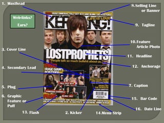
1. 1. Masthead 8. Selling Line
or Banner
Web-links?
Ears? 9. Tagline
10. Feature
Article Photo
3. Cover Line
11. Headline
4. Secondary Lead 12. Anchorage
5. Plug 7. Caption
6. Graphic
15. Bar Code
Feature or
Puff
16. Date Line
13. Flash 2. Kicker 14.Menu Strip
2. Heads and faces
in the top third
Headline in the mid
third
Crowded
style
3. Heads and faces
in the top third
Headline partially in
the mid third
Crowded
style
4. Heads and faces
in the top third
Headline in the mid
third
Crowded
style
5. COLOUR – The colour scheme for Kerrang magazine is generally black and white, with
yellow and red often added in some places. This reflects the style of music Kerrang is
associated with.
FONTS – Generally Kerrang uses 3 or 4 different fonts that match to what they are with.
STYLE – The style of the mag covers is generally very crowded, witch looks good on
this particular magazine, direct mode of address is usually used in their front cover
photos, these two styles together make the mag seem very in your face
USE OF SPACE – The rule of thirds has definitely been used on the Kerrang magazines,
the left side does not always totally dominate the page although most attention is drawn
there. People heads always seem to fit into the top third of the image and the headline
always sits in the middle third
CONCLUDE – The design of the Kerrang magazine fits the typical magazine
conventions, it is always very loud, in your face, but is in this way very effective.