
Recommended
More Related Content
What's hot
What's hot (19)
Similar to Previous students work
Similar to Previous students work (20)
Recently uploaded
Recently uploaded (20)
Previous students work
- 1. Textual analysis of previous students work
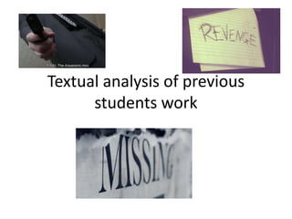
- 2. The assassins • Good use of chiaroscuro to add a bit of tension to the opening scene. This is used so the audience feel anxious about the woman’s pursuer. • Good use of ‘whodunit’, to add mystery to the killers identity. This is used to draw in the audience and make them wonder as to the killers identity. • Good use of close ups, to make the film more interesting, and draw the focus onto his hand. This is later shown to be his impatience waiting for his partners call. • Good use of cutting to make the situation tense and exciting. This is used to make the smarter of the audience expect something to happen soon. • Good use of sonically exaggerated sound to make the murder more prevalent in the audiences mind. This brings the murders to the forefront of their minds and makes them wonder as to why they are targeting those women. • Interesting use of manual focusing to blur out her hand at the end. This adds a touch of finality to her part, as she seems start disappearing, before it all fades to black. • There were no credits used in the intro. This takes away from the feeling of it being the beginning and it almost seems as if it were the final scene of a movie. • The films continuity was sometime off. For example when the man pushes the woman she isn’t close to a sofa, but somehow lands on the sofa.
- 3. Revenge • Good use of non-diegetic, off-screen, music. The pitch and pace of the music set the theme for the coming scene. The high pitch and slow pace make the audience feel that this thriller may be sad and/or scary. • Interesting way of creating a title sequence. The use of papers with the actors names on it coming out the filing cabinet fits the theme. This makes the audience notice the names but not be snapped from their attentive mood. • Interesting use of a voice over. The lady’s voice describing what happened to her as we saw it happen made it rather interesting. This described what happened to the audience and also makes them wonder who she is talking too – which could later lead to a red herring. • Good use of colour to represent the characters. The victim being in light colours may represent her innocence and the attacker being in dark colours may represent his ‘evilness’. This sets up an automatic dislike of the attacker in the audiences mind. • I don’t see the point in putting the attack in reverse, as it adds no new information, and actually seems to subtract from the atmosphere the attack created.
- 4. Missing • Good use of a title sequence to immediately set the tone of the film. The chiaroscuro used, added to the backing track makes the audience understand immediately the theme the movie will take. • Good use of a flash back to make the audience understand what is important to the character and what he is thinking about. • Good use of a close up on his fallen book to show us what he was doing. This leads the audience to speculate about why he is so interested in the missing children. • Good use of a voice over to inform the audience of the little girls death. This leads the audience to feel bad for the man, until they see his book. • Good use of the news paper clippings to make the names less of a distraction from the film. This means the audience can appreciate the names of the people who created the film and yet not break their focus. • Unfortunate shaking of the camera at points, making the film seem amateur-ish. This could be fixed by using a tripod or a steady shot. • Good use of a close up on the old mans eyes. This makes the audience see that he looks weary and tired. This makes them feel pity and empathy for him.