

Recommended
More Related Content
What's hot
What's hot (7)
Viewers also liked
Viewers also liked (20)
Similar to Design Experiments with CRO
Similar to Design Experiments with CRO (20)
Recently uploaded
Recently uploaded (20)
Design Experiments with CRO
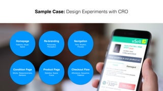
- 1. Sample Case | Design Experiments with CRO Navigation Time, Rhythm, Process Product Page Statistics, Space, Focus Checkout Flow Affordance, Sequence, Patience Homepage Patterns, Visual, Space
- 2. Desirability Viability Feasibility humans need economic technical Solutions
- 3. Challenge Looking to expand the business beyond cell phones and electronics, uSell surveyed customers asking what other types of products they would be interested in selling on the site. Through qualitative surveys and measuring click- through rates in marketing emails, our team observed that customers were interested in selling items such as textbooks, clothing, and video games on uSell.com, but we wanted data to prove it. Homepage Re-Design Version 7.8 Hypothesis Our product team hypothesized that we could add additional verticals to the site without affecting our core conversion rate. Before taking a risk.
- 4. Original the original version of the site allows customers to sell eight different types of electronics by clicking on the icons. The variation features the new sellable items as icons and in the header links menu. v.s. Design & Testing Variation
- 6. Touchpoint: Increase Page Density
- 9. Touchpoint: Reading Sequence Original Variation
- 11. Results We focused on customers placing orders to sell their electronics as the barometer of success in the test. As long as the variation showed no significant negative impact to the core conversion, we would make the expanded products the default. Orders from other verticals would add incremental revenue worth pursuing for the business. After running the test twice, we found that adding additional verticals to the site had somewhere between a break even and -3% impact on conversions on our electronic business. Instead of being focused only on selling electronics, we can commit to offering consumers the opportunity to sell a wider variety of products in our marketplace. Original v.s. Variation 1 (–3%)
- 12. Selling Volume Traffic Challenge After about one quarter we added new additional verticals the Conversion Rate became fragile; because the traffic looks to be not stable enough, even it keeps gradually increase. Our team determined implementing another experiment so that make our Conversion Rate going steady again. Homepage Re-Design Version 8.0 - 8.63
- 13. Hypothesis The uSell product team hypothesized that we could focus on the most popular products to drive a more stable and higher conversion rate. 90% Revenue from iPhone + other brands Cellphone
- 14. Design & Testing v.s. Pattern 2Pattern 1
- 15. Variation BVariation A Preference Test 1
- 16. Variation BVariation A Click Test 1
- 17. Click Test 1 Variation BVariation A Even Variation A doesn’t win from preference test, we still need to validate its usability aspect via click test. As above result, this pattern could concentrate users’ consistent behaviors which potentially is ideal pattern to support hypothesis validation. On the other side, Variation B’s distribution is a kind of chaos. As a homepage design, this pattern is not good for the entrance of traffic which could lead some risks.
- 18. Variation CVariation A Preference Test 2
- 19. Variation CVariation A Click Test 2
- 20. Variation CVariation A Based this round test, we learnt Variation C could work as good as Variation A. It could bring user focus on main CTA enough. Click Test 2
- 21. Variation C Variation B Preference Test 3
- 22. Results After running live A/B testing two weeks, we are glad to see that the new design to the site had somewhere between 12% - 15% improve on conversions on our core business. Original v.s. Variation 3 (+15%)
- 23. Results After released the v8.63, our conversion rate became strong, and then the traffic also met a peak in follow quarters. Based on these scientific experiments, our product team continue to validate the right directions of product. as the right side charts showed, we made a better and better conversion rate, and NPS via a series of new features.
- 24. v8.63 v9.3 Build a regular optimization circle
- 25. Original v.s. New Design
- 26. Results
- 27. Product Page Statistics, Focus, Responsiveness Similarity & Distribution of SKUs Analysis
- 29. Checkout Flow Affordance, Sequence, Patience Participatory Design Session - 3 hrs http://goo.gl/30VH2W Sketches & Wireframes Competitive Analysis http://goo.gl/mcSlkk https://vimeo.com/122208295 Usability Testing with Interactive Prototypes
- 30. Results: Conversion Rate keep -1 to +1 % as original design, but Order Send-In Rate increased from 30% to 55% The new mobile error states UI design The new mobile checkout flow pages
- 31. Wei’s Portfolio - Data Driven Design - Heuristic Design - Systematic Design