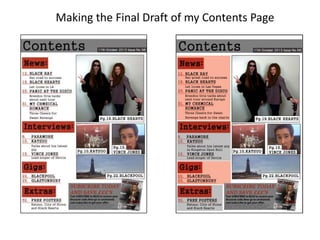
2. Firstly, I added coloured boxes to each sub-heading for my contents to make them stand out
more because it adds a lot more colour to it making it more eye-catching and it contrasts
with the colour scheme more. I did this using the rectangle tool and then decreasing the
opacity of the rectangles so that you can still see the text behind the boxes. I also made sure
that the layers for the rectangles were behind the text layers so that the text is on top of the
rectangles.
3. Next I added more text to the contents as I felt as if the page was quite plain and boring so I
added more text to try and fill out the page more. I did this using the horizontal type tool.