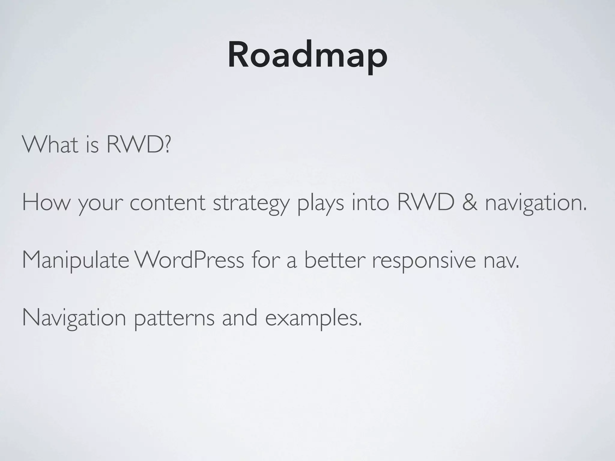
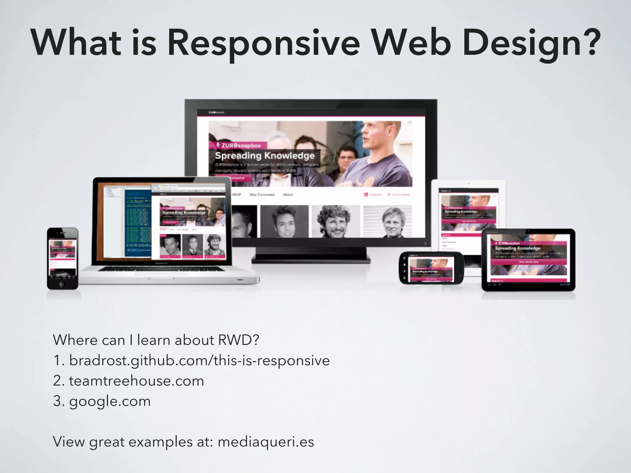
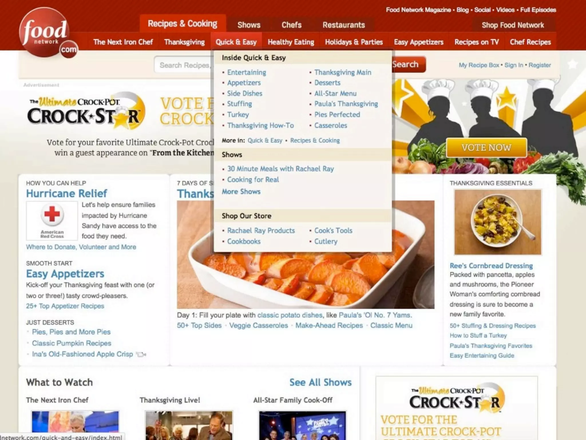
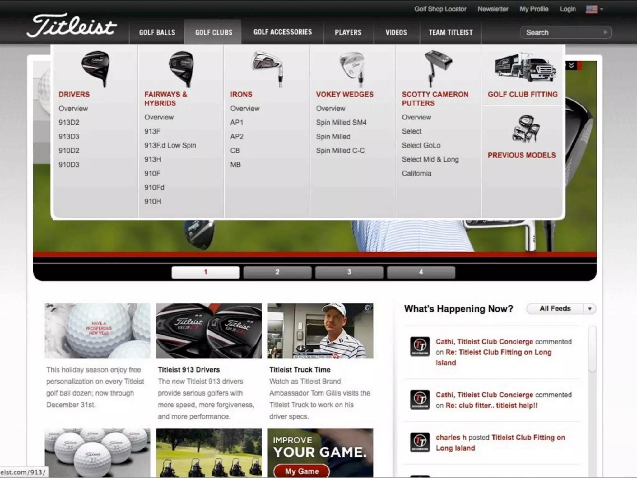
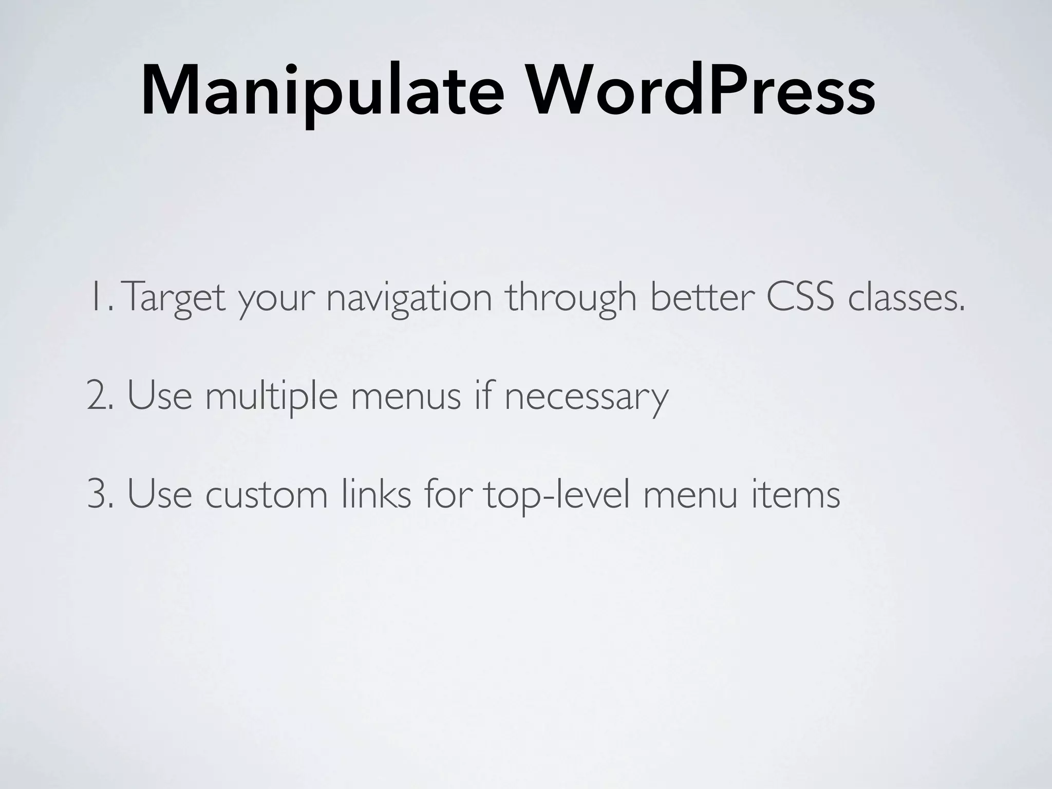
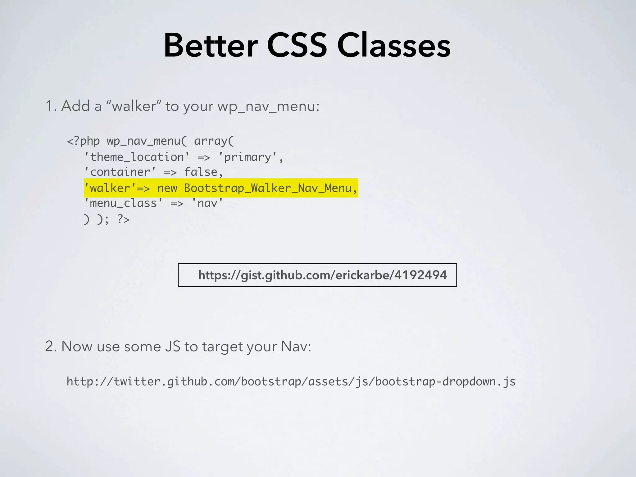
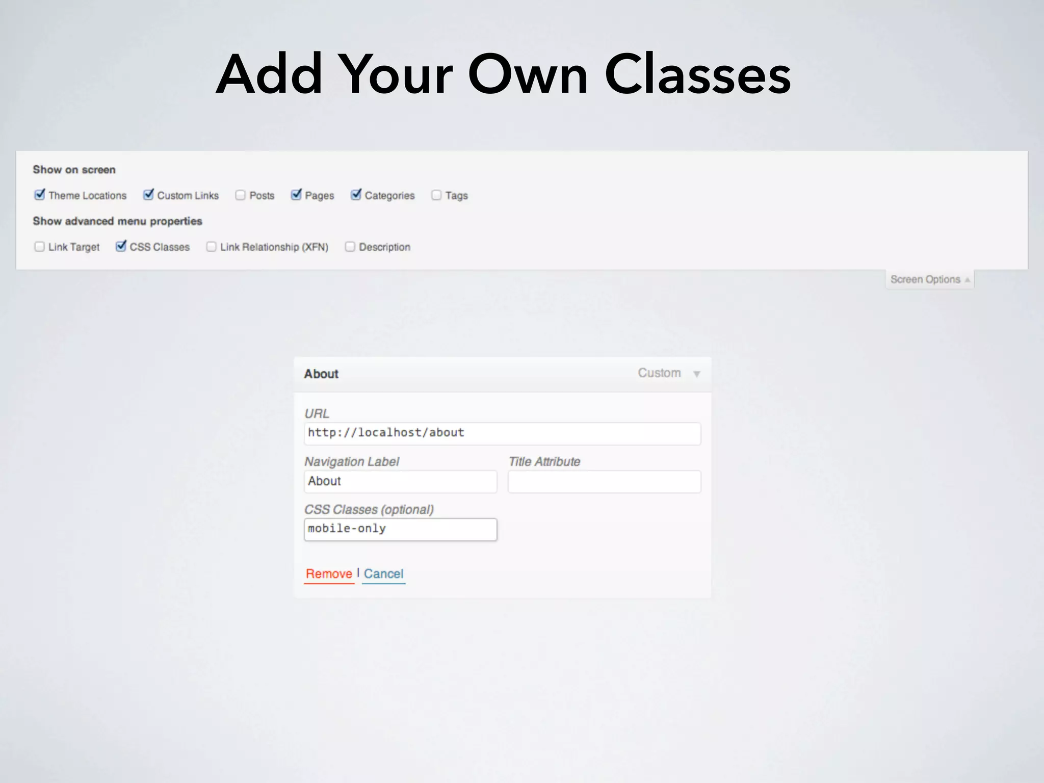
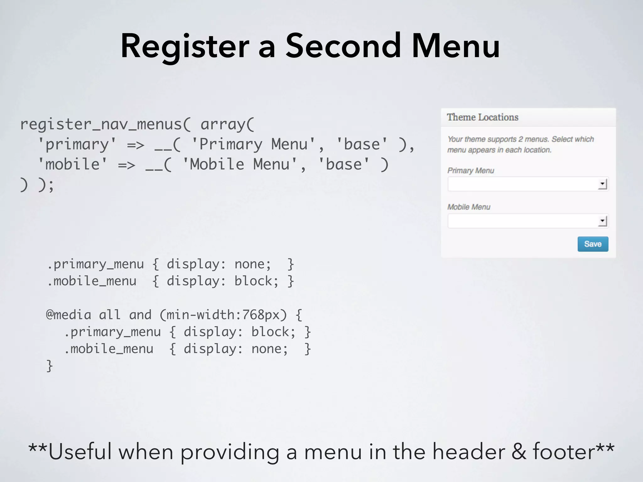
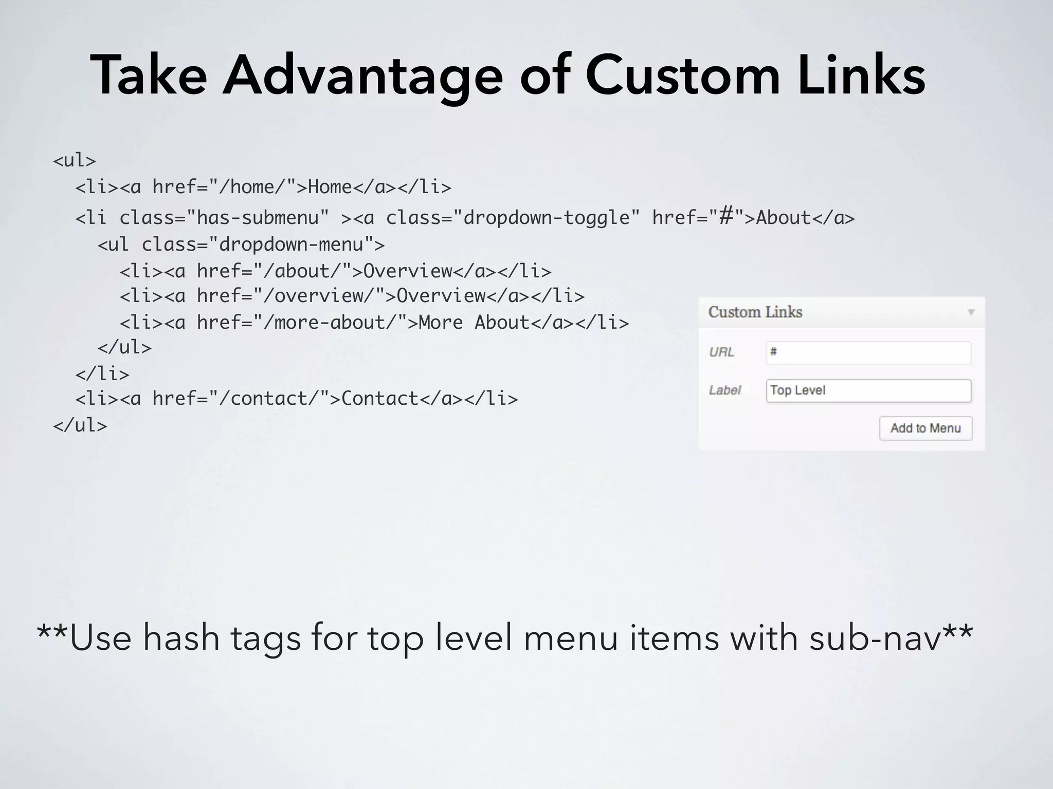
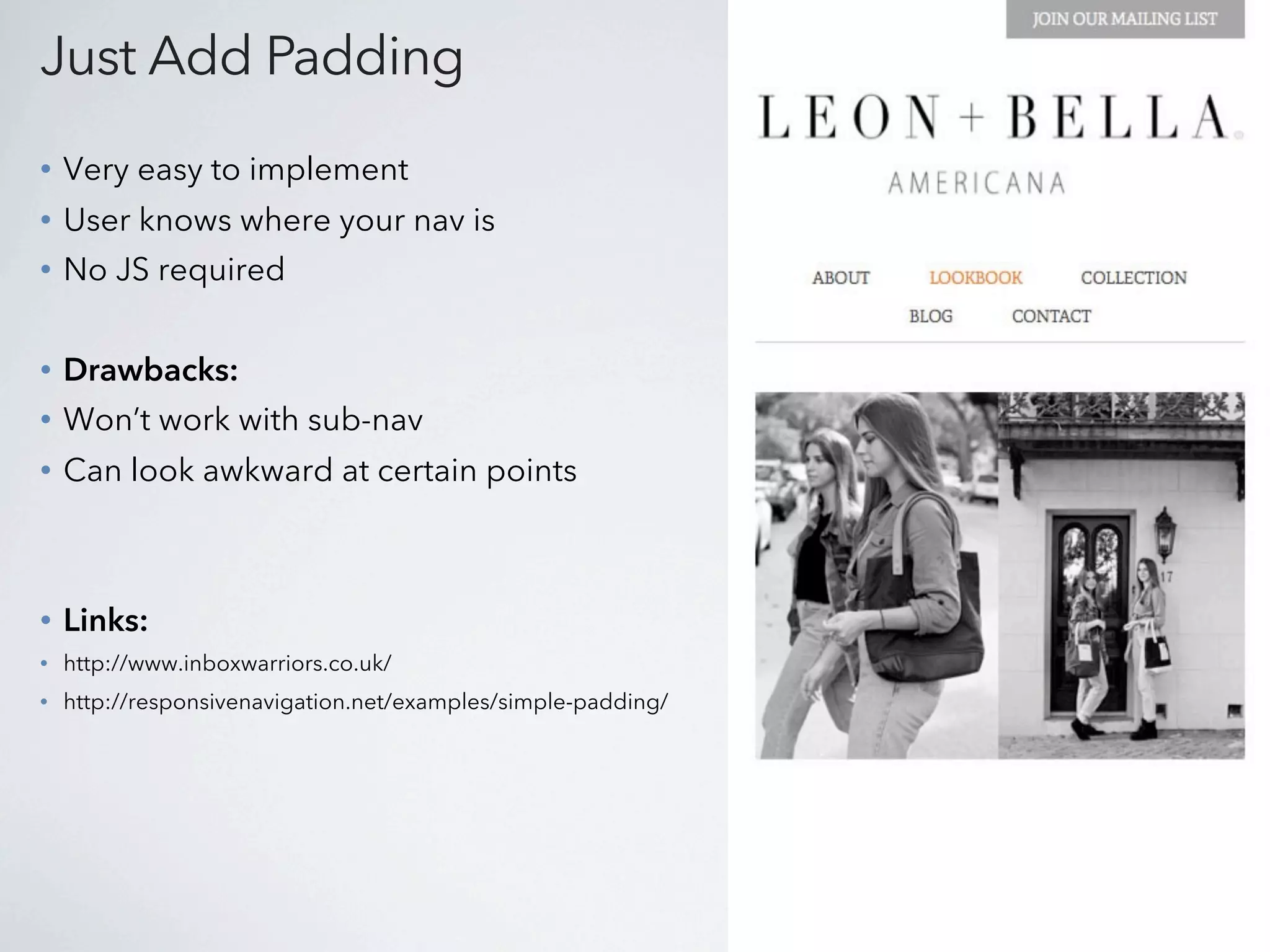
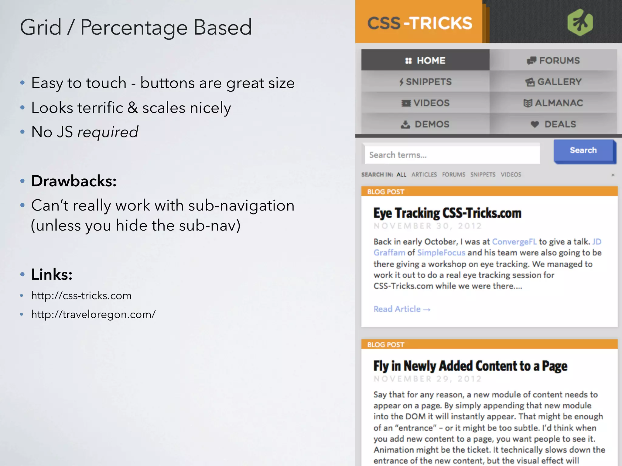
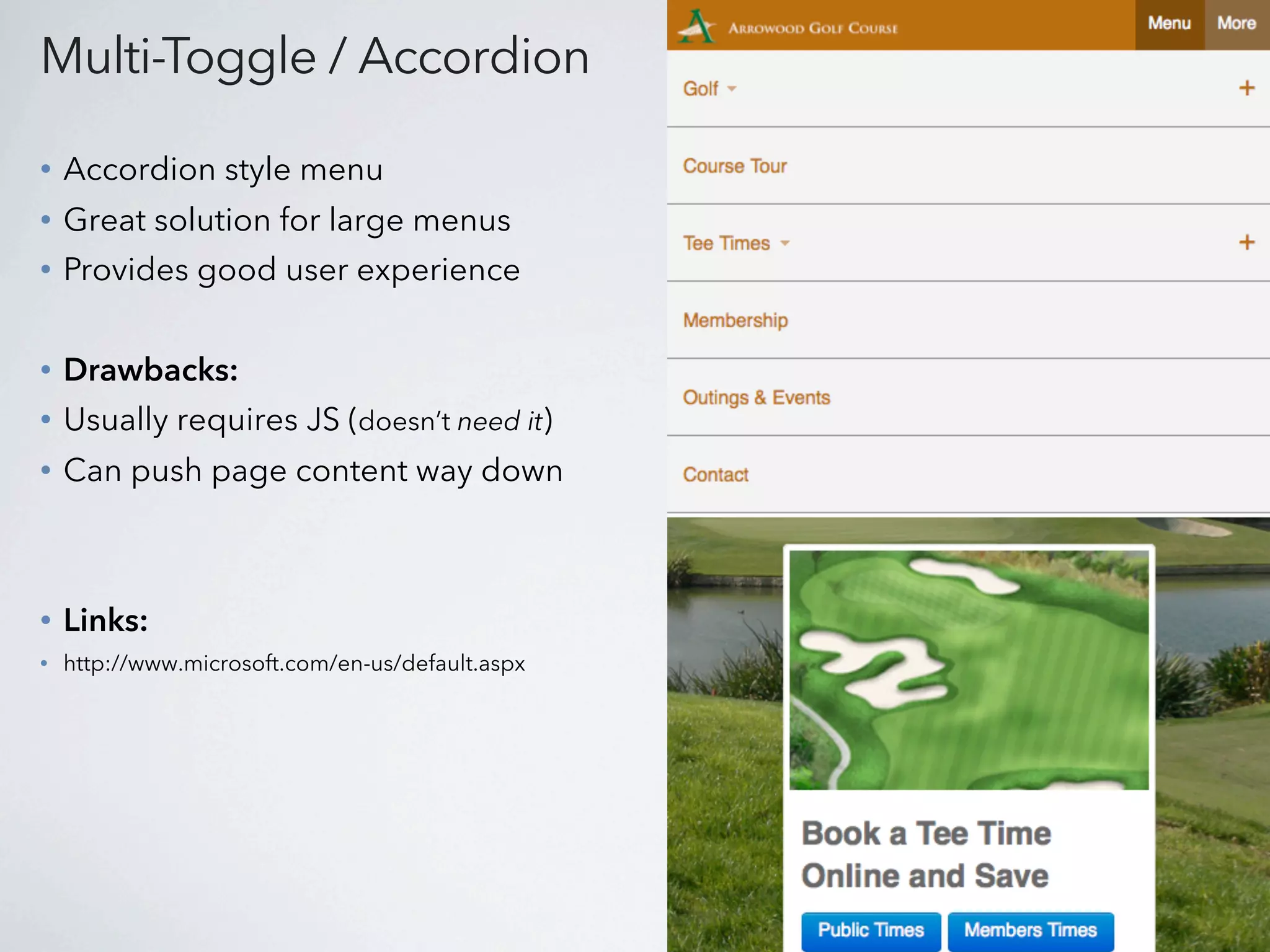
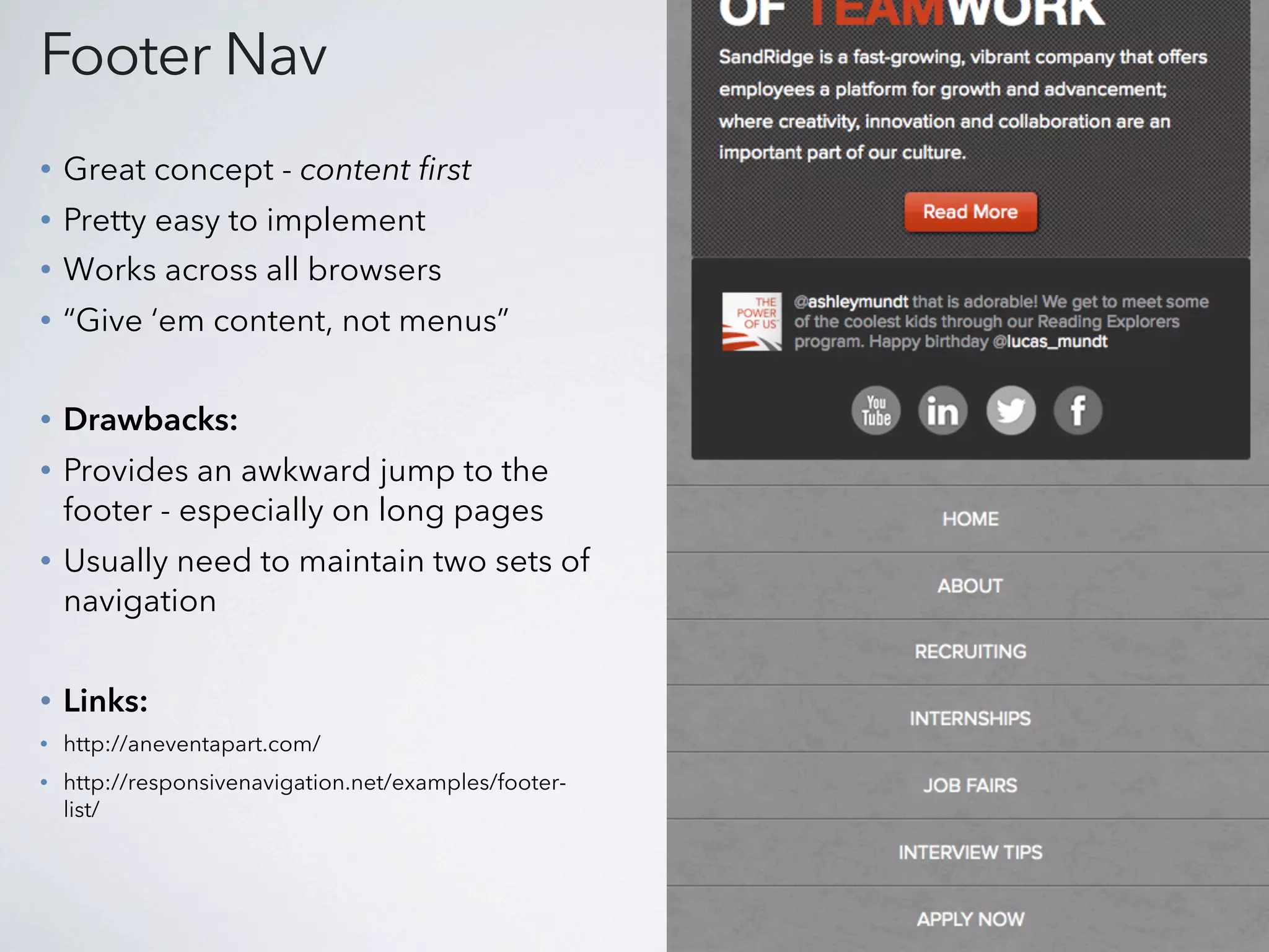
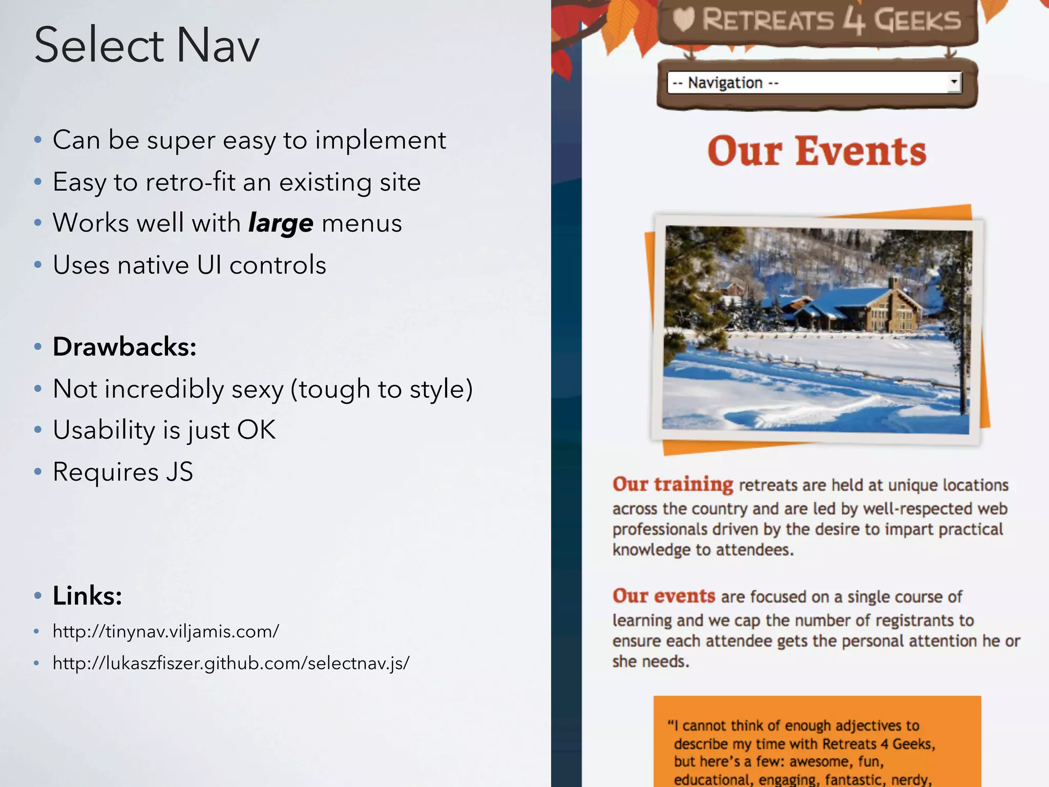
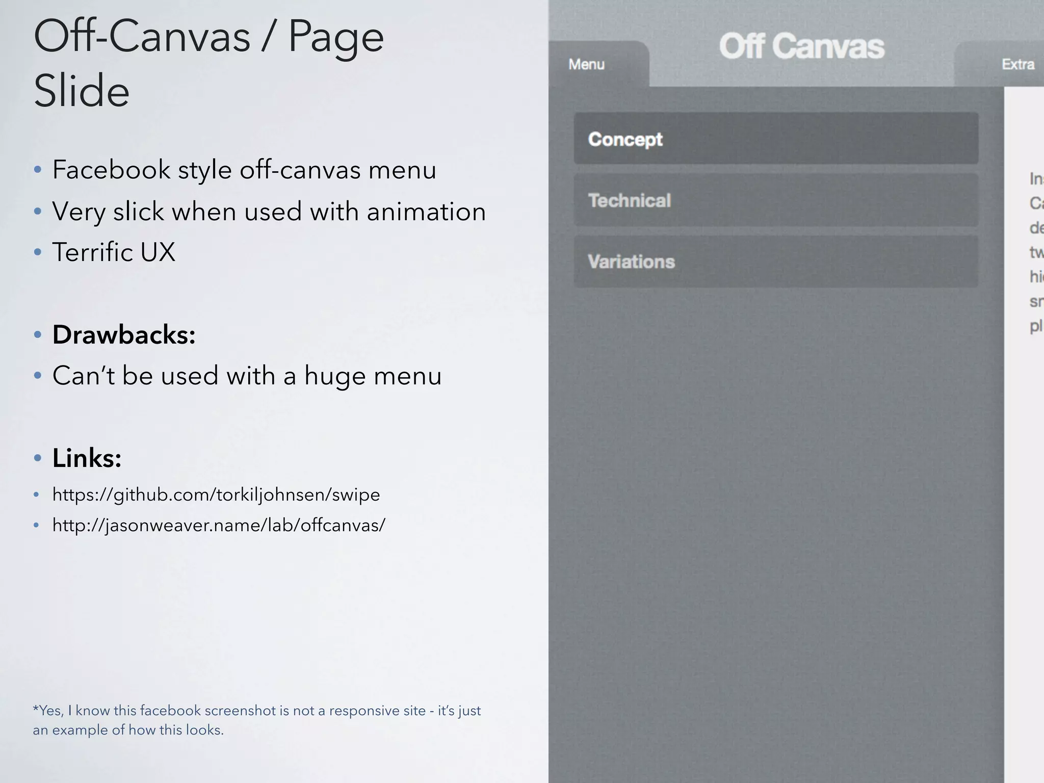
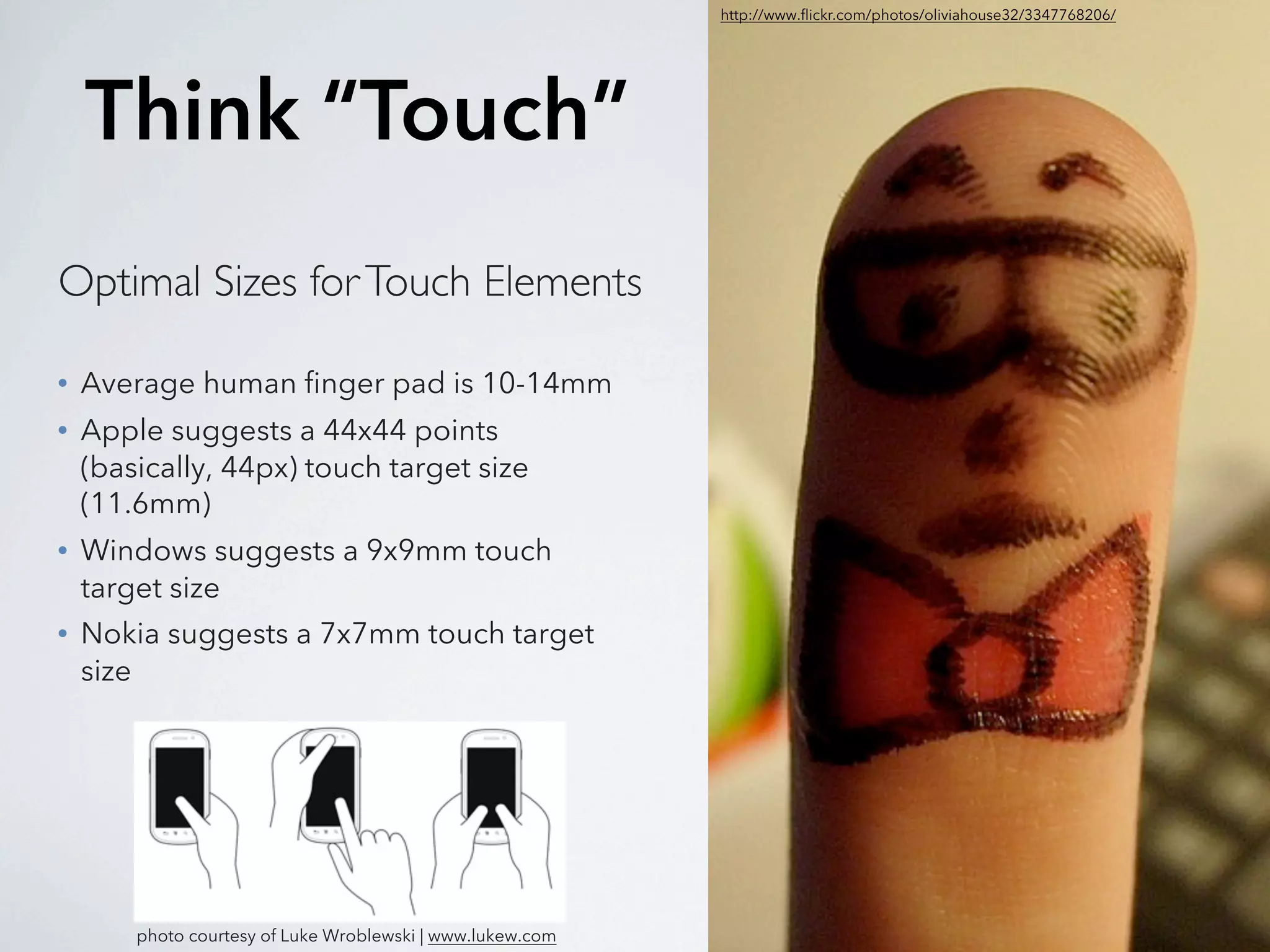
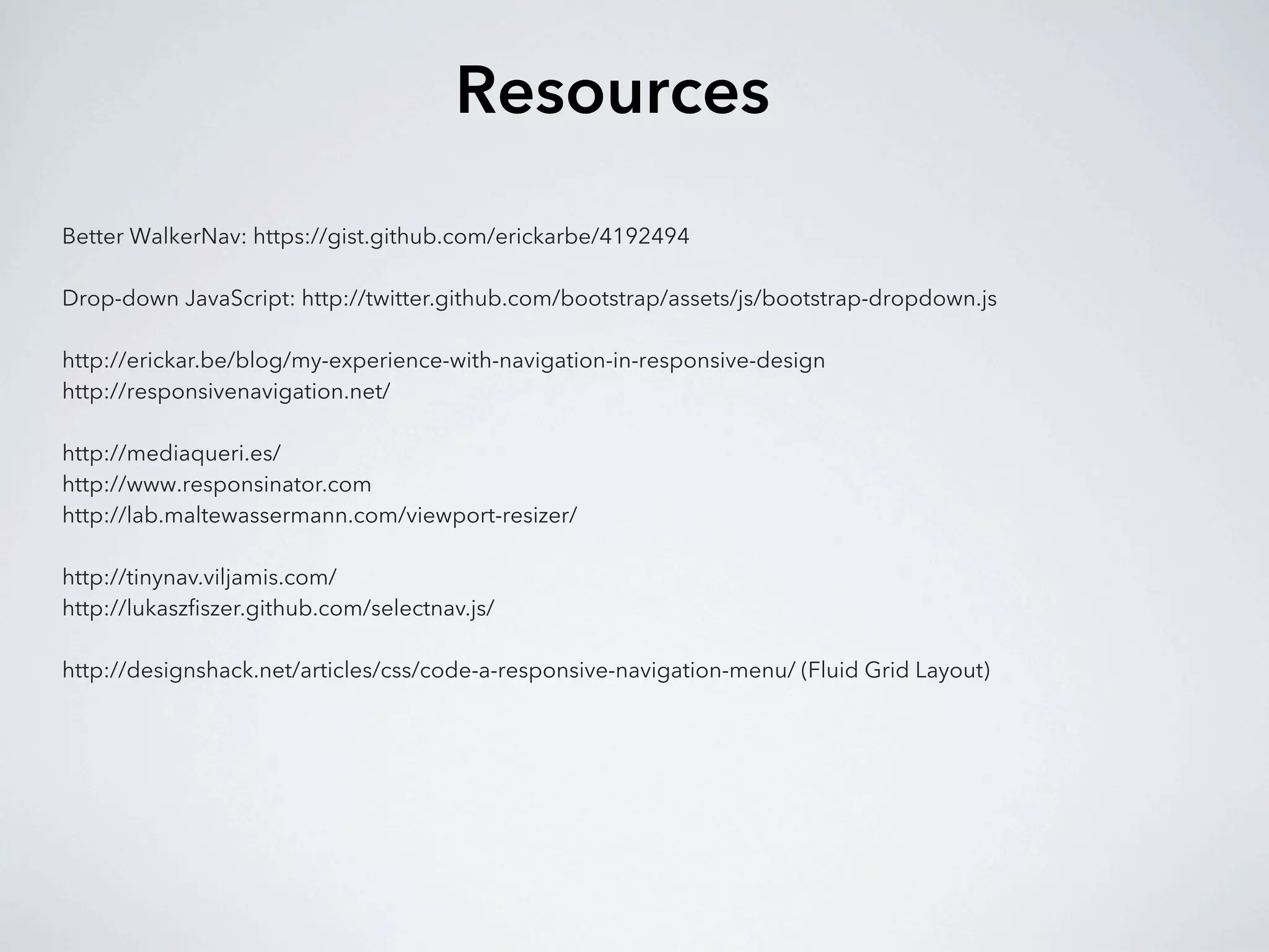
I gave this presentation at WordCamp Atlanta 2013. It covers one of the biggest challenges in responsive design - navigation. Specifically, it covers a few tips on how to leverage your WordPress theme's navigation to make it more responsive. I also cover some popular patterns in navigation that are best formatted for responsive designs - specifically mobile viewports.
3. Roadmap
What is RWD?
How your content strategy plays into RWD & navigation.
Manipulate WordPress for a better responsive nav.
Navigation patterns and examples.
4. What is Responsive Web Design?
Where can I learn about RWD?
1. bradrost.github.com/this-is-responsive
2. teamtreehouse.com
3. google.com
View great examples at: mediaqueri.es
5. Content Strategy
1. What do I want my users to see on mobile?
2. Should I show a “lite” version of my site?
3. But aren’t users within a different context when
viewing my site on their phone?
6. Retro-fitting an existing website
to become responsive
can be difficult.
Especially one with a large menu.
7.
8.
9.
10. “Use mobile as an excuse
to revisit your navigation.”
-Brad Frost
11. Manipulate WordPress
1. Target your navigation through better CSS classes.
2. Use multiple menus if necessary
3. Use custom links for top-level menu items
12. Better CSS Classes
1. Add a “walker” to your wp_nav_menu:
<?php wp_nav_menu( array(
'theme_location' => 'primary',
'container' => false,
'walker'=> new Bootstrap_Walker_Nav_Menu,
'menu_class' => 'nav'
) ); ?>
https://gist.github.com/erickarbe/4192494
2. Now use some JS to target your Nav:
http://twitter.github.com/bootstrap/assets/js/bootstrap-dropdown.js
17. Just Add Padding
• Very easy to implement
• User knows where your nav is
• No JS required
• Drawbacks:
• Won’t work with sub-nav
• Can look awkward at certain points
• Links:
• http://www.inboxwarriors.co.uk/
• http://responsivenavigation.net/examples/simple-padding/
18. Grid / Percentage Based
• Easy to touch - buttons are great size
• Looks terrific & scales nicely
• No JS required
• Drawbacks:
• Can’t really work with sub-navigation
(unless you hide the sub-nav)
• Links:
• http://css-tricks.com
• http://traveloregon.com/
19. Multi-Toggle / Accordion
• Accordion style menu
• Great solution for large menus
• Provides good user experience
• Drawbacks:
• Usually requires JS (doesn’t need it)
• Can push page content way down
• Links:
• http://www.microsoft.com/en-us/default.aspx
20. Footer Nav
• Great concept - content first
• Pretty easy to implement
• Works across all browsers
• “Give ‘em content, not menus”
• Drawbacks:
• Provides an awkward jump to the
footer - especially on long pages
• Usually need to maintain two sets of
navigation
• Links:
• http://aneventapart.com/
• http://responsivenavigation.net/examples/footer-
list/
21. Select Nav
• Can be super easy to implement
• Easy to retro-fit an existing site
• Works well with large menus
• Uses native UI controls
• Drawbacks:
• Not incredibly sexy (tough to style)
• Usability is just OK
• Requires JS
• Links:
• http://tinynav.viljamis.com/
• http://lukaszfiszer.github.com/selectnav.js/
22. Off-Canvas / Page
Slide
• Facebook style off-canvas menu
• Very slick when used with animation
• Terrific UX
• Drawbacks:
• Can’t be used with a huge menu
• Links:
• https://github.com/torkiljohnsen/swipe
• http://jasonweaver.name/lab/offcanvas/
*Yes, I know this facebook screenshot is not a responsive site - it’s just
an example of how this looks.
23. http://www.flickr.com/photos/oliviahouse32/3347768206/
Think “Touch”
Optimal Sizes for Touch Elements
• Average human finger pad is 10-14mm
• Apple suggests a 44x44 points
(basically, 44px) touch target size
(11.6mm)
• Windows suggests a 9x9mm touch
target size
• Nokia suggests a 7x7mm touch target
size
photo courtesy of Luke Wroblewski | www.lukew.com