XXL, VIBE & Hip-hop Weekly Contents Page Analysis
•Download as PPTX, PDF•
1 like•1,103 views

Report
Share
Report
Share

Recommended
Recommended
Saudi Arabia [ Abortion pills) Jeddah/riaydh/dammam/+966572737505☎️] cytotec tablets uses abortion pills 💊💊
How effective is the abortion pill? 💊💊 +966572737505) "Abortion pills in Jeddah" how to get cytotec tablets in Riyadh " Abortion pills in dammam*💊💊
The abortion pill is very effective. If you’re taking mifepristone and misoprostol, it depends on how far along the pregnancy is, and how many doses of medicine you take:💊💊 +966572737505) how to buy cytotec pills
At 8 weeks pregnant or less, it works about 94-98% of the time. +966572737505[ 💊💊💊
At 8-9 weeks pregnant, it works about 94-96% of the time. +966572737505)
At 9-10 weeks pregnant, it works about 91-93% of the time. +966572737505)💊💊
If you take an extra dose of misoprostol, it works about 99% of the time.
At 10-11 weeks pregnant, it works about 87% of the time. +966572737505)
If you take an extra dose of misoprostol, it works about 98% of the time.
In general, taking both mifepristone and+966572737505 misoprostol works a bit better than taking misoprostol only.
+966572737505
Taking misoprostol alone works to end the+966572737505 pregnancy about 85-95% of the time — depending on how far along the+966572737505 pregnancy is and how you take the medicine.
+966572737505
The abortion pill usually works, but if it doesn’t, you can take more medicine or have an in-clinic abortion.
+966572737505
When can I take the abortion pill?+966572737505
In general, you can have a medication abortion up to 77 days (11 weeks)+966572737505 after the first day of your last period. If it’s been 78 days or more since the first day of your last+966572737505 period, you can have an in-clinic abortion to end your pregnancy.+966572737505
Why do people choose the abortion pill?
Which kind of abortion you choose all depends on your personal+966572737505 preference and situation. With+966572737505 medication+966572737505 abortion, some people like that you don’t need to have a procedure in a doctor’s office. You can have your medication abortion on your own+966572737505 schedule, at home or in another comfortable place that you choose.+966572737505 You get to decide who you want to be with during your abortion, or you can go it alone. Because+966572737505 medication abortion is similar to a miscarriage, many people feel like it’s more “natural” and less invasive. And some+966572737505 people may not have an in-clinic abortion provider close by, so abortion pills are more available to+966572737505 them.
+966572737505
Your doctor, nurse, or health center staff can help you decide which kind of abortion is best for you.
+966572737505
More questions from patients:
Saudi Arabia+966572737505
CYTOTEC Misoprostol Tablets. Misoprostol is a medication that can prevent stomach ulcers if you also take NSAID medications. It reduces the amount of acid in your stomach, which protects your stomach lining. The brand name of this medication is Cytotec®.+966573737505)
Unwanted Kit is a combination of two medicines, whiCytotec in Jeddah+966572737505) get unwanted pregnancy kit Riyadh
Cytotec in Jeddah+966572737505) get unwanted pregnancy kit RiyadhAbortion pills in Riyadh +966572737505 get cytotec
As electricity is difficult to store, it is crucial to strictly maintain the balance between production and consumption. The integration of intermittent renewable energies into the production mix has made the management of the balance more complex. However, access to near real-time data and communication with consumers via smart meters suggest demand response. Specifically, sending signals would encourage users to adjust their consumption according to the production of electricity. The algorithms used to select these signals must learn consumer reactions and optimize them while balancing exploration and exploitation. Various sequential or reinforcement learning approaches are being considered.Sequential and reinforcement learning for demand side management by Margaux B...
Sequential and reinforcement learning for demand side management by Margaux B...Paris Women in Machine Learning and Data Science
Saudi Arabia [ Abortion pills) Jeddah/riaydh/dammam/+966572737505☎️] cytotec tablets uses abortion pills 💊💊
How effective is the abortion pill? 💊💊 +966572737505) "Abortion pills in Jeddah" how to get cytotec tablets in Riyadh " Abortion pills in dammam*💊💊
The abortion pill is very effective. If you’re taking mifepristone and misoprostol, it depends on how far along the pregnancy is, and how many doses of medicine you take:💊💊 +966572737505) how to buy cytotec pills
At 8 weeks pregnant or less, it works about 94-98% of the time. +966572737505[ 💊💊💊
At 8-9 weeks pregnant, it works about 94-96% of the time. +966572737505)
At 9-10 weeks pregnant, it works about 91-93% of the time. +966572737505)💊💊
If you take an extra dose of misoprostol, it works about 99% of the time.
At 10-11 weeks pregnant, it works about 87% of the time. +966572737505)
If you take an extra dose of misoprostol, it works about 98% of the time.
In general, taking both mifepristone and+966572737505 misoprostol works a bit better than taking misoprostol only.
+966572737505
Taking misoprostol alone works to end the+966572737505 pregnancy about 85-95% of the time — depending on how far along the+966572737505 pregnancy is and how you take the medicine.
+966572737505
The abortion pill usually works, but if it doesn’t, you can take more medicine or have an in-clinic abortion.
+966572737505
When can I take the abortion pill?+966572737505
In general, you can have a medication abortion up to 77 days (11 weeks)+966572737505 after the first day of your last period. If it’s been 78 days or more since the first day of your last+966572737505 period, you can have an in-clinic abortion to end your pregnancy.+966572737505
Why do people choose the abortion pill?
Which kind of abortion you choose all depends on your personal+966572737505 preference and situation. With+966572737505 medication+966572737505 abortion, some people like that you don’t need to have a procedure in a doctor’s office. You can have your medication abortion on your own+966572737505 schedule, at home or in another comfortable place that you choose.+966572737505 You get to decide who you want to be with during your abortion, or you can go it alone. Because+966572737505 medication abortion is similar to a miscarriage, many people feel like it’s more “natural” and less invasive. And some+966572737505 people may not have an in-clinic abortion provider close by, so abortion pills are more available to+966572737505 them.
+966572737505
Your doctor, nurse, or health center staff can help you decide which kind of abortion is best for you.
+966572737505
More questions from patients:
Saudi Arabia+966572737505
CYTOTEC Misoprostol Tablets. Misoprostol is a medication that can prevent stomach ulcers if you also take NSAID medications. It reduces the amount of acid in your stomach, which protects your stomach lining. The brand name of this medication is Cytotec®.+966573737505)
Unwanted Kit is a combination of two mediciAbortion pills in Doha Qatar (+966572737505 ! Get Cytotec
Abortion pills in Doha Qatar (+966572737505 ! Get CytotecAbortion pills in Riyadh +966572737505 get cytotec
More Related Content
Recently uploaded
Saudi Arabia [ Abortion pills) Jeddah/riaydh/dammam/+966572737505☎️] cytotec tablets uses abortion pills 💊💊
How effective is the abortion pill? 💊💊 +966572737505) "Abortion pills in Jeddah" how to get cytotec tablets in Riyadh " Abortion pills in dammam*💊💊
The abortion pill is very effective. If you’re taking mifepristone and misoprostol, it depends on how far along the pregnancy is, and how many doses of medicine you take:💊💊 +966572737505) how to buy cytotec pills
At 8 weeks pregnant or less, it works about 94-98% of the time. +966572737505[ 💊💊💊
At 8-9 weeks pregnant, it works about 94-96% of the time. +966572737505)
At 9-10 weeks pregnant, it works about 91-93% of the time. +966572737505)💊💊
If you take an extra dose of misoprostol, it works about 99% of the time.
At 10-11 weeks pregnant, it works about 87% of the time. +966572737505)
If you take an extra dose of misoprostol, it works about 98% of the time.
In general, taking both mifepristone and+966572737505 misoprostol works a bit better than taking misoprostol only.
+966572737505
Taking misoprostol alone works to end the+966572737505 pregnancy about 85-95% of the time — depending on how far along the+966572737505 pregnancy is and how you take the medicine.
+966572737505
The abortion pill usually works, but if it doesn’t, you can take more medicine or have an in-clinic abortion.
+966572737505
When can I take the abortion pill?+966572737505
In general, you can have a medication abortion up to 77 days (11 weeks)+966572737505 after the first day of your last period. If it’s been 78 days or more since the first day of your last+966572737505 period, you can have an in-clinic abortion to end your pregnancy.+966572737505
Why do people choose the abortion pill?
Which kind of abortion you choose all depends on your personal+966572737505 preference and situation. With+966572737505 medication+966572737505 abortion, some people like that you don’t need to have a procedure in a doctor’s office. You can have your medication abortion on your own+966572737505 schedule, at home or in another comfortable place that you choose.+966572737505 You get to decide who you want to be with during your abortion, or you can go it alone. Because+966572737505 medication abortion is similar to a miscarriage, many people feel like it’s more “natural” and less invasive. And some+966572737505 people may not have an in-clinic abortion provider close by, so abortion pills are more available to+966572737505 them.
+966572737505
Your doctor, nurse, or health center staff can help you decide which kind of abortion is best for you.
+966572737505
More questions from patients:
Saudi Arabia+966572737505
CYTOTEC Misoprostol Tablets. Misoprostol is a medication that can prevent stomach ulcers if you also take NSAID medications. It reduces the amount of acid in your stomach, which protects your stomach lining. The brand name of this medication is Cytotec®.+966573737505)
Unwanted Kit is a combination of two medicines, whiCytotec in Jeddah+966572737505) get unwanted pregnancy kit Riyadh
Cytotec in Jeddah+966572737505) get unwanted pregnancy kit RiyadhAbortion pills in Riyadh +966572737505 get cytotec
As electricity is difficult to store, it is crucial to strictly maintain the balance between production and consumption. The integration of intermittent renewable energies into the production mix has made the management of the balance more complex. However, access to near real-time data and communication with consumers via smart meters suggest demand response. Specifically, sending signals would encourage users to adjust their consumption according to the production of electricity. The algorithms used to select these signals must learn consumer reactions and optimize them while balancing exploration and exploitation. Various sequential or reinforcement learning approaches are being considered.Sequential and reinforcement learning for demand side management by Margaux B...
Sequential and reinforcement learning for demand side management by Margaux B...Paris Women in Machine Learning and Data Science
Saudi Arabia [ Abortion pills) Jeddah/riaydh/dammam/+966572737505☎️] cytotec tablets uses abortion pills 💊💊
How effective is the abortion pill? 💊💊 +966572737505) "Abortion pills in Jeddah" how to get cytotec tablets in Riyadh " Abortion pills in dammam*💊💊
The abortion pill is very effective. If you’re taking mifepristone and misoprostol, it depends on how far along the pregnancy is, and how many doses of medicine you take:💊💊 +966572737505) how to buy cytotec pills
At 8 weeks pregnant or less, it works about 94-98% of the time. +966572737505[ 💊💊💊
At 8-9 weeks pregnant, it works about 94-96% of the time. +966572737505)
At 9-10 weeks pregnant, it works about 91-93% of the time. +966572737505)💊💊
If you take an extra dose of misoprostol, it works about 99% of the time.
At 10-11 weeks pregnant, it works about 87% of the time. +966572737505)
If you take an extra dose of misoprostol, it works about 98% of the time.
In general, taking both mifepristone and+966572737505 misoprostol works a bit better than taking misoprostol only.
+966572737505
Taking misoprostol alone works to end the+966572737505 pregnancy about 85-95% of the time — depending on how far along the+966572737505 pregnancy is and how you take the medicine.
+966572737505
The abortion pill usually works, but if it doesn’t, you can take more medicine or have an in-clinic abortion.
+966572737505
When can I take the abortion pill?+966572737505
In general, you can have a medication abortion up to 77 days (11 weeks)+966572737505 after the first day of your last period. If it’s been 78 days or more since the first day of your last+966572737505 period, you can have an in-clinic abortion to end your pregnancy.+966572737505
Why do people choose the abortion pill?
Which kind of abortion you choose all depends on your personal+966572737505 preference and situation. With+966572737505 medication+966572737505 abortion, some people like that you don’t need to have a procedure in a doctor’s office. You can have your medication abortion on your own+966572737505 schedule, at home or in another comfortable place that you choose.+966572737505 You get to decide who you want to be with during your abortion, or you can go it alone. Because+966572737505 medication abortion is similar to a miscarriage, many people feel like it’s more “natural” and less invasive. And some+966572737505 people may not have an in-clinic abortion provider close by, so abortion pills are more available to+966572737505 them.
+966572737505
Your doctor, nurse, or health center staff can help you decide which kind of abortion is best for you.
+966572737505
More questions from patients:
Saudi Arabia+966572737505
CYTOTEC Misoprostol Tablets. Misoprostol is a medication that can prevent stomach ulcers if you also take NSAID medications. It reduces the amount of acid in your stomach, which protects your stomach lining. The brand name of this medication is Cytotec®.+966573737505)
Unwanted Kit is a combination of two mediciAbortion pills in Doha Qatar (+966572737505 ! Get Cytotec
Abortion pills in Doha Qatar (+966572737505 ! Get CytotecAbortion pills in Riyadh +966572737505 get cytotec
Recently uploaded (20)
Jual Obat Aborsi Surabaya ( Asli No.1 ) 085657271886 Obat Penggugur Kandungan...
Jual Obat Aborsi Surabaya ( Asli No.1 ) 085657271886 Obat Penggugur Kandungan...
Cytotec in Jeddah+966572737505) get unwanted pregnancy kit Riyadh
Cytotec in Jeddah+966572737505) get unwanted pregnancy kit Riyadh
Top profile Call Girls In Chandrapur [ 7014168258 ] Call Me For Genuine Model...
Top profile Call Girls In Chandrapur [ 7014168258 ] Call Me For Genuine Model...
Top profile Call Girls In Purnia [ 7014168258 ] Call Me For Genuine Models We...
Top profile Call Girls In Purnia [ 7014168258 ] Call Me For Genuine Models We...
Sequential and reinforcement learning for demand side management by Margaux B...
Sequential and reinforcement learning for demand side management by Margaux B...
Top profile Call Girls In Vadodara [ 7014168258 ] Call Me For Genuine Models ...
Top profile Call Girls In Vadodara [ 7014168258 ] Call Me For Genuine Models ...
+97470301568>>weed for sale in qatar ,weed for sale in dubai,weed for sale in...
+97470301568>>weed for sale in qatar ,weed for sale in dubai,weed for sale in...
Vadodara 💋 Call Girl 7737669865 Call Girls in Vadodara Escort service book now
Vadodara 💋 Call Girl 7737669865 Call Girls in Vadodara Escort service book now
Top profile Call Girls In Tumkur [ 7014168258 ] Call Me For Genuine Models We...
Top profile Call Girls In Tumkur [ 7014168258 ] Call Me For Genuine Models We...
Abortion pills in Doha Qatar (+966572737505 ! Get Cytotec
Abortion pills in Doha Qatar (+966572737505 ! Get Cytotec
Aspirational Block Program Block Syaldey District - Almora
Aspirational Block Program Block Syaldey District - Almora
Featured
Featured (20)
Product Design Trends in 2024 | Teenage Engineerings
Product Design Trends in 2024 | Teenage Engineerings
How Race, Age and Gender Shape Attitudes Towards Mental Health
How Race, Age and Gender Shape Attitudes Towards Mental Health
AI Trends in Creative Operations 2024 by Artwork Flow.pdf
AI Trends in Creative Operations 2024 by Artwork Flow.pdf
Content Methodology: A Best Practices Report (Webinar)
Content Methodology: A Best Practices Report (Webinar)
How to Prepare For a Successful Job Search for 2024
How to Prepare For a Successful Job Search for 2024
Social Media Marketing Trends 2024 // The Global Indie Insights
Social Media Marketing Trends 2024 // The Global Indie Insights
Trends In Paid Search: Navigating The Digital Landscape In 2024
Trends In Paid Search: Navigating The Digital Landscape In 2024
5 Public speaking tips from TED - Visualized summary
5 Public speaking tips from TED - Visualized summary
Google's Just Not That Into You: Understanding Core Updates & Search Intent
Google's Just Not That Into You: Understanding Core Updates & Search Intent
The six step guide to practical project management
The six step guide to practical project management
Beginners Guide to TikTok for Search - Rachel Pearson - We are Tilt __ Bright...
Beginners Guide to TikTok for Search - Rachel Pearson - We are Tilt __ Bright...
Unlocking the Power of ChatGPT and AI in Testing - A Real-World Look, present...
Unlocking the Power of ChatGPT and AI in Testing - A Real-World Look, present...
XXL, VIBE & Hip-hop Weekly Contents Page Analysis
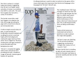
- 1. The masthead name ‘XXL’ logo, manages to stand out from the rest of the page despite the fact that it is rather small and of different colour and this is performed because of the colour scheme of red and size of font. This could imply that XXL focus on being a well known brand. The title is written in a simple lowercase manner suggesting that 50 cent is of higher status and piles of money is something that CENT is calm with. The serif font supplies the text with a sense of rich effect. A rather simple natural colour of grey is used instead of a predictable colourful background enabling the artist to contrast highly with the background making the page stand out from other music magazines. The blue clothing also manages to blend in pretty smoothly with the background as well. The border around the small text happens to underline the title of the page providing the page with a much more cleaner yet immaculate look. A colloquial phrase is used in order to conform to the genre of the music which gives the impression that this form of language is the language that ‘50 Cent’ himself uses. Famous Artist names are mentioned and written in bold font in order to attract the major demographic. The fact that 50 Cent is standing on piles of cash instantly tells us about his character and status as someone wealthy and stern at the same time. ‘50 cent’ is revealed shrugging rather stern and serious face providing him with a hardened image of himself. A stereotypical feature of rap artists. 50 Cent is seen not clutching his fist onto the briefcase, suggesting an alternative thought that money isn’t an issue for ‘Cent’.
- 2. The title ‘Contents’ has been placed in a different approach to other magazines. This makes the magazine more unique. The use of white in this text makes the title contrast with the dark red background. The background colour is a dark red to red gradient. This makes the hip hop artist stand out even more. It also makes the spotlight on him, showing he’s the main focus on the contents page. Large ‘V’ represents Vibe magazines and is important as it is a form of iconography for the music magazine. VIBE magazines logo, also includes the issue of the magazine underneath. The artist is seen topless as a result to show his body tattoos suggesting a strong part of his character to conform to the stereotypes of hip-hop magazines Subheadings are written in bold and in capitals in order to make the magazine readable. The title ‘Features’ is expressed in a rather fancy feature. This provides the magazine with a classy making it sincerely original. The artist is revealed holding a mask which could perhaps suggest that he is creating a unique image for him self, attempting to stand out.
- 3. Again, hip hop weekly has a different approach to the other magazines I have analysed. This contents page is a lot more packed with writing. This is less interesting but more informative. ‘Word on the street’ is a common phrase used by hip hop fanatics. This is a good way to describe the content as the readers can relate to this language. The subscription advertisement is highlighted by red to make it stand out. The logo has no inner filling which gives the logo an old- school look which correlates with Hip Hops culture. Stars are used throughout the contents page. This gives each category such as ‘Entertainment’ an icon as each star is a different colour. The use of categorisation is a good tactic as it makes an article easier to find. Page number and magazine name. Hip Hop weekly felt no need to add a title to this page. Numbers are used throughout so it is clear that this page is a contents. A thick red bar is used to group the features. The artist at the top of the page is smiling in the photo. This is a different approach as hip hop artists are presented as hardened characters with an image of being ‘bad’. This image shows 3 hip hop artists all posing in different ways. Suggesting that life as music producer is different to a normal occupation. List of staff associated with hip hop weekly.