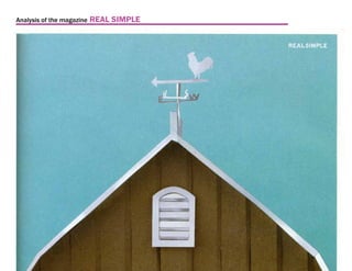
2. Analysis of the magazine REAL SIMPLE
Introduction
REAL SIMPLE is a magazine targeting young to middle age REAL SIMPLE
housewivesa nd women. The magazine’s contents are revolve Published since 2000
around practical solutions to everyday challenges ranging from Size:
the following categories: 10 3/4 in X 9 in
Perfect Bound (Note: It has no vertical
Food and Recipes, Home and Organizing, Beauty and Fashion. pressed dented edge on the left hand edge.
Holidays and Entertaining, Health, Work and Life.
Matte finish on cover,
regular magazine finish in pages.
The slogan of the magazine is “Life made Easy” and “Life made
easier, everyday”
In this presentation, we will compare and categorize layouts
from three issues in 2009, June, September, December issues
3. Analysis of the magazine REAL SIMPLE
Logo / Masthead
Strapline/ Slogan 50.5 pt
13.5 pt Possibly custom font reference to
Franklin Gothic Demi, ITC Blair Bold
FF Meta Serif Book and Engravers Gothic
FF Meta Serif Pro Book Franklin Gothic Demi
REAL SIMPLE
ITC Blair Bold
Engravers Gothic
Main Cover Lines
and Cover LInes
Negative Lead
Range from
17 pt, 18pt leading
to
Cover Image 30 pt font, 32pt leading
works with Types
in PMN Caecilia Pro
to keep cover:
- Spacious
in Light, Roman, Bold
- Elegant with subtle contrast
4. Analysis of the magazine REAL SIMPLE
40pt Category Head
Headline Font is usually FF Meta Serif
40 pt Serif Bold in Category Head
28 pt regular is used in Headline. 32pt Leading.
10 pt San Serif is used in Deck. 12pt to 14pt Leading.
All with regular kerning, except Category head,
it has tighter kern.
28/32 Headline
range from 10/12 to 10/14 Deck
5. Analysis of the magazine REAL SIMPLE
Type Style throughout the magazine
- Elegant with subtle contrast
Main text Font is also FF Meta San Serif
9 pt San Serif Bold is usaully used as subheads and info
9 pt San Serif is used in body text. Leading is usually 12pt
8 pt San Serif is used in credits and side notes. Leading is 10pt
Use of Dingbats: Oversize Quotation marks ranging from
20pt to 50pt is ofetn used.
All with regular kerning,
except Subheads with wider kerning.
8/10 Vredits
9/12 Subheads
9/12 Body text
Oversized
Dingbats
6. Analysis of the magazine REAL SIMPLE
Page basic structure
Magazine size Magazine is Spine Width - Gutter Column Width
around 240 to Inside Margin about 11pt, from about 120pt, 10pica, 1 3/4in.
Trim 250 pages about 60pt, 3/16in. to
height 1 3/4in. about 215pt, 18pica, 3in.
10 3/4 in
width
9 in
Outside
Margin
Vary from
Flush
to
1/4in from Trim
to
whatever
Credits
Folio
1 3/4in, 60pt
about 1/4in
from the Binding
from Trim
name font 5.5pt
page number 8pt
7. Analysis of the magazine REAL SIMPLE
layout of Standard Page - thoughts
In this first standard content of the magazine called
thoughts, a inspiring quotation is feature in a dedicated
page every issue. Emphasis is strategicly placed on
quotation mark where it leads readers to pay attention
to the quote.
8. Analysis of the magazine REAL SIMPLE
layout of Standard Page - the simple list
Every Issue of the magazine has a page called the
simple list, it list various statistics of intersting facts.
Numbers are the main focus here and it is played up by
placing numbers in font size even bigger than the title of
the page. Use of two colours in numbers and subheads
is also a crucial emphasis tool. Colour choice varies in
each issue.
9. Analysis of the magazine REAL SIMPLE
layout of Standard Page - table of contents
The example here is the table fo contents that comes
after the two standard pages with ads inbetween.
Use of different cyan colour in the numbers plays up the
page numbers in here. Featured articles is lightlighed in
a box on the right hand side.
10. Analysis of the magazine REAL SIMPLE
layout of Standard Page - table of contents
Second page of the two page table of contents.
11. Analysis of the magazine REAL SIMPLE
layout of Standard Page - categories
In most cases, emphasis is placed on category line and
headlines. The example here is one of the many sub-
divider pages that divide up categories of articles. Arts
are important elements throughout the magazine, most
pages have arts take up as much pleasant to eye space
as possible.
12. Analysis of the magazine REAL SIMPLE
layout of Standard Page - categories
More examples of the frequently use sub dividing pages
with big art, big category title, and short decks as tips.
13. Analysis of the magazine REAL SIMPLE
layout of Standard Page - articles in general
In the articles layout, the grid and layout is different
from articles to articles. The following is the most typical
layout.
Font size used in Category and headline is the main
focus. used ot coloured deck and pull quote on the side
is used to highlight important sentencts.
14. Analysis of the magazine REAL SIMPLE
Compare to the previous example of a typical article
layout, this is a very close resemblance to the same
layout. Only this article starts with with a different treat-
ment on headline, deck and lead. Both has pull quote
on the side. Art placement is identical.
It is interesting to see how different the layout is looking
like when all the essential placement is so similar.
15. Analysis of the magazine REAL SIMPLE
Similar layout but different appearances Page in Grids and Columns
is create using the tricks include different photo REAL SIMPLE uses of single column to 4 columns
size, text placement, font sizes and colour. with variation inbetween
SINGLE COLUMN and layout variations
16. Analysis of the magazine REAL SIMPLE
2 COLUMNS and layout variations
17. Analysis of the magazine REAL SIMPLE
3 COLUMNS and layout variations
In the case of multiple columns layout, variations are
created in vary placement of arts, ads, captions, text
colour and infographics.
18. Analysis of the magazine REAL SIMPLE
4 COLUMNS and layout variations
19. Analysis of the magazine REAL SIMPLE
Mock up of an layout resemblance to layout of REAL SIMPLE
The following spread is a recreation of a layout created using
references to the style and layout of REAL SIMPLE.
solutions
D I Y O R G A N I Z AT I O N S solutions
Reusing vintage items as wall organizers
Think twice before throwing away your grandparents spoon and forks sets, and wood planks
from the hardwood floor renocation, even a old farm rake can be an elegant necklaces display.
Wall Organization
This idea for using an old heating grate as a mail slot
is fun and original, and also makes use of your wall.
2
1 3
1. Spoon and forks key holders 3. Reclaimed hardwood bookshelf
Think twice before throwing away your grandmas Proud to be finishing a recent flooring renovation
spoon and forks sets, and if you like to host dinner might means getting rid of those old wooden floors.
party at your place, these lovely holders double as What about spend some planning and turn the still
great conversation piece in the kitchen. usable materials into bookshelves instead.
REAL SAMPLE NOVEMBER 2011
REAL SAMPLE NOVEMBER 2011
2. Rake the necklace rack
P R O D U C E D B Y K AT E PA R K E R ,
S H A R O N TA N E N B R U M , Autumn cleaning might be long done since this
AND ANGELA LEUNG old rake looks like it has been sitting in a abandon
farmhouse for years. Give it another useful second
PHOTOGRAPHS BY LUCY ALLEN
life by utilize it as a beautiful necklace holder.
STYLING BY AMY WILSON
53 54
20. Analysis of the magazine REAL SIMPLE
Mock up of an layout resemblance to layout of REAL SIMPLE
Without guides and grids.
solutions
D I Y O R G A N I Z AT I O N S solutions
Reusing vintage items as wall organizers
Think twice before throwing away your grandparents spoon and forks sets, and wood planks
from the hardwood floor renocation, even a old farm rake can be an elegant necklaces display.
Wall Organization
This idea for using an old heating grate as a mail slot
is fun and original, and also makes use of your wall.
2
1 3
1. Spoon and forks key holders 3. Reclaimed hardwood bookshelf
Think twice before throwing away your grandmas Proud to be finishing a recent flooring renovation
spoon and forks sets, and if you like to host dinner might means getting rid of those old wooden floors.
party at your place, these lovely holders double as What about spend some planning and turn the still
great conversation piece in the kitchen. usable materials into bookshelves instead.
REAL SAMPLE NOVEMBER 2011
REAL SAMPLE NOVEMBER 2011
2. Rake the necklace rack
P R O D U C E D B Y K AT E PA R K E R ,
S H A R O N TA N E N B R U M , Autumn cleaning might be long done since this
AND ANGELA LEUNG old rake looks like it has been sitting in a abandon
farmhouse for years. Give it another useful second
PHOTOGRAPHS BY LUCY ALLEN
life by utilize it as a beautiful necklace holder.
STYLING BY AMY WILSON
53 54
Research, Documentation and Mock up by Angela Leung for Typography 5 Class in Fall Term 2011 at OCAD. THE END