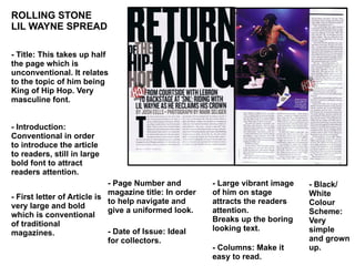
1. ROLLING STONE LIL WAYNE SPREAD - Title: This takes up half the page which is unconventional. It relates to the topic of him being King of Hip Hop. Very masculine font. - Introduction: Conventional in order to introduce the article to readers, still in large bold font to attract readers attention. - First letter of Article is very large and bold which is conventional of traditional magazines. - Page Number and magazine title: In order to help navigate and give a uniformed look. - Date of Issue: Ideal for collectors. - Large vibrant image of him on stage attracts the readers attention. Breaks up the boring looking text. - Black/ White Colour Scheme: Very simple and grown up. - Columns: Make it easy to read.