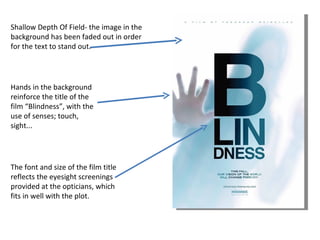
1. Shallow Depth Of Field- the image in the background has been faded out in order for the text to stand out. Hands in the background reinforce the title of the film “Blindness”, with the use of senses; touch, sight... The font and size of the film title reflects the eyesight screenings provided at the opticians, which fits in well with the plot.
2. The use of white light on this image has reflected the “white blindness” disease which the film revolves around. In this image, Julianne Moore’s eyes, nose, mouth and hands are visible, linking to a human beings 5 senses. A biblical and religious analysis of this image would be that the white light is a symbol of God and Moore’s eyes facing up, in a cry of help, whilst the hands are pushing her down. The billing box is placed around the image instead of at the bottom, which challenges and breaks the codes and conventions of a regular film poster. The white light on the rest of Moore’s face has put all the attention and focus on her eyes, which instead of being white, are green and therefore makes the viewer question the Blindness title.