Print Screens Of Magazine
•Download as DOCX, PDF•
0 likes•88 views
Report
Share
Report
Share
Recommended
Recommended
More Related Content
Recently uploaded
Recently uploaded (16)
Chapter-8th-Recent Developments in Indian Politics-PPT.pptx
Chapter-8th-Recent Developments in Indian Politics-PPT.pptx
HISTORY- XII-Theme 3 - Kinship, Caste and Class.pptx
HISTORY- XII-Theme 3 - Kinship, Caste and Class.pptx
PEACE BETWEEN ISRAEL AND PALESTINE REQUIRES EXTREMISTS OUT OF POWER AND RESTR...
PEACE BETWEEN ISRAEL AND PALESTINE REQUIRES EXTREMISTS OUT OF POWER AND RESTR...
ys jagan mohan reddy political career, Biography.pdf
ys jagan mohan reddy political career, Biography.pdf
Nika Muhl Visa Approval Shirt, Nika Muhl Visa Approval T-Shirt
Nika Muhl Visa Approval Shirt, Nika Muhl Visa Approval T-Shirt
Featured
More than Just Lines on a Map: Best Practices for U.S Bike Routes
This session highlights best practices and lessons learned for U.S. Bike Route System designation, as well as how and why these routes should be integrated into bicycle planning at the local and regional level.
Presenters:
Presenter: Kevin Luecke Toole Design Group
Co-Presenter: Virginia Sullivan Adventure Cycling AssociationMore than Just Lines on a Map: Best Practices for U.S Bike Routes
More than Just Lines on a Map: Best Practices for U.S Bike RoutesProject for Public Spaces & National Center for Biking and Walking
Featured (20)
How to Prepare For a Successful Job Search for 2024
How to Prepare For a Successful Job Search for 2024
Social Media Marketing Trends 2024 // The Global Indie Insights
Social Media Marketing Trends 2024 // The Global Indie Insights
Trends In Paid Search: Navigating The Digital Landscape In 2024
Trends In Paid Search: Navigating The Digital Landscape In 2024
5 Public speaking tips from TED - Visualized summary
5 Public speaking tips from TED - Visualized summary
Google's Just Not That Into You: Understanding Core Updates & Search Intent
Google's Just Not That Into You: Understanding Core Updates & Search Intent
The six step guide to practical project management
The six step guide to practical project management
Beginners Guide to TikTok for Search - Rachel Pearson - We are Tilt __ Bright...
Beginners Guide to TikTok for Search - Rachel Pearson - We are Tilt __ Bright...
Unlocking the Power of ChatGPT and AI in Testing - A Real-World Look, present...
Unlocking the Power of ChatGPT and AI in Testing - A Real-World Look, present...
More than Just Lines on a Map: Best Practices for U.S Bike Routes
More than Just Lines on a Map: Best Practices for U.S Bike Routes
Ride the Storm: Navigating Through Unstable Periods / Katerina Rudko (Belka G...
Ride the Storm: Navigating Through Unstable Periods / Katerina Rudko (Belka G...
Good Stuff Happens in 1:1 Meetings: Why you need them and how to do them well
Good Stuff Happens in 1:1 Meetings: Why you need them and how to do them well
Print Screens Of Magazine
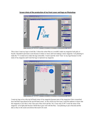
- 1. Screen shots of the production of my front cover and logo on Photoshop<br />This is how I want my logo to look like. I chose the colour blue as it wouldn’t make my magazine look girly or boyish. I decided to put music icons because it relates to music and I am making a music magazine. I am planning to make the ‘T’ to stand out to make the logo noticeable. I want to put the word ‘Tune’ on my logo because it is the name of my magazine and I want the logo to represent my magazine.<br />I want my logo to be at the top left hand corner of my magazine because most of the magazines I have researched have had their logo placed at the top left hand corner. As this will be my first issue I want the audience to know that this magazine is new that is why I have put a blue circle and the ‘No.1 issue only £2.99’ I want the name of the magazine to be light pink because I think that it goes well with the blue. I am planning to put a barcode and the date as they’re the usual conventions that need to be used.<br />