KING VISHNU BHAGWANON KA BHAGWAN PARAMATMONKA PARATOMIC PARAMANU KASARVAMANVA...
Analysing Content Pages
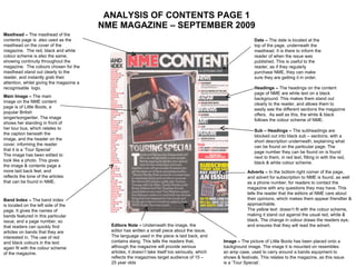
1. ANALYSIS OF CONTENTS PAGE 1 NME MAGAZINE – SEPTEMBER 2009 Date – The date is located at the top of the page, underneath the masthead. It is there to inform the reader of when the issue was published. This is useful to the reader, as if they regularly purchase NME, they can make sure they are getting it in order. Headings – The headings on the content page of NME are white text on a black background. This makes them stand out clearly to the reader, and allows them to easily see the different sections the magazine offers. As well as this, the white & black follows the colour scheme of NME. Sub – Headings – The subheadings are blocked out into black sub – sections, with a short description underneath, explaining what can be found on the particular page. The page number they can be found on is found next to them, in red text, fitting in with the red, black & white colour scheme. Masthead – The masthead of the contents page is also used as the masthead on the cover of the magazine. The red, black and white colour scheme is also the same, showing continuity throughout the magazine. The colours chosen for the masthead stand out clearly to the reader, and instantly grab their attention, whilst giving the magazine a recognisable logo. Main Image – The main image on the NME content page is of Little Boots, a popular British singer/songwriter. The image shows her standing in front of her tour bus, which relates to the caption beneath the image, and the header on the cover, informing the reader that it is a ‘Tour Special’ The image has been edited to look like a photo. This gives the image & contents page a more laid back feel, and reflects the tone of the articles that can be found in NME. Band Index – The band index is located on the left side of the page. It gives the names of bands featured in this particular issue, and a page number, so that readers can quickly find articles on bands that they are interested in. The use of red and black colours in the text again fit with the colour scheme of the magazine. Editors Note – Underneath the image, the editor has written a small piece about the issue, The language used in the piece is laid back, and contains slang. This tells the readers that, although the magazine will provide serious articles, it doesn’t take itself too seriously, which reflects the magazines target audience of 15 – 25 year olds Adverts – In the bottom right corner of the page, and advert for subscription to NME is found, as well as a phone number, for readers to contact the magazine with any questions they may have. This tells the reader that the editors at NME care about their opinions, which makes them appear friendlier & approachable. The yellow text doesn’t fit with the colour scheme, making it stand out against the usual red, white & black. The change in colour draws the readers eye, and ensures that they will read the advert. Image – The picture of Little Boots has been placed onto a background image. The image it is mounted on resembles an amp case, used to carry around a bands equipment to shows & festivals. This relates to the magazine, as this issue is a ‘Tour Special’.
2. ANALYSIS OF CONTENTS PAGE 2 Q Magazine – October 2008 Masthead – The masthead of Q Contents page has a continuous house style, as it is made with the same colour scheme as the cover, red, white and black. The continuous use of the Q logo on both the cover & contents page makes the magazine recognisable to the reader. Issue Number/Date – The issue number and date is found in the top corner of the Q contents page. This is a common feature of contents pages, as it allows the reader to buy issues in the correct order, and lets them keep track of this. The sub – heading used anchors the image of The Courteeners. It tells the reader who the band are, and gives them a page number, so the article about the band can be easily found. Main Image – The image of The Courteeners in Q is the main focal point of the content page, as it is the only large image on a page that is lead mainly by text. The Courteeners are a popular indie band, and therefore fit in with the genres Q includes in its magazine. The image is taken from a photoshoot, and looks professional, reflecting the approach Q takes to music. Headings – The headings on the Q content page are used to clearly show the reader what is in the particular issue of the magazine. The white text against the red background makes them clearly visible to the reader, whilst following the colour scheme of the magazine. The ‘Every Month’ shows the reader what is regularly included in the magazine, whilst the ‘Features’ shows any new aspects or articles that are only found in this particular issue. Features – Q Magazine is well known for its reviews and articles on new & upcoming artists. The review on the contents page stands out to the audience, who are drawn to read it, and gives the reader information if artists featured in the issue. Sub – Headings – Similarly to NME magazine, Q ‘s content page contains sub – headings, with a brief description of what each feature contains underneath, as well as a page number, so that the reader can find particular articles. The page numbers are in red, and the text in black, following the colour scheme of Q.
3. ANALYSIS OF CONTENTS PAGE 3 Kerrang! Magazine – November 2009 Masthead – The masthead of Kerrang magazine is found in the center of the page, underneath a large image of Bring Me The Horizon. The placement of the masthead reflects the stlye of the music Kerrand reports on. Rock goes against stereotypes, therefore the magazine has reflected this, by changing the layout of the Contents Page. Editor’s Letter – The letter from the Editor of Kerrang magazine is clearly visible on the contents page, showing the reader that the staff at Kerrang want their magazine to be laid back, and approachable for the reader, through their style of writing and approach to music. The image of the Editor adds to this, as they are not just a name on a page, but have a visual to accompany them. Date/Issue Number – The date and issue number is found at the top of the page, as is typical for most Music Magazines. The date and issue number informs the reader that they are following the issues in the right order, and allows them to keep track. Advertisements – Found in the bottom right hand corner of the page, an advertisement for subscription to Kerrang Magazine is seen. The use of red stands out, as it goes against the colour scheme used in the rest of Kerrang. Headings – The headings of Kerrang magazines Content Pages are on a black background, with yellow text. This makes the words stand out to the reader, and follows the colour scheme of Kerrang. The headings in this issue show what is regularly featured in the magazine, such as Live Reviews, and gives feedback from readers, showing Kerrang care about their readers opinions. Main Image – The main image of Kerrang’s Contents Page is of Oli Sykes, lead singer of the band Bring Me The Horizon. The band are a popular rock group, and therefore fit the genre that Kerrang regularly reports on. The image shows Oli with fans at a show, reinforcing the idea that Kerrang are laid back & care about the readers, as the artists they report on do. Sub – Headings – The sub – headings are in black text, with the page numbers next to them in red, making it clear to the reader what page certain articles can be found on. The red goes against the general colour scheme, making then numbers stand out clearly.