
Recommended
Recommended
More Related Content
Recently uploaded
Recently uploaded (20)
Featured
Featured (20)
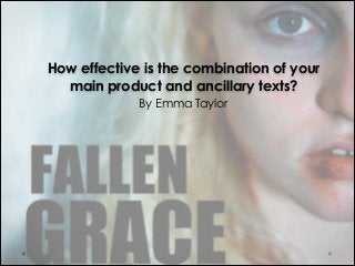
Fallen Grace; Evaluation Task Three
- 1. How effective is the combination of your main product and ancillary texts? ! By Emma Taylor
- 2. Intended Outcome of our Production • The intention for our coming of age supernatural thriller trailer for ‘Fallen Grace’ was to entertain and intrigue our target audience of young people (15-25) in hope that they would engage in the themes displayed in the trailer and want to see the finished feature film. ! • The aim of producing the two ancillary tasks (the poster and website) we hoped to interest our potential audience in our film by denoting the genre of the film through the genre of the film in both of the ancillary tasks, which are popular with our target market. We aimed to attract the same target audience as other films which are similar to ours such as ‘The Perks of being a Wallflower’ which we analysed.
- 3. Ancillary Tasks • Our ancillary tasks included making both poster and website. We had to ensure that they followed similar thriller like themes in the design to provide continuity from the film to the ancillary tasks to make them effective in promoting ‘Fallen Grace’ accurately. In order to prepare for making our poster and website we did two separate photo shoots (one on set with special effects make-up and another with a photography studio set up for actor profile shots).
- 4. The Website • Our website was hosted by a professional company (Top Floor Web Hosting) which provided a professional website making templates for us to design our site without having advertisements on our site, and also provided us with a the UK domain name www.fallengracemovie.co.uk. • In the production of the ‘Fallen Grace’ website we had to keep in mind the themes and genre of our trailer and design the website accordingly. We used Claude Levi-Strauss’ theory of binary oppositions to fuel the basis of our website design using a black and white colour scheme to connote good and evil which is explicitly expressed in our trailer.
- 5. Research into Web Design • We looked into the web pages of films we had analysed to see key conventions which were in keeping with our genres. We found that cross media convergence was frequently employed to get the audience engaged with the film, by placing links to social media onto their websites such as Facebook and Twitter pages. The trailer for the film was also situated on the home page of the website to make it more likely for the audience to watch it, and hopefully be persuaded to see the film. Screen shot from ‘The Perks of being a Wallflower’ website Screen shot from ‘The Hunger Games’ website !5
- 6. Aspects of the Website • In modern society it is increasingly essential to provide information on multiple media platforms and so we have made our website accessible on phone devices, tablets, Wii, and on YouTube. • We also recognised the importance of social media in the marketing for our film and so created Facebook and Twitter pages to link the website to. This could widen our audience by loyal fans ‘sharing’ posts and entering competitions to win prizes. !6
- 7. The Poster • The image on the picture was taken by Emma on set when filming the torture scene with our main protagonist, Grace when she had special effects make-up of blood dripping off her face and fingers in order to connote the thriller genre in our production as it has dark and serious themes. We used dark colours such as black for the main title to convey the darkness in the film which is also mirrored in the film (black title plates) and in the website (black text). This image is also used on the website, Facebook and Twitter pages in order to create a visual identity for the film. • Using Photoshop CS5 we increased the saturation, and underexposed the image to create a sense of ‘mania’ to the poster, aiding the dark themes utilised in ‘Fallen Grace’. • References to the production companies, Facebook and Twitter pages are also used in order to display continuity from all the tasks and also to aid the promotion of the film. ! !
- 8. Research into Poster Designs • Our poster had to imitate other conventions of other film posters from our chosen genres in order gain interest from our target audience who enjoy similar themed films whilst adhering to our chosen schemes from our trailer, website and social media outlets. • We looked at posters from films similar to ours such as the thriller ‘Salt’ starring Angelina Jolie and directed by Phillip Noyce. We replicated the use of the main actress’ name at the top of the poster in order to promote the film, giving the poster ‘edge’. We have done this to help promote the film due to the actors used in the film. !8
- 9. Research into Poster Designs • As the main aim of posters is to be easy to read and to grab the audience’s attention to market the ‘Fallen Grace’ effectively. In order to do this we contrasted the ‘icy’ harsh blue colour on the left of the poster with the darker detail on the right to try and gain the attention of the public. The blood dripping from Grace’s head instantaneously draws the audience in and establishes the thriller genre in ‘Fallen Grace’. The institutional information at the bottom of the poster also uses the binary oppositions as seen in the website to establish connections between all the tasks and to make this information to be seen more clearly. This institutional information (of production companies, the director, the DOP ect is found on most film posters to give sufficient credit to the film makers. !9
- 10. The Poster • We used other conventions commonly seen on film posters such as reviews with star ratings from critically acclaimed film festivals such as ‘Raindance’ and ‘Cannes’ gives the film a good impression instantaneously as they can see it’s a good standard. This is also shown on the ‘Fallen Grace’ website, and helps promote the film as many people are more likely to see the film if it has good reviews. !10
- 11. Audience Feedback from the Ancillary Tasks • Many people liked the poster design and thought it was very effective in promoting ‘Fallen Grace’ as it looked professional and effectively conveyed the themes in the trailer whilst conveying sufficient levels of enigmas (why is she being tortured?) to keep the audience engaged. !11
- 12. Theorist: Vladimir Propp • Vladimir Propp’s media theory is that they are many different character types which appear in media texts. This is expressed clearly in our trailer this links to our trailer in numerous ways. Our trailer contains a villain, a hero and helpers who all have key and specific roles to play in order for the narrative of a story to function. Steve Neal expresses that media texts should be ‘similar with differences’ and we have tried to incorporate this idea by making the ‘hero’ a female instead of the stereotypical male heroic part, which is increasingly being incorporated into films due to social change and the understanding that women are equal to men. This can be seen in the ‘Hunger Games’ trilogy where Katniss Everdine is the protagonist defeating the evils with her strength and courage. The villain is also portrayed in the trailer as he kidnaps Grace establishing the basic and crucial storyline to ‘Fallen Grace’; good vs evil. The helpers (Zara and Charlie) are shown being distressed (throwing a chair across a classroom) and hints at both of them going on a mission to find Grace by running through fields.
- 13. Theorist: Tzvetan Todorov • Tzvetan Todorov’s narrative theory describes that every story consist of an ‘equilibrium’, a ‘disruption’ and a ‘revised equilibrium’. Trailers form their own narrative by only hinting at the story, creating enigmas and not displaying the ‘revised equilibrium’ to not give away the plot line of the film. In order to give the trailer closure but not to display the ending, montage post-production techniques were used to give a basic summary of the trailer which an atmospheric ‘swooping’ sound effect at the end of the trailer.
- 14. Following our Plans We planned the production of our trailer, website and poster design extensively in order to get the results we wanted from each section and to make sure that each had continuity features to give the film its own identity so it could be easily recognised through fonts, characters, colourisation choices ect. We made animatics, shot, prop, and equipment lists to ensure we knew how the film was going to plan out along with catering for health and safety needs in our risk assessments of our chosen locations. Whilst aspects of the production did change in each section of production (filming extra shots whilst on set, and creating a montage at the end of the trailer) we did make sure we stuck to the original plans as best we could. Some aspects of making the trailer were made more difficult at times due to absences of team members which made the production process take longer than planned but we dealt with these situations accordingly (re-distributed the extra work load amongst ourselves) in order to make the shoots run smoothly in order to get the footage and results we originally aimed for.
- 15. Mise-en-scene • Lighting - We aimed to create a chiaroscuro lighting effect for the ‘disruption’ (Todrov) scenes of our trailer which we achieved with studio lighting and colour grading in order to create mystery and suspense in the trailer. • Props - We used props such as ‘party cups’ in the house party scene, buying food and drinks for the actors to act appropriately for a happy house party seen which worked really well on camera in connoting enjoyment. • Costume - We used costume in order to connote differences in characters semiotically. For instance, Grace wore a white top when getting kidnapped in order to connote her innocence and vulnerabilty, whilst Mr Eastwood, the antagonist, wore dark clothing including a hoodie which is commonly associated with criminality to represent their characters without explaining each character in detail on screen. • Set Design - We chose locations which suited the mood we wanted to create for each scene including a car park for the kidnap scene to create an eerie, stressful scene full of tension. • Make-up - We used special effects make-up accordingly in order to increase realism for our trailer, and to increase the audience’s empathy for Grace.
- 16. In Conclusion… • In conclusion we think that the combination of our trailer and our ancillary tasks are very effective together in promoting ‘Fallen Grace’. They all accurately display aspects of narrative, genre which are important in promoting a feature film. There are several themes which follow throughout all the tasks to provide continuity such as institutional information (the film makers) which is conventional of each task. • The combinations of tasks allow us to reach a wide audience both locally (through the poster) and potentially globally (through the trailer being online and the website being easily accessible through a variety of mediums including smart phones and tablets to a wide audience). • We are very happy with the results of each task set and think they interconnect well together to promote the feature film ‘Fallen Grace’. !16